Building an illustration portfolio from scratch can feel paralyzing. You have folders full of incredible artwork, but deciding how to arrange them on a screen is an entirely different skill set.
The most efficient way to overcome this design block is to stop trying to reinvent the wheel. The industry's top illustrators, concept artists, and art directors have already established the visual language of a professional website. By studying high-end online art portfolio examples, you can reverse-engineer their success and apply their structural secrets to your own digital brand. Here is how to transform your website from a chaotic gallery into an agency-grade presentation.
Step 1: Implement the "Single Masterpiece" Homepage
When reviewing the best online art portfolio examples, you will notice a recurring theme: extreme confidence on the homepage.
Amateurs crowd their homepage with 20 different thumbnails, terrified that if the client doesn't see everything immediately, they will leave. Professionals do the exact opposite.
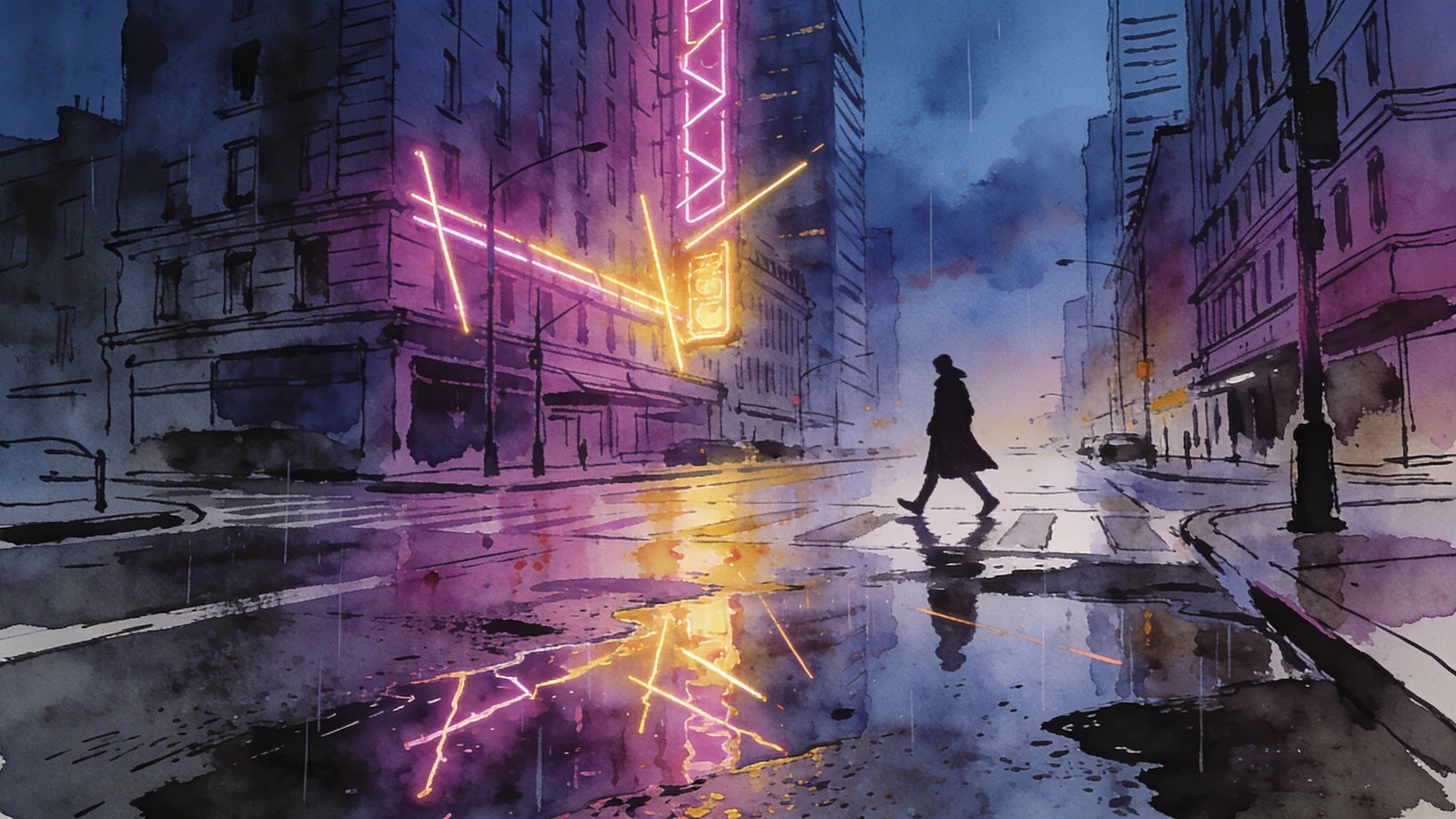
The Transformation: Delete the grid on your homepage. Select your absolute strongest, most visually arresting illustration. Use it as a massive, edge-to-edge "Hero" image. This single masterpiece acts as a statement of intent. It proves your technical mastery instantly and sets a luxurious, premium tone for the rest of the website.
Step 2: Use Asymmetrical Pacing in Galleries
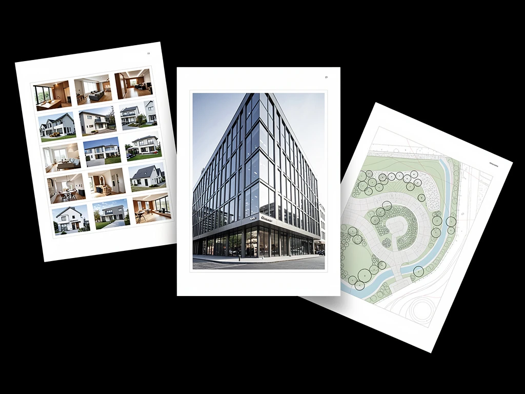
If your gallery forces every image into a perfect 1:1 square crop, your website will look like an Instagram feed, not a professional portfolio.
The Transformation: The most creative online art portfolio examples utilize asymmetrical masonry layouts. This allows you to place a tall, vertical character portrait next to a wide, cinematic environment painting without any awkward cropping. The staggered, interlocking grid forces the viewer's eye to wander dynamically down the page, creating a rhythm that keeps them engaged longer.
Step 3: Embrace the Dark Mode Aesthetic
Many illustrators default to a white background because it feels "safe" and clean. However, if you are a digital painter, a concept artist, or an illustrator who works with heavy contrast and vibrant lighting, a white background is actively fighting your art.
The Transformation: Look at the portfolios of top artists working at studios like Blizzard or Riot Games. They almost exclusively use dark mode (deep charcoal or pure black backgrounds). A black background acts as a velvet frame; it absorbs screen glare and allows the saturated colors and glowing lighting effects in your digital paintings to pop with incredible, cinematic intensity.
Step 4: Include "Behind the Scenes" Context
Art directors do not just hire your hands; they hire your brain. They need to know you can solve visual problems.
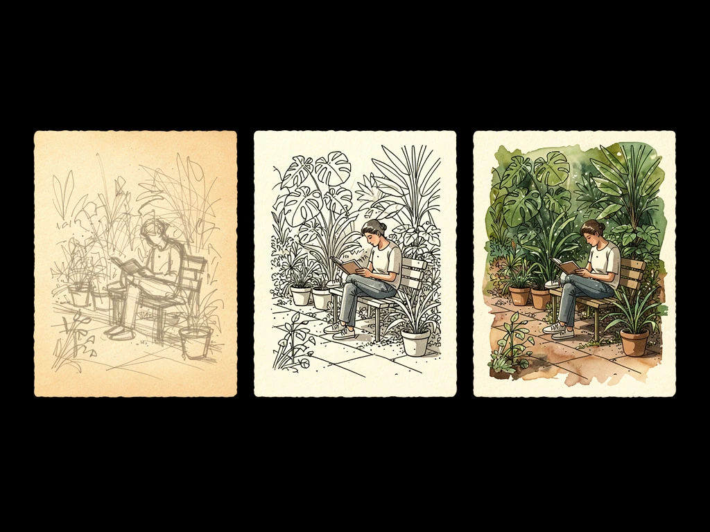
The Transformation: The best online art portfolio examples don't just show the final book cover. They include a dedicated project page that shows the progression. Include your rough thumbnails, your color exploration swatches, and the final line art. Add a short paragraph explaining the creative brief you were given. This transparency proves you are a reliable professional who understands the commercial production pipeline.
Transforming your digital presence does not require a degree in web development. With Portfoliobox, you can effortlessly implement the design principles found in the industry's best online art portfolio examples, building a bespoke, high-end website in minutes — no coding required.