When environment illustrators or concept artists look to build their portfolio websites, they almost exclusively look at other illustrators for inspiration. While this is helpful for benchmarking the quality of your art, it is often detrimental to the layout of your website. Illustrators have a terrible habit of overcrowding their galleries.
If you want to learn how to present spatial art, environments, and architecture in a way that feels premium and luxurious, you should look outside your industry. Some of the most effective layout strategies come from high-end interior design portfolio examples. Interior designers are masters of spatial pacing and visual flow. Here is how illustrators can steal their structural secrets to build a better website.
1. The "Wide and Breathable" Layout
If you paint massive, cinematic environments—like a sprawling cyberpunk cityscape or a detailed fantasy tavern—cramming those images into small square thumbnails destroys their scale.
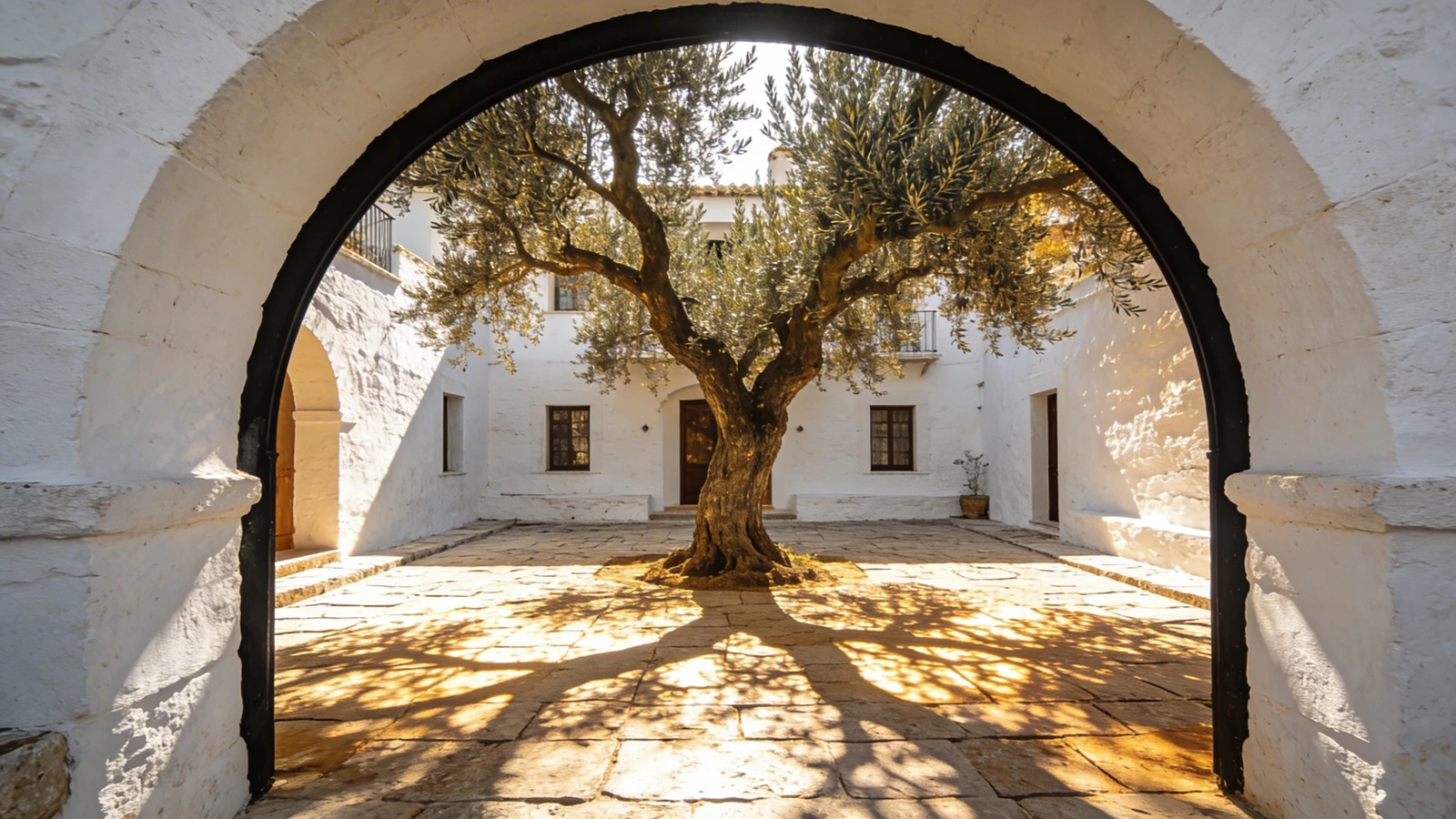
When you study high-end interior design portfolio examples, you will notice they rarely use tight grids. They use the "Wide and Breathable" layout. How to apply it: Use a single-column layout for your environment illustrations. Make every image span the full width of the screen. Place massive amounts of white space (negative space) between each image as the viewer scrolls down. This forces the client to stop and absorb the intricate details of your environment without being distracted by adjacent images.
2. Contextual Lighting Breakdowns
Interior designers do not just show a room; they show how light interacts with the space at different times of the day to prove their technical understanding of atmosphere.
How to apply it: If you are a concept artist pitching environments to a game studio, lighting is everything. Do not just upload the final daytime render of your environment. Treat it like a case study. Below the main image, show a "lighting breakdown"—the exact same environment painted in the harsh midday sun, during a moody sunset, and under bioluminescent night lighting. This proves to art directors that you understand how to control mood through color scripts.
3. The "Material and Texture" Callout
Interior designers always include macro photographs of their materials (the weave of a rug, the grain of the wood) alongside wide shots of the room.
How to apply it: Environment illustration is all about texture. When you upload a wide shot of a ruined castle, include smaller crop-ins next to it. Show a 100% zoom crop of the crumbling stone texture, the rusty metal portcullis, or the painted moss. This "Material Callout" proves to 3D modelers and art directors that your rendering is highly detailed and structurally sound, not just a blurry digital smudge.
4. Minimalist Typography
Finally, interior designers never let the website text distract from the room. They use elegant, highly minimalist sans-serif typography.
How to apply it: Remove the bulky, stylized fonts from your website. Use clean, geometric fonts. Let the complex architecture and vibrant lighting of your environment illustrations provide all the visual excitement on the page.
Presenting complex environments requires a platform that understands scale. With Portfoliobox, you can effortlessly implement the spacious layouts found in top interior design portfolio examples, allowing your illustration work to breathe — no coding required.