Fine artists are inherently creative individuals. When it comes time to build their digital presence, they often assume that the website itself needs to be a highly "creative" experience.
This is a massive trap. When you try to make your website overly creative—using textured backgrounds, bright colors, chaotic animations, and complex navigation menus—you create digital clutter. This clutter actively competes with your artwork for the viewer's attention. If a high-end collector lands on your site and feels overwhelmed by the interface, they will leave without buying anything. If you want to transform your website from a chaotic blog into a premium digital gallery, here are the most effective portfolio website ideas to solve visual clutter.
The Problem: The "Wall of Art"
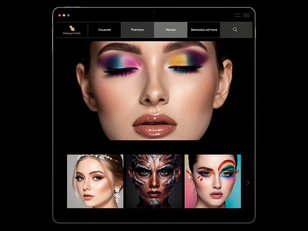
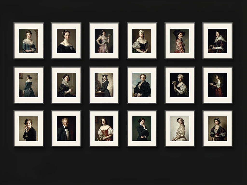
The most common mistake fine artists make is the uniform grid. They upload 40 highly detailed, colorful paintings and force them into a tight, edge-to-edge square grid with no spacing. The colors clash, the compositions fight each other, and the viewer experiences immediate visual fatigue.
The Solution: Aggressive Negative Space
In gallery curation, empty space is not "blank." It is an active structural element used to provide relief and focus. The Idea: Stop cramming your images together. Increase the padding (the space between the images) significantly. Whether you are using a grid or a vertical scroll, ensure there is a thick, distinct border of empty space around every single thumbnail. This invisible frame forces the viewer's eye to stop and appreciate the individual piece, rather than blurring them all into one chaotic mass.
The Problem: The "Template" Aesthetic
If you use a generalist website builder, your site will likely have a bright, corporate template. If your website looks like a local accountant's website, your fine art loses its exclusivity.
The Solution: The "White Cube" Interface
Fine art requires a specific environment to shine. The Idea: You must choose a platform that allows you to replicate the "White Cube" aesthetic of a physical contemporary gallery. Strip away all the design elements. Use a pure white or pure black background. Use a minimalist, clean geometric font for your title. The website design must completely disappear so the texture of your art can take center stage.
The Problem: The Monotonous Scroll
If your gallery is just a single column of images, all exactly the same width, scrolling down the page becomes monotonous. The client gets bored because the visual rhythm never changes.
The Solution: Asymmetrical Editorial Layouts
Magazine designers never use perfectly uniform grids. They use scale and asymmetry to dictate importance. The Idea: Break the grid. Use an asymmetrical masonry layout. Make your absolute best painting take up 60% of the screen width, and place two smaller, related studies next to it. By varying the size and placement of your images, you create "visual pacing." It makes the scrolling experience feel curated, dynamic, and highly professional.
The Problem: Dead Ends
When a collector finishes looking at your beautiful gallery, they reach the bottom of the page. If there is nothing there, you have created a dead end, forcing them to hunt for a contact page to buy something.
The Solution: Frictionless E-Commerce
The Idea: Never leave a page blank at the bottom. Integrate a seamless e-commerce block directly beneath your galleries. Allow the collector to see the price, click "Purchase," and check out securely immediately, removing all friction from the sales process.
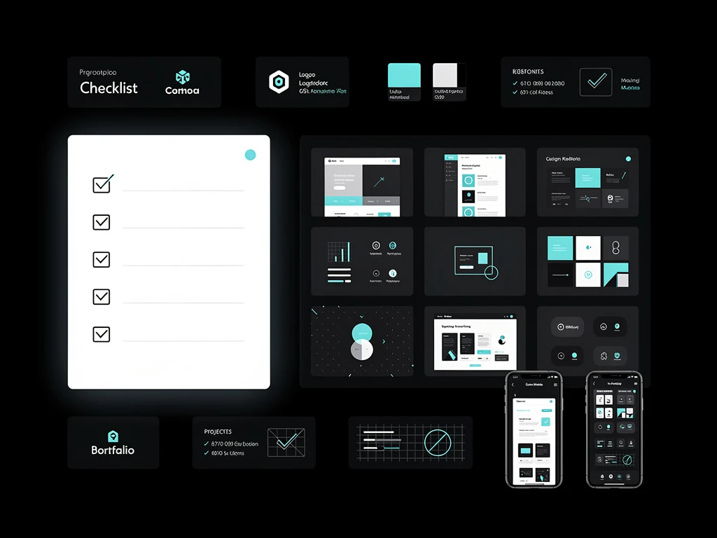
You don't need to write code to implement these high-level curatorial principles. With Portfoliobox, you have native access to asymmetrical masonry grids, deep typographical control, and expansive white space, allowing you to build an agency-grade fine art portfolio in minutes.