Illustrators are masters of color, composition, and storytelling within the frame of a single image. However, when it comes to placing 20 of those images onto a web page, many artists struggle. They upload their beautiful illustrations to a generic template, and the result often looks chaotic, cluttered, and unprofessional.
The problem is not the art; the problem is the layout. To elevate your digital presentation and attract high-paying commercial clients or publishing houses, you must borrow structural rules from a neighboring discipline. Here are the most effective graphic design ideas for portfolios that will instantly solve your presentation problems.
Problem 1: Visual Clutter and Fatigue
If you place 30 highly detailed, colorful illustrations into a tight, uniform square grid on your homepage, you create visual fatigue. The art director's eye doesn't know where to look. The colors clash, and the individual impact of each piece is destroyed by the noise of the others.
The Graphic Design Solution: Aggressive Negative Space
Graphic designers understand that empty space is an active design element, not just "blank" space.
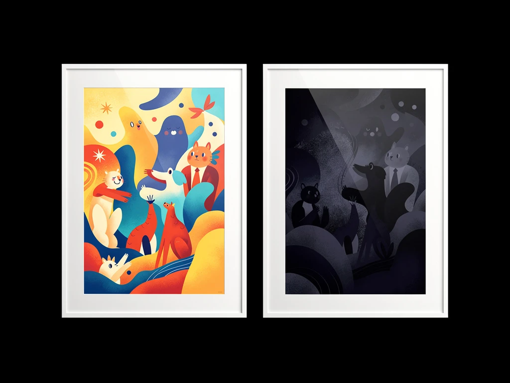
How to apply it: Implement aggressive negative space (white space) between your images. Instead of a tight grid, use a single-column layout or a highly spaced masonry grid. Give each illustration a massive border of empty space. This acts as an invisible frame, allowing the viewer's eye to rest and forcing them to appreciate each piece individually, drastically increasing its perceived value.
Problem 2: The "Cookie-Cutter" Layout
When every image is forced into the exact same 1:1 square crop (like an Instagram feed), your portfolio looks like a cheap, cookie-cutter template. It fails to reflect the bespoke, creative nature of your artistry.
The Graphic Design Solution: Asymmetrical Pacing
Editorial designers (who layout magazines) rarely use uniform grids. They use asymmetry to create visual rhythm and pacing.
How to apply it: Break the grid. Use a dynamic masonry layout that allows you to mix a massive, horizontal landscape painting next to a tight, vertical character portrait. Make some images large and others small. This asymmetrical pacing creates a sophisticated, editorial flow that keeps the viewer engaged as they scroll down the page.
Problem 3: Disconnected Branding
Many illustrators treat the text on their website as an afterthought, using whatever default font came with their template. This creates a disconnect. If you paint delicate, whimsical children's book illustrations, but your website uses a harsh, brutalist tech font, the client experiences brand confusion.
The Graphic Design Solution: Typographic Alignment
Typography is the anchor of brand identity. The fonts you choose must subconsciously align with the style of your art.
How to apply it: Select typography deliberately. If your work is classic and painterly, choose an elegant serif font. If your work is sleek vector art, choose a modern, clean sans-serif font. Ensure your name (your logo) and your navigation menu use this consistent typography.
Problem 4: The "Dead End" Gallery
When an art director finishes scrolling through your gallery, what happens? If the page simply ends and they have to scroll all the way back up to find your contact page, you are introducing friction. Friction kills bookings.
The Graphic Design Solution: The Call to Action (CTA)
Graphic designers build websites as funnels, designed to lead the user to a specific action.
How to apply it: Never leave a page as a dead end. At the bottom of every illustration gallery, place a clear, highly visible Call to Action button (e.g., "Inquire About Commissions" or "Contact for Freelance"). Guide the client effortlessly toward hiring you.
You don't need a degree in graphic design to implement these high-level layout concepts. With Portfoliobox, you get a platform built for all creatives, allowing you to easily apply these graphic design ideas and build an agency-grade website in minutes — no coding required.