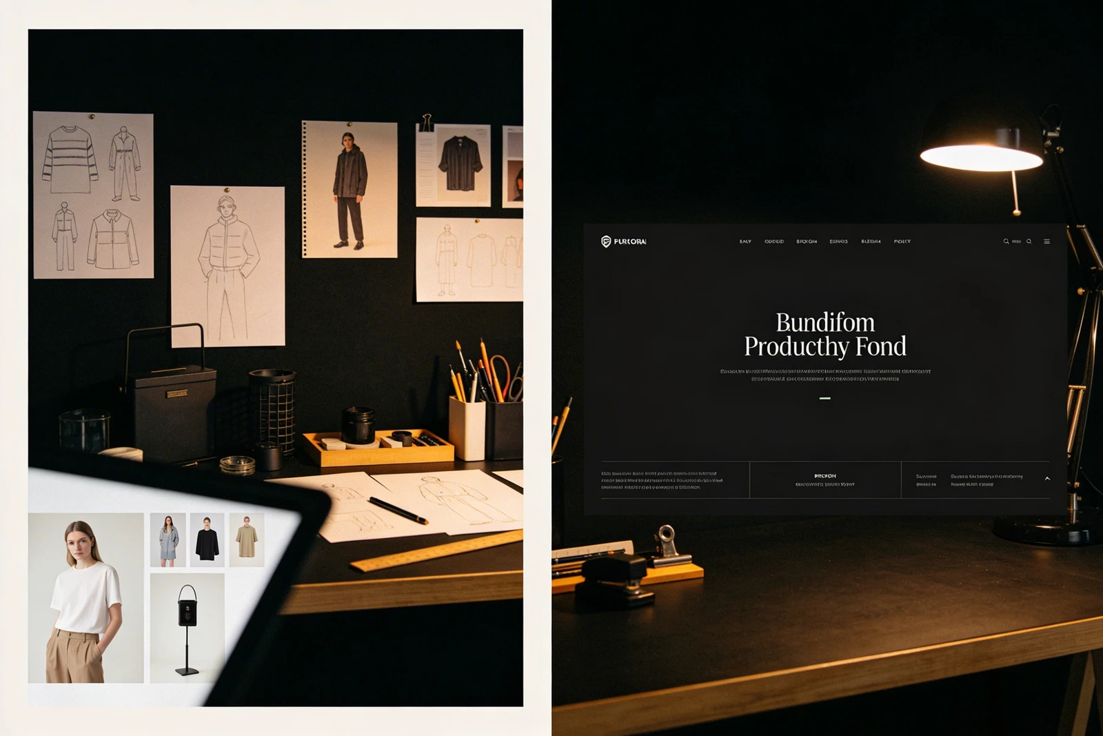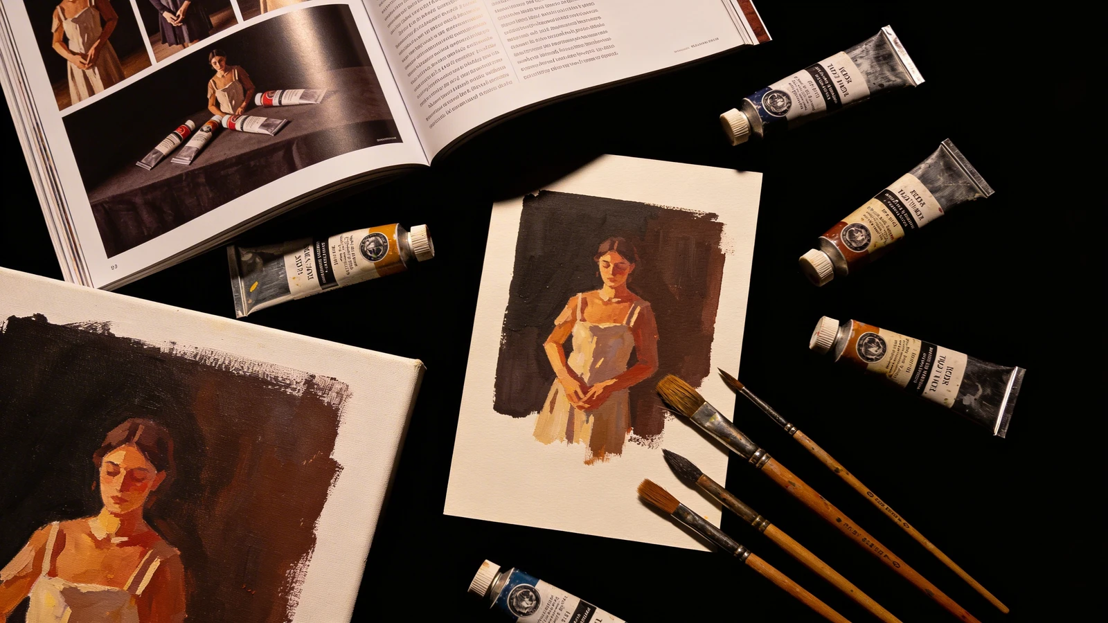
For traditional fine artists, the transition to the digital world is often jarring. You know exactly how to light a canvas in a physical gallery. You know how to space paintings on a white wall to give them room to breathe. You know how to engage a collector at an opening reception.
But when it comes to translating that experience to an online portfolio, many artists freeze. They dump a folder of JPEGs into a template and hope for the best. The result is usually a website that feels sterile and lifeless. A successful digital gallery requires its own specific architecture. If you want to attract high-end representation and sell directly to collectors, here is a deep dive into the anatomy of a successful fine art online portfolio.
1. The Architecture of the Homepage: The Statement Piece
In a physical gallery, there is always a "statement piece" placed strategically so it is the very first thing you see when you walk through the door. It sets the tone for the entire exhibition.
Your online portfolio must do the same. Do not use your homepage to show a grid of 20 small thumbnails. This is visually overwhelming. The Fix: Your homepage should consist of a single, massive, edge-to-edge photograph of your absolute best painting or sculpture. This "Hero" image acts as a velvet rope. It immediately establishes a premium, luxurious tone and proves your technical mastery before the collector even clicks a menu button.
2. The Architecture of the Gallery: The Invisible Frame
When you frame a painting, you don't use a frame that is brighter and louder than the art itself. The frame's job is to protect and elevate the painting.
Your website is the digital frame. The Fix: Eliminate all visual clutter. Do not use textured website backgrounds, colorful borders, or whimsical fonts. A highly successful online portfolio utilizes stark minimalism—either pure gallery white or deep charcoal black. By removing the web design elements, the rich colors and textures of your fine art command 100% of the viewer's attention.
3. Contextualizing the Scale
The biggest disadvantage of an online portfolio is that a 10-inch watercolor and a 10-foot oil canvas look exactly the same size on a smartphone screen.
If a collector cannot immediately understand the scale of your work, they will not buy it. The Fix: Never just upload the flat scan of the painting. For every piece, include a secondary photograph showing the painting hanging in a room, or a photograph of yourself standing next to it in the studio. Providing physical context instantly grounds the artwork in reality.
4. The Architecture of Acquisition (E-commerce)
The ultimate goal of your digital presence is not just to display art; it is to generate income and secure commissions.
If a collector falls in love with a piece, they shouldn't have to hunt for your email address and wait three days for a reply regarding pricing. The Fix: Integrate a seamless e-commerce experience directly into your online portfolio. List the prices of available originals and offer high-quality archival prints. Ensure the checkout process is smooth, secure, and visually consistent with the rest of your elegant website.
Translating a physical gallery experience to a digital screen requires the right infrastructure. With Portfoliobox, you have access to the minimalist layouts, uncompressed image rendering, and integrated commerce tools necessary to build a world-class online portfolio — no coding required.