The most fatal error a Makeup Artist (MUA) can commit is assuming their portfolio website is a digital scrapbook.
A digital scrapbook holds everything you have ever accomplished: the beautiful bridal makeup you did last weekend, the avant-garde neon runway look from three years ago, and the horrific zombie special-effects prosthetic you built for a student film.
When you organize your portfolio website like a scrapbook, throwing every single genre natively onto your scrolling homepage grid, you commit a critical B2B error known as "Visual Clutter." A commercial casting director attempting to hire you for a corporate lifestyle commercial will be completely alienated by the zombie prosthetic. A film director looking for gore will be irritated by the soft, glowing bridal portraits.
To convert website traffic into high-paying retainers, you must architect strict visual boundaries. You must become a master of "Conceptual Layout Siloing." Here is exactly how to execute it.
The 'Unified Aesthetic' Homepage
The absolute hardest decision an MUA has to make is selecting their defining homepage aesthetic.
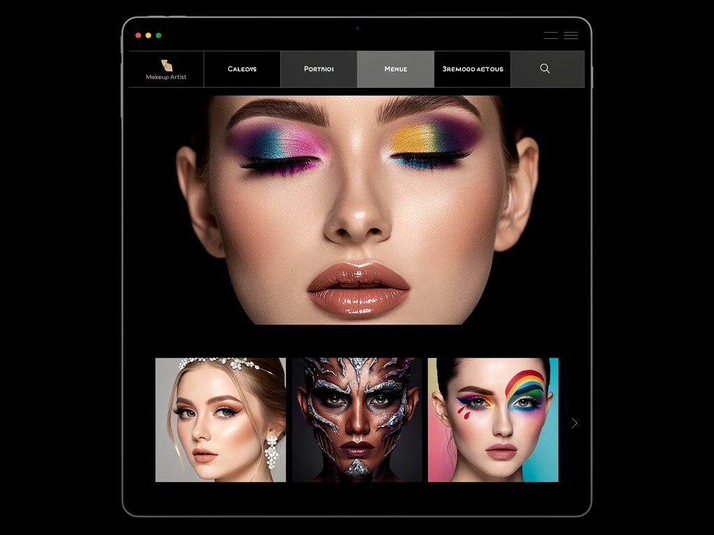
Your homepage cannot be a chaotic mixture of styles. It must project a single, unified visual temperature. If you want to be known as a High-Fashion MUA, every single image on your absolute front page must be edgy, structural, and fiercely illuminated. If you want to dominate the luxury bridal market, every image on the front page must be soft, luminous, and romantic.
The Rule: If an image is beautiful, but it contradicts the core 'temperature' of your homepage, you must brutally delete it from the front grid. A completely unified, six-image grid projects vastly more corporate authority than a chaotic forty-image grid.
Establishing The 'Sub-Genre Silos'
If you lock your homepage into a single aesthetic, where does the rest of your incredible work go? It goes into strictly managed Conceptual Silos within your top-level navigation menu.
Do not use vague menu titles like "My Work" or "Gallery." You must use exact industry terminology to allow casting directors to hunt for exactly what they need instantly.
Create dedicated, password-free sub-pages:
- Commercial & Lifestyle Grooming (For corporate advertising).
- Macro Beauty (Extreme, razor-sharp close ups of lips and eyes for cosmetic brands).
- Theatrical & Prosthetics (For film, television, and heavy SFX).
If a Film Director clicks the Theatrical tab, they enter a completely separate visual ecosystem on your site. They only see gore, prosthetics, and aging makeup. They do not see a single glowing bride. You have effectively created three different targeted resumes inside one domain.
Safely Formatting 'Micro-Clips'
Because modern makeup is heavily judged on how it reacts to kinetic motion, MUAs are increasingly uploading short "micro-clips" (3-second looping videos) of models shifting their faces to catch the light.
The Clutter Danger: If you embed five looping, un-synchronized video clips directly next to each other in a tight grid, your website transforms into a chaotic, dizzying mess that will physically hurt the casting director's eyes.
The Layout Solution: You must format micro-clips securely. Never place two looping videos directly beside one another. Always anchor a video clip by surrounding it with massive negative white space, or placing it mathematically between two completely static, silent photographs. Treat motion like a hyper-aggressive accent, not the main structural component.
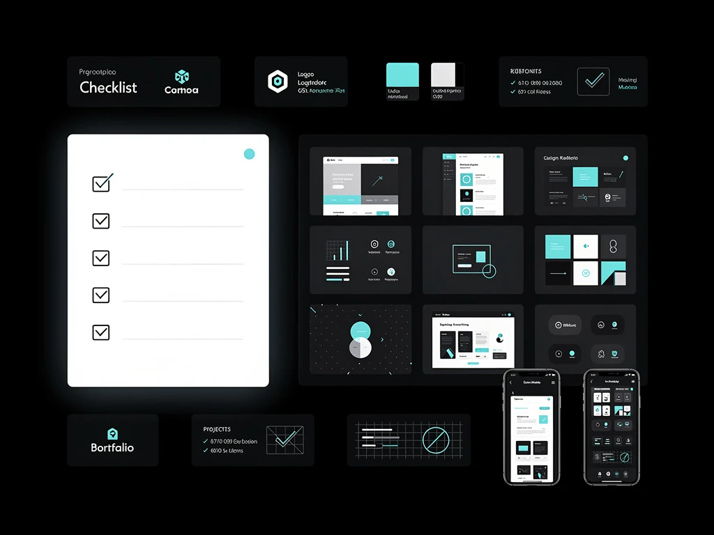
Designing a perfectly compartmentalized cosmetic portfolio requires a web builder that explicitly understands structural silence. By running your B2B presence on Portfoliobox, beauty artists leverage uncompressed, highly-organized masonry grids to silo their aesthetics perfectly, securing massive corporate trust instantly — no coding required. Explore makeup portfolio examples to see how other artists have successfully implemented this strategy.