Graduating from design school is a paradox. You are technically at the peak of your academic training, yet when you enter the job market, art directors often dismiss your work in three seconds. This is the "Junior Trap."
The trap exists because most students present their work exactly the way their professors asked them to: as academic exercises. Agencies don't want to hire students who are good at taking tests; they want to hire professionals who can solve commercial problems. If your website screams "recent grad," you will struggle to get hired. By analyzing the structural choices of the absolute best student portfolio website examples—the ones that secure jobs at top-tier agencies before graduation—we can identify how to solve this presentation problem.
The Problem: The "Chronological Archive"
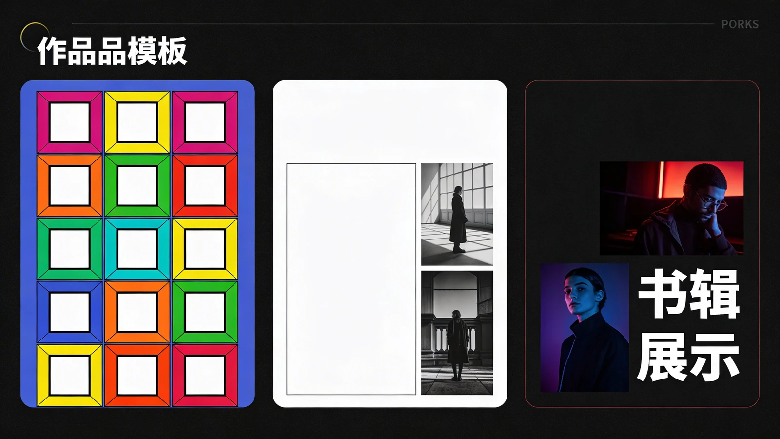
The hallmark of an amateur student portfolio is the chronological dump. The student uploads their freshman color theory exercises, their sophomore typography posters, and their senior thesis, all jumbled together in a massive grid.
The Solution: Ruthless Commercial Curation
An art director at a branding agency does not care about your freshman still-life drawing. The Strategy: The best student portfolio website examples solve this by applying ruthless commercial curation. They delete 80% of their academic work. They isolate the 4 to 6 projects that look like real-world client briefs. If you want to be a UX designer, only show UX design. Present yourself not as a generalist student, but as a specialized junior professional.
The Problem: The Imaginary Client
Student projects are usually self-initiated or based on hypothetical prompts (e.g., "Redesign the logo for a local coffee shop"). The problem is that these projects lack real-world constraints. They look pretty, but they don't prove you can handle a real client's demands.
The Solution: The Strategic Case Study
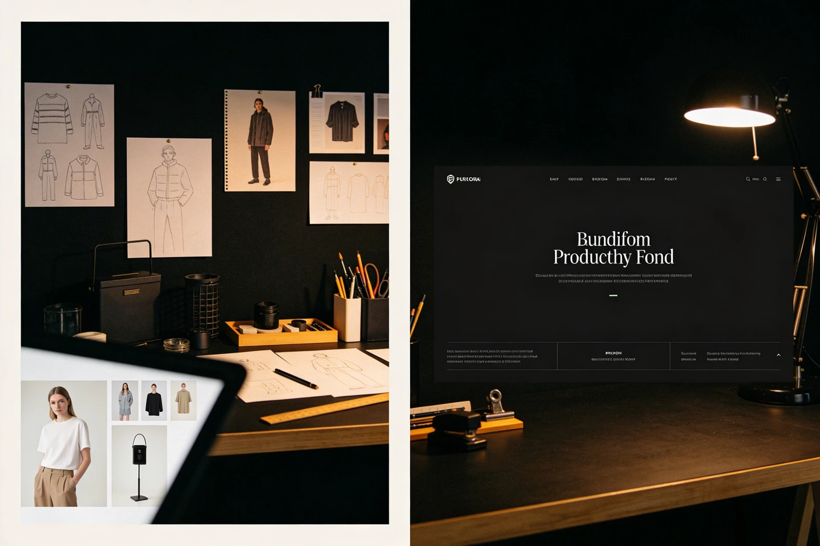
You must prove that you can think critically, not just push pixels. The Strategy: Top students solve this by building deep-dive case studies. Even if the project is fake, the strategy must be real. Below the final design, they write a brief paragraph outlining the (imagined) business problem. They show their rough sketches and explain why they chose a specific color palette to solve that specific business problem. This proves to the art director that you understand commercial strategy.
The Problem: The "Free Template" Aesthetic
Many students use free, mass-market website builders that force their work into rigid square grids with clunky fonts. It makes the work look cheap.
The Solution: The "Invisible Frame" Layout
The Strategy: The most successful student portfolio website examples mimic the digital presence of elite design agencies. They abandon uniform grids for asymmetrical masonry layouts. They use pure white backgrounds and clean, geometric sans-serif fonts. They use massive amounts of negative space between projects. The website interface becomes an invisible, luxury frame, elevating the perceived value of the student work inside it.
To escape the Junior Trap, your presentation must outshine your resume. With Portfoliobox, you have access to the exact asymmetrical layouts, deep typographical controls, and uncompressed rendering needed to build a portfolio that secures top-tier agency roles — no coding required.