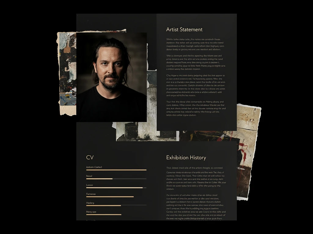
When a fine artist—whether a contemporary sculptor, an abstract expressionist painter, or a gallery curator—looks to build their website, they often browse the internet for inspiration. However, most artists look at what the successful artists are painting, rather than how they are presenting it.
If you want to command premium prices and secure exclusive gallery representation, your digital presentation must be flawless. The most successful artists in the industry do not just upload JPEGs; they curate digital exhibitions. By dissecting the structural architecture of the best artist portfolio examples, you can reverse-engineer their success and apply it to your own digital brand. Here is a deep dive into the anatomy of a world-class art portfolio.
1. The Anatomy of the Homepage: The Decisive Hero
Amateur portfolios use the homepage as a directory. They present the viewer with a massive grid of 30 thumbnails, forcing the collector to do the hard work of choosing what to look at.
The Professional Approach: Top-tier artist portfolio examples utilize the "Decisive Hero." The homepage is completely stripped of clutter. It features a single, massive, full-bleed photograph of the artist's most impactful piece. Why it works: It acts as a digital velvet rope. It immediately establishes a premium, authoritative tone. It tells the collector, "I am a master, and this is my masterpiece," before the collector even scrolls down the page.
2. The Anatomy of the Gallery: Editorial Curation
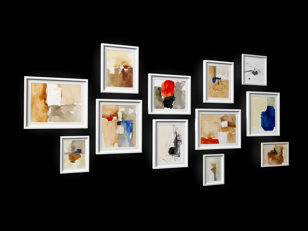
When you click into the galleries of successful artists, you rarely see rigid, uniform square grids. The images are not crammed together edge-to-edge.
The Professional Approach: The best websites use asymmetrical masonry layouts or sleek, single-column vertical scrolls with massive amounts of negative space (padding) between each image. Why it works: This creates "visual pacing." It mimics the physical experience of walking through a high-end contemporary art gallery. The negative space forces the viewer's eye to stop and absorb the physical details of each painting independently, preventing visual fatigue.
3. The Anatomy of the Artwork: Proving the Physicality
A digital screen flattens art. It destroys the thick impasto ridges of an oil painting and the delicate tooth of watercolor paper.
The Professional Approach: Elite artist portfolio examples never rely on just a flat scan. They contextualize the physical object. When you click on a painting, you see the flat scan, but you also see a macro-photograph zoomed in on the texture. You see a photograph of the painting hanging beautifully framed in a modern architectural space. Why it works: It proves to the collector that they are not just buying a digital image; they are acquiring a substantial, tactile, luxury physical object.
4. The Anatomy of the Interface: The Invisible Frame
The final shared characteristic of elite fine art portfolios is the complete lack of "web design."
The Professional Approach: You will not find bright background colors, complex animations, or whimsical cursive fonts on the websites of world-class artists. The interface is entirely minimalist—usually stark gallery white or deep charcoal black. Why it works: The website design acts as an invisible frame. It gets out of the way so the vibrant colors and deep textures of the fine art can command 100% of the viewer's emotional attention.
You can reverse-engineer this success for your own career. With Portfoliobox, you have access to the same immersive hero sliders, dynamic masonry grids, and minimalist frameworks used in the world's best artist portfolio examples — allowing you to build a premium, gallery-grade website in minutes, with no coding required.