One of the most common reasons freelance illustrators fail to gain traction in the industry is a lack of cohesive visual identity. When an art director visits your website and sees a hyper-realistic 3D render next to a cartoonish vector logo and a messy watercolor sketch, they don't see versatility. They see a lack of commitment.
To book high-end commercial jobs, you must establish yourself as a master of a specific visual language. If you are struggling to narrow down your style, analyzing distinct medium of artwork examples is the best way to find your path. Here are 5 distinct mediums and how mastering one can transform your digital portfolio into a highly bookable asset.
1. The "Digital Painter" (Raster Art)
The Medium: Using software like Photoshop or Procreate to mimic traditional painting techniques (oils, acrylics) while utilizing the speed of digital layers. Who it attracts: The entertainment industry. This is the standard medium for concept artists, card game illustrators (like Magic: The Gathering), and sci-fi book cover artists. The Portfolio Strategy: Your portfolio should focus entirely on lighting, rendering, and atmosphere. Use a dark-mode website to make the saturated digital colors pop, and include case studies showing your rough thumbnails progressing to highly polished, cinematic final images.
2. The "Vector Specialist"
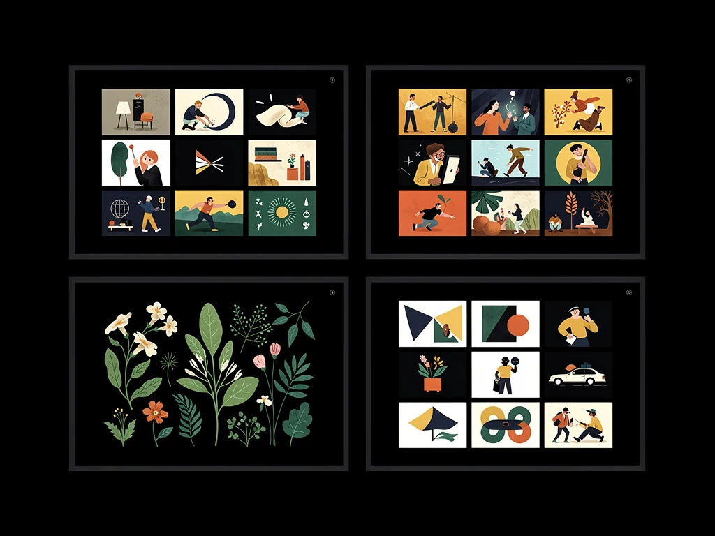
The Medium: Using mathematical curves in software like Adobe Illustrator. The art is characterized by flat, bold colors, crisp edges, and infinite scalability without losing resolution. Who it attracts: Editorial art directors (magazines, newspapers), corporate branding agencies, and packaging designers. The Portfolio Strategy: A vector portfolio must be immaculate. The website design should mimic the art: bright, minimalist, and heavily reliant on white space. Avoid textured backgrounds. Present your vector illustrations alongside photorealistic mockups showing how they look printed on actual products or magazine pages.
3. The "Traditional Tactician" (Watercolor/Gouache)
The Medium: Physical paint on paper, scanned and color-corrected digitally. Who it attracts: Children's book publishers, boutique stationery brands, and high-end editorial clients seeking a "handmade," organic feel. The Portfolio Strategy: Your digital presentation must emphasize the physical texture of the art. Do not use dark mode. Use a crisp, gallery-white background. Upload high-resolution scans that allow the client to zoom in and see the pooling of the watercolor pigment and the tooth of the cold-pressed paper.
4. The "Line & Ink" Master
The Medium: High-contrast black-and-white line art (either digital or traditional pen and ink), sometimes accented with a single spot color. Who it attracts: Graphic novel publishers, indie tabletop RPG creators, and editorial spot illustration. The Portfolio Strategy: The portfolio should feel like a high-end zine or an old-school print shop. Use an asymmetrical masonry grid to create an edgy, dynamic layout. The contrast between the stark black ink and the white background of the website is your primary visual weapon.
5. The "Mixed Media Innovator"
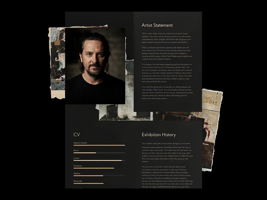
The Medium: Combining traditional textures (like scanned pencil sketches or painted acrylic washes) with digital coloring and collaging. Who it attracts: Avant-garde fashion magazines, music industry clients (album covers/posters), and boutique editorial publications. The Portfolio Strategy: This is the only medium where a slightly chaotic layout works. Use overlapping images, dynamic scrolling effects, and bold typography to match the rebellious, collage-like nature of the artwork.
Choosing a medium is the first step; presenting it properly is the second. With Portfoliobox, you have the ultimate flexibility to build a bespoke website that perfectly complements whichever medium of artwork examples you choose to master — no coding required.