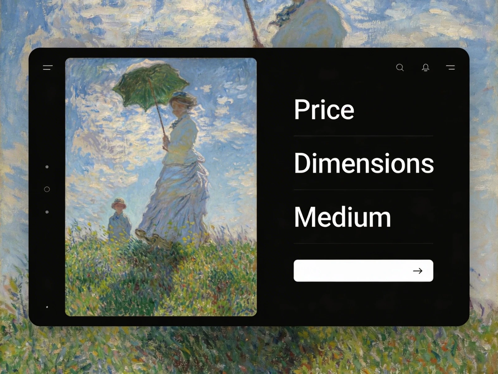
For illustrators who specialize in the physical realm—creating gig posters, packaging illustrations, book covers, or editorial spreads—building a digital portfolio presents a unique challenge. You are trying to sell a tactile, physical experience through a flat, glowing screen.
When a potential client views print design portfolios that consist entirely of flat, exported JPEGs floating on a white background, the work feels lifeless. The client cannot feel the texture of the paper, see the shine of the foil stamping, or understand the scale of the poster. If you want to command industry authority and book high-end commercial print jobs, you must bridge this gap. Here is how to solve the most common presentation problems and perfect your print illustration portfolio.
The Problem: The "Flat Export" Phenomenon
The fastest way to devalue your print illustration is to upload the raw, flat digital file (the PDF or JPEG) exactly as you sent it to the printer.
When an art director looks at a flat rectangle containing a book cover design, it looks like a digital painting, not a physical object. It lacks context. The client has to use their imagination to visualize how that illustration will look sitting on a bookstore shelf, and you should never rely on a client's imagination to sell your work.
The Solution: High-End Photorealistic Mockups
The secret weapon of authoritative print design portfolios is the photorealistic mockup.
If you designed a label for a boutique wine bottle, do not just show the flat vector art. Purchase or download a high-quality, layered PSD mockup of a wine bottle. Apply your art to the bottle, complete with digital lighting, shadows, and reflections. If you designed an editorial illustration for a magazine, show a mockup of the magazine splayed open on a coffee table.
Contextualizing your art proves that you understand how your illustrations exist in the real world, instantly elevating your perceived professionalism.
The Problem: Ignoring the Physical Details
Print illustration is inherently tactile. You make specific choices about paper stock (matte vs. gloss), printing techniques (letterpress, screen printing), and specialty finishes (embossing, gold foil). A standard web gallery cannot convey these critical details.
The Solution: Macro Photography and Annotations
If you have physical copies of the final printed product, hire a photographer (or use a high-quality macro lens yourself) to take extreme close-ups of your work.
Show the physical texture of the paper. Show how the light catches the foil stamping on your poster. Furthermore, use text to your advantage. Underneath the images, write a brief specification list:
- Client: Independent Record Label
- Process: 3-Color Screen Print
- Paper: 100lb French Paper Co. Construction White
This technical language signals to art directors that you are deeply knowledgeable about the printing process and won't send them files that are impossible to manufacture.
The Problem: Cluttered Digital Galleries
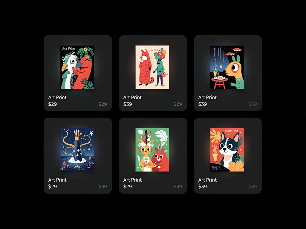
Print work often contains a lot of typography and intricate details. If you cram 20 different posters and book covers into a tight grid on your website, the page becomes visually exhausting to look at.
The Solution: Aggressive Negative Space
To make your print work feel premium, you must utilize aggressive negative space (white space). Give each project room to breathe. Use a clean, single-column layout where the client scrolls down to see one large, high-resolution mockup at a time, rather than overwhelming them with a chaotic grid.
Translating physical art to a digital space requires a platform built for premium presentation. With Portfoliobox, you can utilize elegant, spacious layouts and high-resolution rendering to ensure your print design portfolio commands the authority you deserve — no coding required.