When an art director, a photo editor, or a potential client clicks the link to your website, you have approximately three seconds to convince them to stay. Three seconds. In that incredibly brief window, they will judge your professionalism, your aesthetic, and your value. All of this judgment happens on one specific screen: your portfolio front page.
Many photographers treat their homepage as an afterthought—a dumping ground for their latest Instagram posts or a confusing maze of poorly labeled galleries. But a successful portfolio front page is highly strategic. It acts as a filter, immediately communicating who you are, what you do, and the caliber of work you produce.
If you want to stop losing high-paying jobs to photographers with better websites, you need to fix your front page. Here is a step-by-step guide to building a portfolio front page that elevates your brand and gets you booked.
Step 1: Select Your Hero Image (The Three-Second Pitch)
The foundation of an impactful portfolio front page is the hero image. This is the large, prominent photograph that greets visitors the moment your site loads. It must be your strongest, most arresting piece of work.
Do not use a collage. Do not use a fast-moving slideshow that makes the user dizzy. Choose one image that encapsulates your specific style and niche. If you are an architectural photographer, choose a shot that showcases immaculate perspective and lighting. If you are a fashion photographer, choose an editorial image that drips with attitude. This image is your three-second pitch; it needs to hit the viewer right between the eyes.
Step 2: Craft a Razor-Sharp Value Proposition
A beautiful image isn't enough on its own; you need context. Somewhere on your portfolio front page, ideally near the top or subtly integrated over the hero image, you must include a clear value proposition.
This is not a long-winded biography about when you got your first camera. It is a concise, one-sentence statement that tells the client exactly what you do. For example: "Commercial Lifestyle Photographer Based in New York," or "High-End Food & Beverage Photography."
When an art buyer lands on your portfolio front page, they shouldn't have to guess if you shoot what they need. Tell them immediately.
Step 3: Streamline the Navigation Menu
The primary goal of your portfolio front page is to guide the visitor into your specific galleries. If your navigation menu is cluttered with links to a blog you haven't updated in two years, a prints shop with three items, and five different social media icons, you are creating friction.
Keep your navigation aggressively simple. A standard, effective menu looks like this:
- Portfolio (or specific categories like "Portrait," "Editorial," "Commercial")
- About
- Contact
That's it. Every extra link is an opportunity for the client to get distracted and leave before they see your best work.
Step 4: Curate the Entry Points (If Applicable)
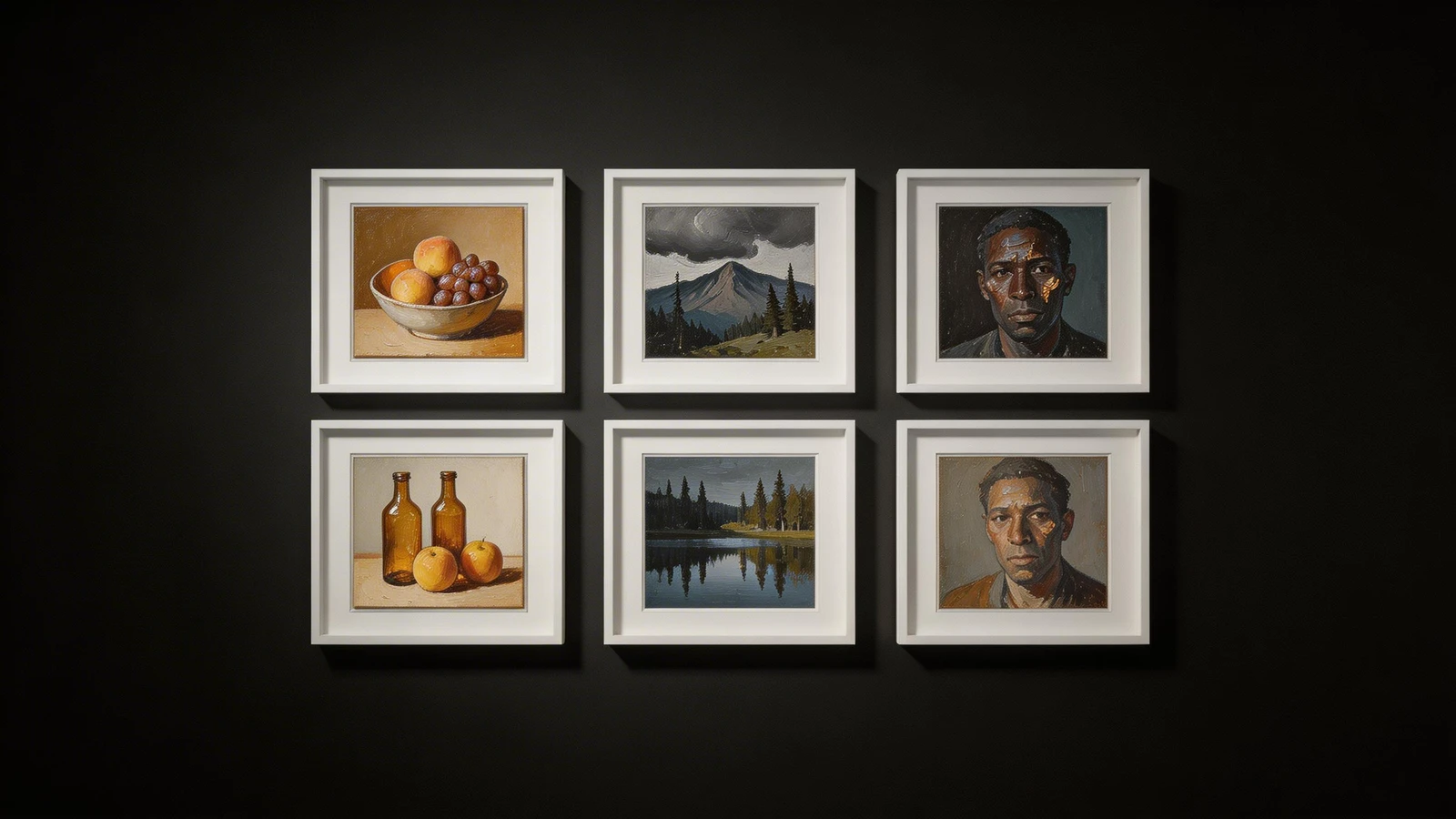
If you shoot multiple distinct niches and a single hero image isn't enough, your portfolio front page needs clear entry points. Instead of a single image, you might use a clean grid of two or three images, each linking to a specific gallery.
For example, a wedding and portrait photographer might have the screen split: one side featuring a stunning bride, linking to the "Weddings" gallery, and the other side featuring a moody studio shot, linking to the "Portraits" gallery. These entry points must be visually distinct and clearly labeled so the user knows exactly where to click.
Step 5: Include a Clear Call to Action (CTA)
Don't assume that a client will naturally find their way to your contact page. You must guide them there. Your portfolio front page should include a subtle but clear Call to Action (CTA).
This doesn't mean a flashing red "HIRE ME" button. It means a clean, elegantly designed button or text link that says "Get in Touch," "Book a Session," or "Contact for Commercial Rates." Placing this CTA strategically on the front page reduces the friction between a client admiring your work and actually sending you an inquiry.
Step 6: Test Mobile Responsiveness
More than half of your website traffic will likely come from mobile devices. If your beautifully designed portfolio front page breaks, crops weirdly, or loads slowly on a smartphone, you look amateurish.
After you design your front page, test it mercilessly on every device you can find. Does the hero image crop in a way that cuts off the subject's head? Is the navigation menu easy to tap with a thumb? A seamless mobile experience is non-negotiable for a professional digital identity.
Your portfolio front page is the digital equivalent of a firm handshake and a sharp suit. It sets the tone for every interaction that follows. Take the time to build it right, and it will work tirelessly as your best marketing asset.
Ready to build a front page that converts? With Portfoliobox, you can create a stunning portfolio website in minutes — no coding required.