Creative professionals are, by nature, imaginative and experimental. However, when building a digital portfolio, this creativity often becomes a liability. In an attempt to make their website stand out, freelancers often overload their pages with bright background colors, complex animations, chaotic typography, and confusing navigation menus.
This creates digital clutter. When a corporate art director or a potential client lands on a cluttered website, they don't think, "Wow, this person is so creative!" They think, "This is too confusing; I'm going to hire someone else." If you are struggling to secure premium clients, your website design might be actively fighting against your work. By studying the industry's best online portfolio examples, we can identify how top professionals solve digital clutter.
The Problem: The "Everything" Homepage
The most common symptom of digital clutter is treating the homepage like an archival storage drive. You upload every project you have touched in the last five years, hoping that by showing volume, the client will see your value.
The Solution: Ruthless Curation and the "Hero" Image
When you look at the online portfolio examples of top-tier design agencies, their homepages are shockingly bare. The Fix: They utilize aggressive curation. They remove their mediocre work and only display their absolute 5 best projects. Furthermore, they use a "Hero" layout. The homepage is dominated by one massive, edge-to-edge image of their most impressive work. By removing the clutter of 40 thumbnails, they force the client to focus on undeniable mastery.
The Problem: Competing "Web Design"
Many creatives use website templates that feature textured backgrounds (like faux canvas or concrete), colorful gradient headers, and whimsical cursive fonts.
The Solution: The "White Cube" Aesthetic
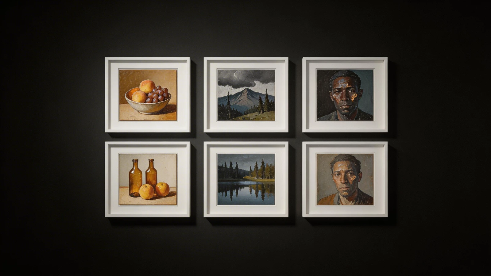
The best portfolios use the website design as an invisible frame. The Fix: Look at the digital presence of elite photographers or illustrators. They replicate a high-end contemporary art gallery. The backgrounds are stark, pure white (or deep black). The typography is incredibly minimal, usually a clean sans-serif. By completely removing the "web design," the vibrant colors and sharp details of the actual creative work command 100% of the viewer's attention.
The Problem: The Auto-Cropped Uniform Grid
If you use a generalist website builder, it will force all your images into a rigid square grid, auto-cropping your wide horizontal shots and your tall vertical designs. This destroys your intended compositions and creates a monotonous, boring scrolling experience.
The Solution: Asymmetrical Masonry Layouts
Top professionals refuse to let an algorithm crop their work. The Fix: Elite online portfolio examples utilize asymmetrical masonry grids. This layout allows images of various sizes and aspect ratios to interlock seamlessly. It creates dynamic visual pacing, making the website feel like a curated editorial magazine. Furthermore, these professionals use massive amounts of negative space (padding) between the images, ensuring each project has room to breathe.
Solving digital clutter is the fastest way to elevate your perceived value. With Portfoliobox, you can effortlessly implement the sleek masonry layouts, stark minimalist backgrounds, and uncompressed image rendering found in the world's best online portfolio examples — no coding required.