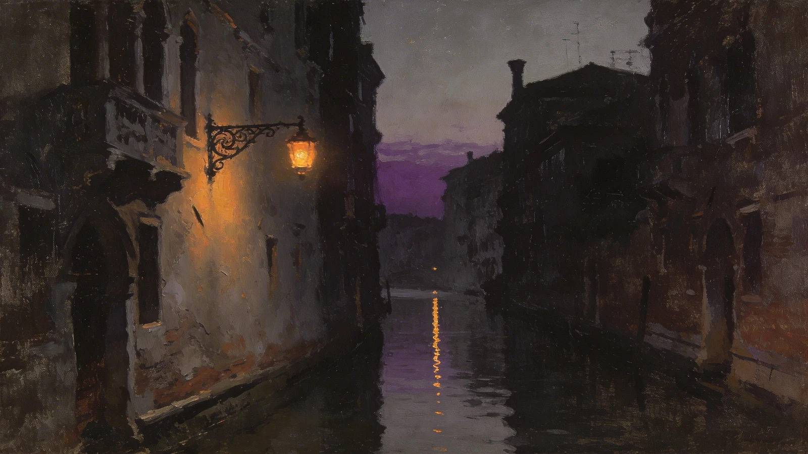
Four years ago, my fine art career was flatlining. I was spending all my time in the studio producing massive, highly textured abstract canvases, but I couldn't get a gallery director to return my emails, and I wasn't selling anything directly to collectors online.
I was convinced the art market was just a closed club. I was wrong. The reality was that my digital presentation was actively sabotaging my work. My website was a cluttered mess of different fonts, a distracting textured background, and blurry photos of my paintings crammed into a tight grid. The turning point in my career didn't come from changing my painting style; it came from fiercely studying high-end personal portfolio website examples from established, successful fine artists. Here is the story of how reverse-engineering their success saved my career.
The Revelation: Art Requires an Invisible Frame
The first thing I noticed when looking at top-tier personal portfolio website examples was what they didn't have. They didn't have "creative" web design.
I had tried to make my website look artsy by using a gray canvas texture for the background and a cursive font for my name. It looked terrible and actively fought against the paintings. The Transformation: I stripped my website down to the studs. I adopted the "White Cube" aesthetic used by modern galleries. I changed the background to stark white and used a clean, geometric sans-serif font. Suddenly, the website became an invisible frame. The bright, chaotic colors of my abstract paintings popped off the screen because they were no longer competing with the website's design.
The Power of Pacing
My old website just dumped every painting I had ever finished into a massive, edge-to-edge square grid. It was exhausting to look at.
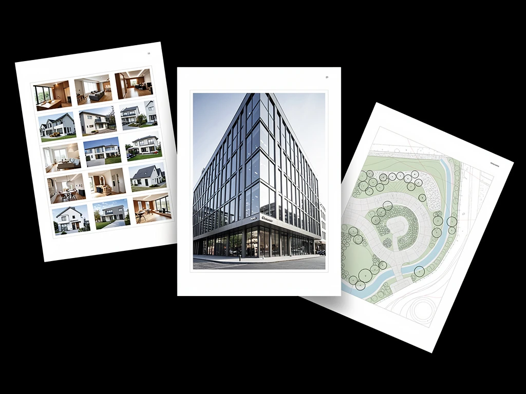
The Transformation: When I studied the best personal portfolio website examples, I noticed they used dynamic, asymmetrical layouts. They placed massive amounts of negative space (padding) between the images. I adopted a masonry layout. I let a large horizontal painting take up the whole screen, followed by two smaller vertical studies below it. This created "visual pacing," making the website feel like a curated editorial magazine rather than a cold database.
Proving the Scale
Because my paintings are heavily textured and often 6 feet wide, a flat JPEG on a 5-inch phone screen completely destroyed their value. Collectors couldn't tell if the painting was massive or tiny.
The Transformation: The top artists never left scale to the imagination. I started taking secondary photographs. Next to every painting, I uploaded a high-resolution macro shot showing the thick impasto texture. I also uploaded a photo of the painting hanging in a beautifully lit room. By proving the physical scale and tactile nature of the work, I justified my premium pricing.
The Result: Seamless Commerce
Finally, I noticed that the best artists made it incredibly easy to buy their work. They didn't hide behind a "Contact Me for Pricing" button.
The Transformation: I integrated a seamless e-commerce storefront directly into my portfolio. I listed the prices, dimensions, and medium clearly, and allowed collectors to check out instantly with a credit card.
Within three months of rebuilding my digital presence based on these principles, I sold my first major original online and secured my first solo gallery exhibition. If you are ready to stop sabotaging your own art, use Portfoliobox. It provides the uncompressed rendering, minimalist gallery layouts, and built-in commerce tools you need to build a world-class website — no coding required.