Architects are natural builders. We like to design everything from the ground up, from the massing of a skyscraper down to the door handle. This instinct often extends to how we build our portfolios; many of us insist on starting with a completely blank InDesign document, spending dozens of hours tweaking grids and font sizes before a single drawing is placed.
While custom design is commendable, it is often incredibly inefficient. If you are rushing to meet a job application deadline or putting together a pitch for a client, spending 40 hours on layout design is a poor use of your time.
This is where creative architecture portfolio templates come in. Using a template doesn't mean your portfolio will look generic. A great template acts as a rigorous structural framework—a grid system that enforces discipline and clarity, allowing your actual architectural work to shine. By leveraging the right template, you can transform a chaotic collection of drawings into a professional, booking-ready digital identity.
Here is a look at the types of architecture portfolio templates you should consider, and why they work.
1. The Strict Swiss Grid Template
The Swiss design style, known for its extreme reliance on grid systems, asymmetric layouts, and sans-serif typography, is a perfect match for architecture.
Why It Works
Architectural drawings are inherently structured and technical. A template based on a strict 4-column or 6-column grid respects the geometry of your work. It forces you to align your plans and sections perfectly, creating a sense of order. When a hiring manager opens a portfolio built on a Swiss grid, their immediate impression is one of extreme organization and professionalism.
What to Look For
Look for templates that prioritize negative space. The template should have predefined, generous margins and clearly established font hierarchies (e.g., Helvetica or Univers for all headings and body text). It should guide you to leave certain columns entirely empty to give the page breathing room.
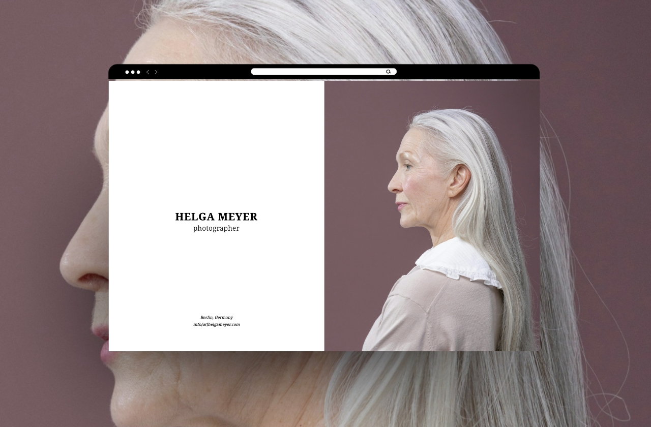
2. The Editorial Magazine Template
While some portfolios need to be highly technical, others need to tell a compelling story. Editorial-style templates draw inspiration from high-end architecture and design magazines like El Croquis or Architectural Digest.
Why It Works
If you are applying for a highly conceptual design role, or pitching a high-end residential client, you need to sell an atmosphere. Editorial templates allow your "hero images" (large, moody renders or beautiful physical model photos) to take center stage, often bleeding off the edge of the page. They allow you to weave narrative text around the imagery in an engaging way.
What to Look For
These templates should have flexible layouts for full-page photo spreads, block quotes, and structured areas for project narratives. They often mix a strong serif font for headings (to add a touch of classic elegance) with a clean sans-serif for body copy.
3. The Digital-First Scrolling Template
In today's industry, your portfolio is far more likely to be viewed on a monitor or an iPad than printed on paper. Designing a portfolio for print and then just emailing the PDF often results in a poor viewing experience, as reviewers have to zoom in and out constantly.
Why It Works
A digital-first template is designed specifically for screen ratios (usually 16:9). It anticipates how a user scrolls or clicks through a presentation. This shows technological fluency and respect for the reviewer's preferred medium.
What to Look For
Look for landscape-oriented templates that fit perfectly on a standard monitor without requiring vertical scrolling for a single page. These templates should have built-in digital navigation elements, such as a clickable table of contents or project tabs along the edge of the page.
4. The Process-Heavy Academic Template
If you are applying to graduate school or seeking your first internship, your portfolio needs to show how you think, not just the final result.
Why It Works
Templates designed for academic work provide structured ways to show iteration. They prevent the chaotic "data dump" that ruins many student portfolios. They guide you to show the initial sketch, the diagram, the physical model, and the final render in a logical sequence.
What to Look For
Look for templates that have specific page layouts dedicated to "process." These might include grids of small squares perfect for showing sequential massing diagrams, or multi-column layouts designed to place concept text directly next to explanatory sketches.
5. The Minimalist "Pitch Deck" Template
When you are an established professional pitching to a client, they don't want a 50-page book. They want a tight, persuasive pitch deck.
Why It Works
Clients are busy. A minimalist pitch deck template forces you to be brief. It is designed to be presented on a screen in a boardroom, accompanying your spoken presentation. It keeps the focus on the big ideas and the high-level value you bring.
What to Look For
These templates should have extremely large, legible typography (designed to be read from across a room) and highly simplified layouts. They should focus heavily on high-impact imagery and bulleted data points (e.g., project size, budget, sustainability metrics) rather than long paragraphs of text.
Using a template is not a shortcut; it is a smart workflow choice. By adopting a proven structure, you can ensure your portfolio is legible, professional, and impactful, freeing you up to focus on the architecture itself.
Building your portfolio doesn't have to be complicated. With Portfoliobox, you can create a stunning portfolio website in minutes — no coding required.