There is a common misconception among freelance creatives that a minimalist portfolio website is a "lazy" website. Many designers and photographers believe that if they don't fill every inch of the screen with bold colors, complex animations, and overlapping typography, potential clients will think they lack technical skill.
The exact opposite is true. In the world of high-end commercial art and design, minimalism is the ultimate flex. It projects supreme confidence. A cluttered website screams, "Please look at everything I can do!" A minimalist website whispers, "My work is so good, it doesn't need a distraction." If you want to stop competing for low-paying gigs and start commanding luxury rates, you must master restraint. Here is how to build a minimalist portfolio website that actually converts.
1. Eliminate the "Web Design"
The first step to minimalism is accepting that your website is not the product; it is the frame.
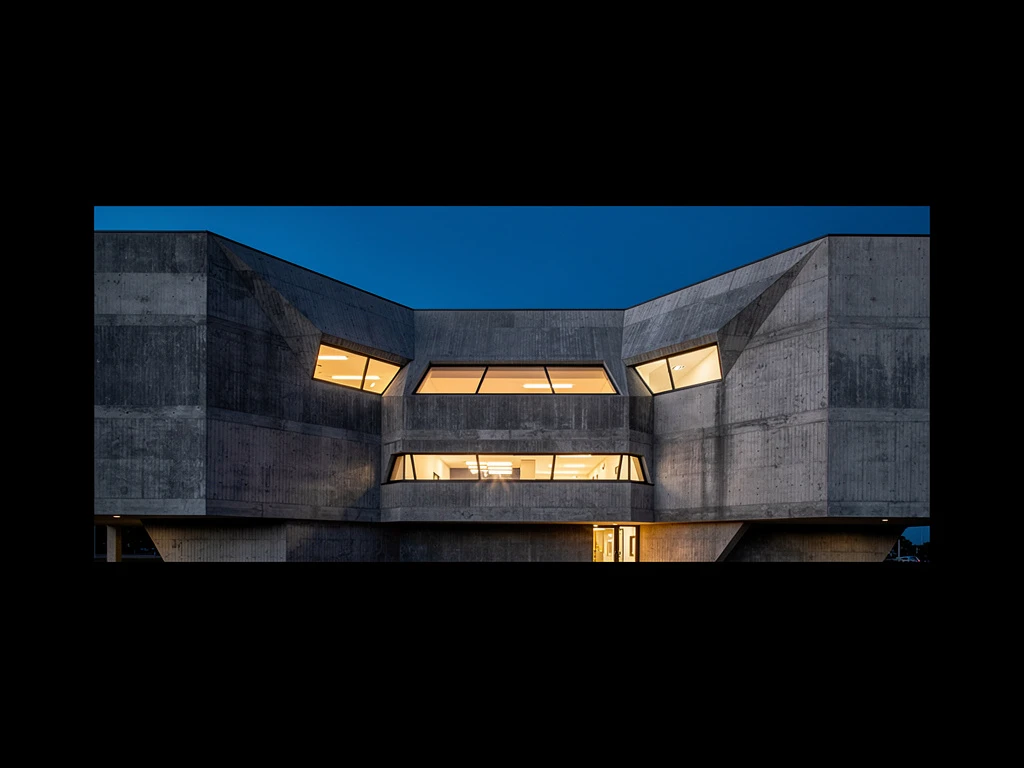
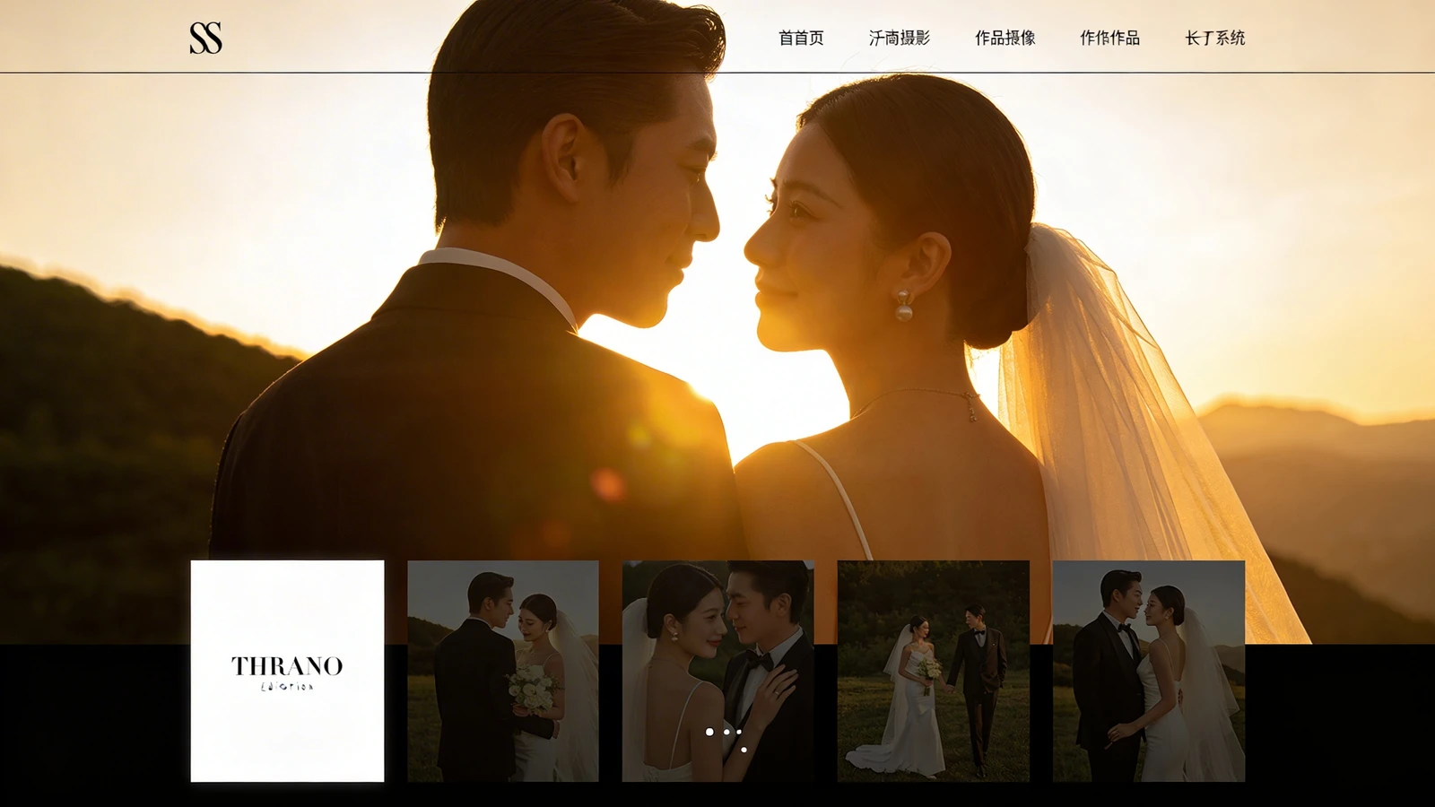
The Execution: You must systematically delete "web design." Remove the textured backgrounds. Remove the gradient headers. Remove the drop shadows from your images. The background of your website should be pure, stark white (or deep black). The navigation menu should be incredibly simple and tucked away. By removing visual noise, you force the client to focus entirely on the crisp details and vibrant colors of your actual creative work.
2. Embrace Aggressive Padding (Negative Space)
Minimalism is not just about removing things; it is about how you treat the empty space that remains.
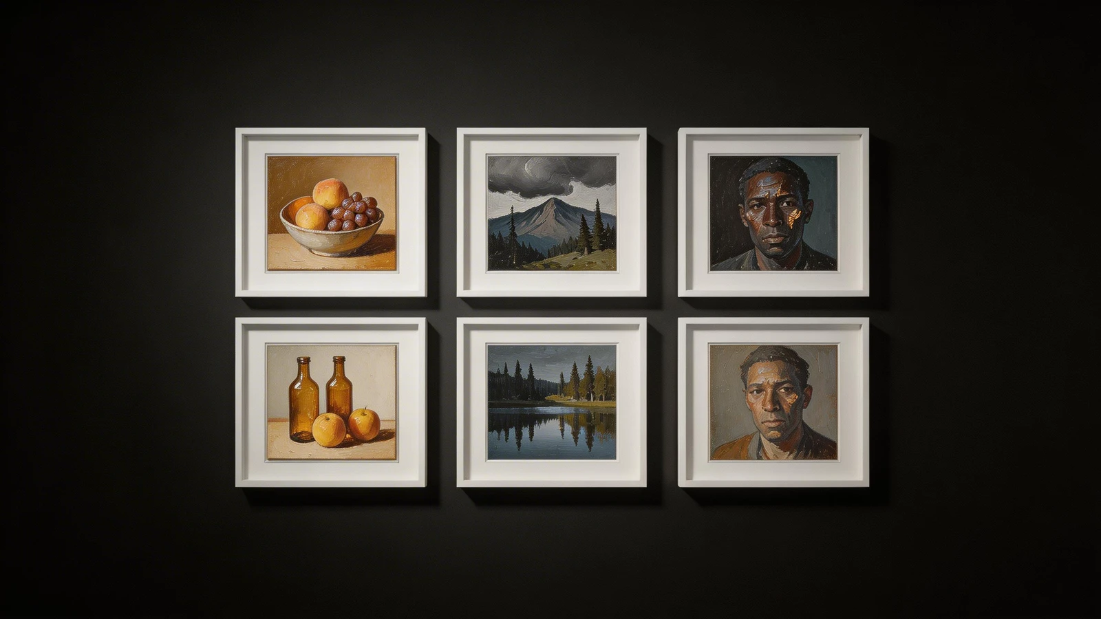
The Execution: Amateurs cram their images together edge-to-edge. Professionals use aggressive negative space. Increase the padding between your project thumbnails by 200%. If you feature a massive photograph on your homepage, surround it with a thick border of empty white space. This isolation forces the viewer to pause and absorb the image fully, elevating its perceived value. It mimics the luxurious pacing of a physical contemporary art gallery.
3. Restrict Your Typography
A common mistake is trying to inject "personality" into a minimalist site by using whimsical, complex fonts.
The Execution: A minimalist portfolio website should use a maximum of two fonts, and ideally just one. Choose a clean, geometric sans-serif font (like Helvetica, Inter, or Roboto). Do not use color for your text; stick to black, white, or dark gray. You will create visual hierarchy not by changing fonts, but by changing scale and weight (e.g., a massive, bold headline paired with small, light body text).
4. The Ruthless Edit (Curation)
You cannot have a minimalist presentation if you upload 50 different projects. Visual clutter destroys the minimalist aesthetic.
The Execution: You must edit your portfolio down to the absolute essentials. Select your 6 to 8 most impressive, highest-paying projects. Hide everything else. A small, flawless gallery creates an aura of exclusivity. It tells the client that you only take on premium work.
Building a truly minimalist site from scratch can actually be quite difficult because you have nothing to hide behind. The layout engine must be flawless. With Portfoliobox, you have access to the exact asymmetrical masonry grids, deep typographical controls, and massive padding settings required to build a luxury minimalist portfolio website — no coding required.