When a makeup artist decides to build their first digital portfolio, they often feel a desperate need to prove themselves. This anxiety usually translates into "over-designing." They choose templates with complex animations, loud background colors, and cluttered grids containing every photo they have ever taken.
The result is a website that feels chaotic and amateurish. In the high-end beauty industry—whether you are targeting luxury bridal clients or top-tier commercial directors—clutter is the enemy of premium pricing. If you want to command respect and higher day rates, you must solve this presentation problem by mastering the minimalist portfolio website.
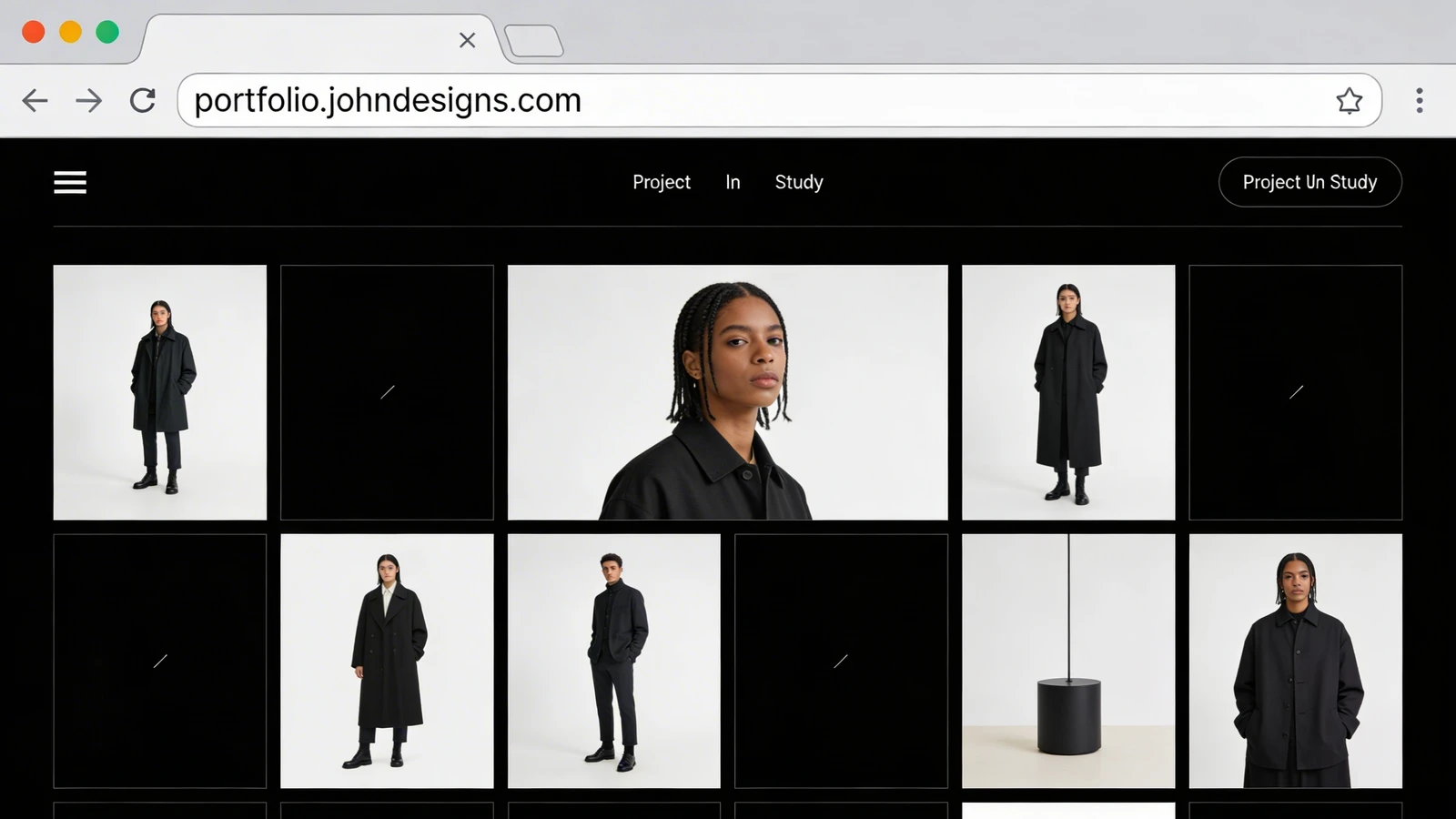
The Problem: Visual Competition
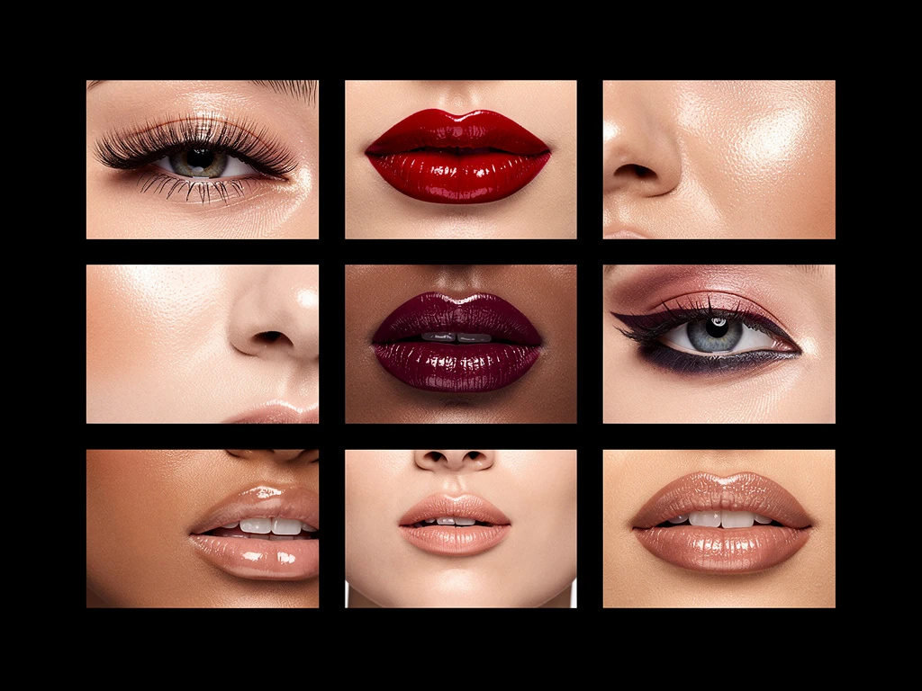
Makeup artistry is an intensely colorful and detailed medium. If you are showcasing a bold, avant-garde editorial look featuring neon graphic eyeliner, that image requires the viewer's complete attention.
If that image is placed on a website with a bright pink background, scrolling marquee text, and five other images crammed next to it, the website's design is actively competing with your makeup. The art director's eye doesn't know where to focus, and the intricate details of your artistry are lost in the noise.
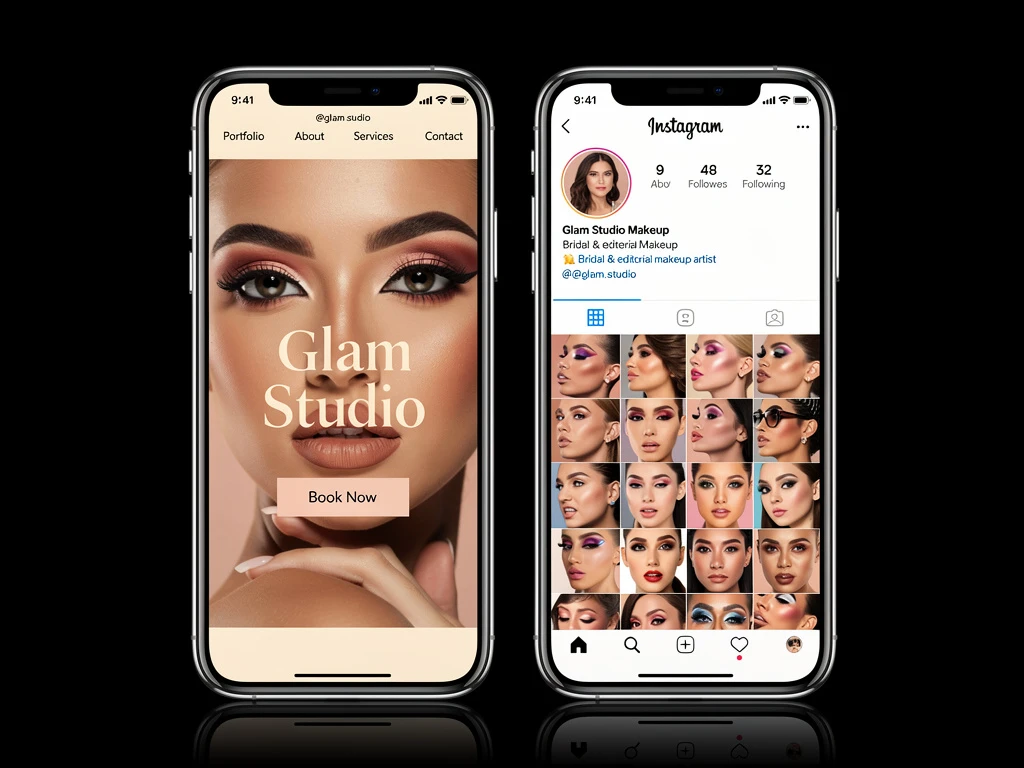
The Solution: The "Invisible" Frame
The core philosophy of a minimalist portfolio website is that the design should be invisible.
Think of a high-end contemporary art gallery. The walls are stark white, the lighting is focused, and the paintings are given massive amounts of empty space around them. This is the aesthetic you must replicate digitally. By utilizing stark backgrounds (either pure white or deep black) and removing unnecessary design elements, you create an invisible frame. The only thing the client sees is the flawless execution of your makeup.
The Problem: Decision Fatigue
When a bride lands on a cluttered website with ten different menu options, drop-down links, and an endless scrolling gallery of 100 photos, she experiences decision fatigue. She doesn't know what to click first, so she often clicks nothing and leaves the site.
The Solution: Curated Scarcity
A minimalist portfolio website utilizes curated scarcity. You are telling the client exactly what to look at.
Instead of a massive grid, use a clean, horizontal slider that forces the viewer to look at one breathtaking image at a time. Limit your main navigation to three or four essential links: "Portfolio," "About," "Services," and "Contact." By removing the clutter, you guide the client seamlessly through your digital presentation directly to your booking form.
The Problem: Slow Performance
Complex website designs with heavy background animations and dense photo grids take longer to load. In a fast-paced industry, a casting director will not wait five seconds for your website to render.
The Solution: Speed and Precision
Minimalist design is inherently faster. Because there is less code required to load complex structural elements, the server can dedicate its resources entirely to rendering your high-resolution makeup images instantly. A fast, responsive website subconsciously signals efficiency and professionalism.
Embracing minimalism is the fastest way to elevate your digital brand. With Portfoliobox, you can build a stunning, lightning-fast minimalist portfolio website designed specifically to make your makeup artistry the star of the show — no coding required.