Several years ago, I was struggling to define my digital brand as a makeup artist. My website was functional, but it felt generic. One afternoon, while sitting in a cafe with a friend who works as a senior art director at an advertising agency, she turned her laptop around and showed me a link.
"You need to look at this," she said.
She didn't show me another makeup artist's page; she showed me a high-end graphic design portfolio website. It completely changed how I viewed digital presentation. The way graphic designers architect their portfolios is drastically different from how beauty professionals do it, and there are three massive secrets we can steal from them to elevate our own careers.
Secret 1: The Power of the "Case Study"
As makeup artists, we usually just upload a final, retouched image and move on. Graphic designers rarely do this. They present their work as "case studies."
When a designer uploads a logo, they also show the initial sketches, the color palette they chose, and how the logo looks printed on a business card. They tell the story of the project. Makeup professionals should adopt this immediately, especially for editorial and SFX work.
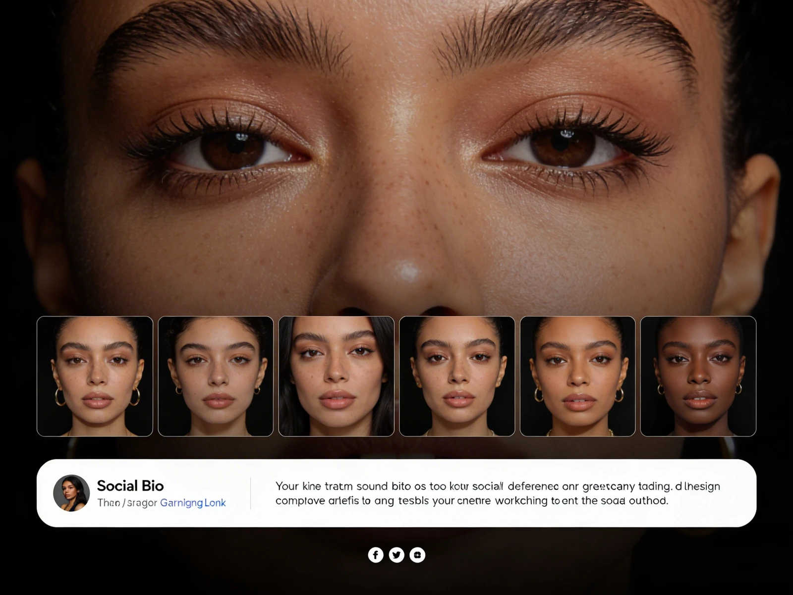
Instead of just posting the final magazine cover, create a project page. Include the final shot, but also include your mood board, a breakdown of the specific products you used to achieve that flawless skin texture, and a behind-the-scenes video of you applying the makeup on set. This proves to clients that you are a conceptual thinker, not just someone who applies foundation.
Secret 2: Aggressive Use of Negative Space
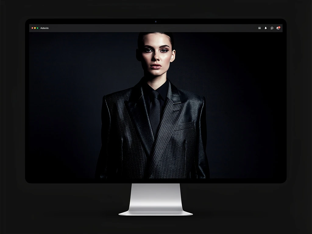
The graphic design portfolio website my friend showed me was strikingly empty. There were no chaotic grids or overlapping elements. Every image was surrounded by a massive border of white space (negative space).
Designers understand that white space is a luxury signal. It tells the viewer, "This piece of art is important enough to stand alone." When you cram thirty makeup photos onto a single scrolling page, you cheapen your work. By adopting the minimalist, white-space-heavy approach of a graphic designer, your makeup imagery instantly feels more expensive and editorial.
Secret 3: Typography as a Brand Anchor
Most makeup artists treat typography as an afterthought, choosing whatever default font came with their website template. Graphic designers treat typography as a core pillar of their brand identity.
The fonts you choose for your headers and service menus send subconscious signals to your clients. A sleek, thin sans-serif font signals modern, minimalist luxury (perfect for high-end bridal or skincare). A bold, brutalist serif font signals edgy, avant-garde editorial. Pay attention to the fonts on graphic design sites and carefully select typography that aligns with the specific makeup clientele you want to attract.
You don't need to learn how to code or hire a developer to implement these high-level design concepts. With Portfoliobox, you get a platform built for all creatives, allowing you to build an agency-grade website in minutes — no coding required.