When James, an incredibly talented automotive photographer, first launched his digital portfolio, he made a classic mistake. His homepage featured a complex mosaic of twenty different cars—from vintage Porsches to modern supercars—all crammed together in a tightly cropped grid. He thought he was showing versatility.
Instead, he was showing chaos.
When a prominent ad agency art director landed on his site looking for a photographer for a luxury SUV campaign, they stayed for exactly four seconds before clicking away. The visual noise was overwhelming, and the lack of a clear focal point made James look like an enthusiast rather than a high-end commercial specialist.
A mentor advised James to scrap the mosaic. Instead, he replaced it with a single, sweeping, high-resolution image of a classic Defender navigating a moody, fog-drenched mountain pass. No text overlay, no sidebars, just the image and a subtle menu. The very next week, that same art director returned to the site, saw the new cover image, and booked James for a $15,000 campaign.
The lesson? Your homepage is your storefront window. It is the digital cover of your book. We're going to explore why this initial impression is so critical and look at the strategy behind successful examples of portfolio covers that actually book jobs.
The Three-Second Audition
In the creative industry, you don't get five minutes to explain your artistic vision to a potential client. You get about three seconds.
When an editor or a bride clicks the link in your Instagram bio, their brain makes a series of split-second judgments based entirely on your portfolio cover (your homepage layout and hero image). They are instantly evaluating:
- Professionalism: Does this look like an expensive, reliable service?
- Specialty: Does this photographer shoot what I need them to shoot?
- Aesthetic: Do I connect with this visual style?
If your portfolio cover fails to answer these three questions with a resounding "yes," the client will bounce to a competitor.
Deconstructing Successful Examples of Portfolio Covers
What separates an amateur homepage from a professional portfolio cover? Let's break down the strategies behind the most effective homepage designs used by top-tier photographers.
The Single Hero Image: The Ultimate Power Move
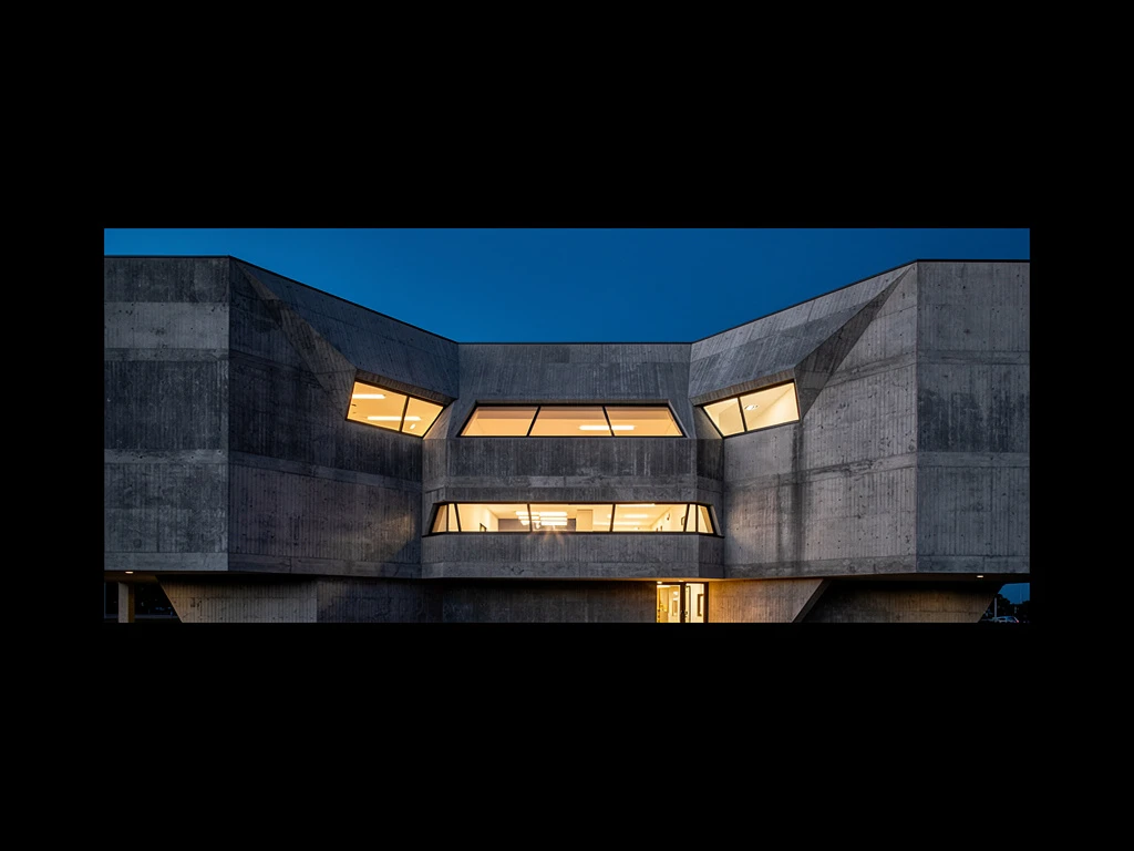
The most confident portfolio cover you can create is a full-screen, single hero image. This is the visual equivalent of walking into a room and owning it.
Why it works:
- Forced Focus: It completely eliminates visual clutter. The client has no choice but to engage deeply with one specific photograph.
- Emotional Impact: A massive, high-resolution image on a retina display carries immense emotional weight. It allows the viewer to see the texture, the lighting, and the nuance of your work.
How to execute it: You cannot use a "pretty good" photo for a single hero cover. It must be a masterpiece. It needs to be technically flawless and perfectly representative of the exact type of work you want to be hired for. If you want to shoot high-fashion editorial, your hero image must look like it was ripped from the pages of Vogue.
The Tightly Curated Carousel
If you shoot in a genre where narrative or variety is key (such as documentary wedding photography or travel photojournalism), a single image might not tell the whole story. In this case, a slow-moving, tightly curated carousel is an excellent option.
Why it works:
- Pacing: It controls the speed at which the viewer consumes your work.
- Narrative Arc: You can sequence 3 to 5 images to show range—for example, a wide landscape, a medium portrait, and a tight detail shot.
How to execute it: The keyword is tightly curated. Never put more than five images in a homepage carousel. Ensure the images transition smoothly (no jarring jump cuts or cheesy animations) and that they share a cohesive color palette and tonal mood. If the first image is bright and airy, the second image shouldn't be a dark, gritty night shot.
The Editorial Split-Screen
For commercial photographers who balance striking imagery with strong branding, the split-screen portfolio cover is becoming increasingly popular. This layout features a strong vertical image on one half of the screen, and clean typography (perhaps a tagline and navigation) on the other.
Why it works:
- Magazine Aesthetic: It mimics the layout of high-end editorial spreads, immediately elevating the perceived value of your brand.
- Context: It allows you to include a clear, concise tagline (e.g., "Food & Beverage Photographer, New York City") without overlaying text directly on top of your art, which can look messy.
How to execute it: This requires strong vertical (portrait orientation) imagery. Ensure the typography is elegant and minimalist—think classic serifs or clean, modern sans-serifs. The negative space on the text side is just as important as the image itself.
Common Portfolio Cover Mistakes to Avoid
When looking for examples of portfolio covers to inspire your own, it's equally important to know what not to do.
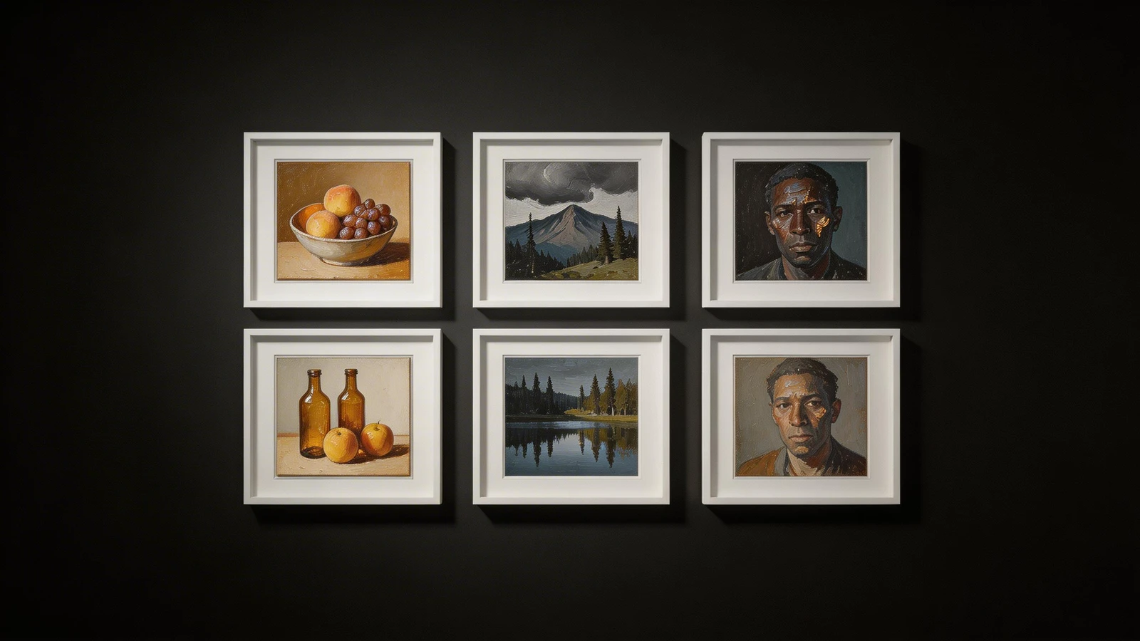
- The Collage Grid: As James learned in our opening story, cramming dozens of thumbnail-sized images onto your homepage is overwhelming and screams amateur.
- Text Overlay Nightmares: Never place complex paragraphs of text directly over a busy photograph. It makes the text illegible and ruins the image. If you must use text over an image, ensure the image has significant negative space (like a clear sky or a blank wall) specifically for that purpose.
- Ignoring Mobile: An image that looks stunning as a horizontal hero on a 27-inch iMac might look terrible when center-cropped on a vertical iPhone screen. Always check how your platform handles mobile responsiveness for cover images.
The Cover is Just the Beginning
Your portfolio cover is the handshake, but the rest of the website is the conversation. Once you have hooked the client with a stunning initial impression, the rest of your site must maintain that high standard. Your inner galleries must be just as curated, your "About" page must be engaging, and your contact process must be frictionless.
However, without that strong initial hook, no one will stick around for the conversation. By studying successful examples of portfolio covers and implementing a strategy based on clarity, confidence, and quality, you can transform your website from a simple gallery into a powerful engine for your creative business.
Building your portfolio doesn't have to be complicated. With Portfoliobox, you can create a stunning portfolio website in minutes — no coding required.