Staring at a blank website template is one of the most intimidating parts of being a freelance illustrator. You have the artwork, but how do you arrange it to look like a premium, agency-grade business rather than a student's blog?
The most efficient way to design a high-converting website is to study the masters. By analyzing the structural layouts of successful, established illustrators, you can reverse-engineer their digital presentation. Here are 5 layout strategies pulled from the industry's most stunning digital art portfolio examples that you can apply to your own site today.
1. The "Cinematic Hero" Layout
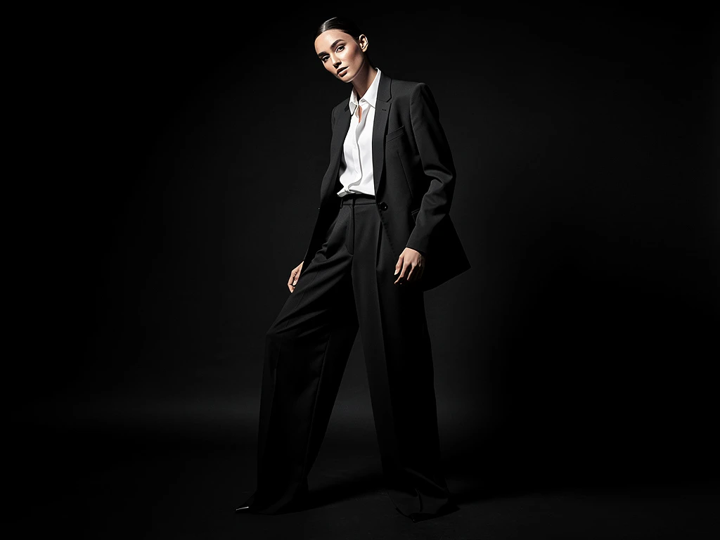
Many top concept artists working in film or AAA gaming use the Cinematic Hero layout.
The Strategy: Instead of a grid of thumbnails, the homepage opens with a single, massive, edge-to-edge video or high-resolution image. Why it works: It immediately immerses the art director in your world. If you create epic sci-fi environments, a massive, uncompressed hero image proves your technical mastery of lighting and scale before the client even scrolls.
2. The "Editorial Masonry" Grid
If you are an illustrator with varying image sizes (some tall character portraits, some wide landscapes), a standard square grid will ruin your compositions.
The Strategy: The best digital art portfolio examples utilize an asymmetrical masonry layout. This allows images of different aspect ratios to interlock seamlessly, much like the layout of a high-end fashion magazine. Why it works: It creates visual pacing. The staggered layout forces the viewer's eye to wander dynamically, making the browsing experience feel curated rather than automated.
3. The "Deep-Dive Case Study"
Art directors don't just want to see the final book cover; they want to know that you are a reliable problem solver.
The Strategy: Instead of clicking an image and just seeing a larger version of it, clicking a thumbnail opens a dedicated project page. This page shows the final art, followed by the initial rough sketches, the color exploration swatches, and a brief paragraph explaining the creative brief. Why it works: It proves you have a professional, repeatable pipeline. It shows clients that your beautiful art is the result of strategic planning, not just a lucky accident.
4. The "Dark Mode Velvet Frame"
A standard white background can sometimes wash out the vibrant, glowing colors of digital paintings.
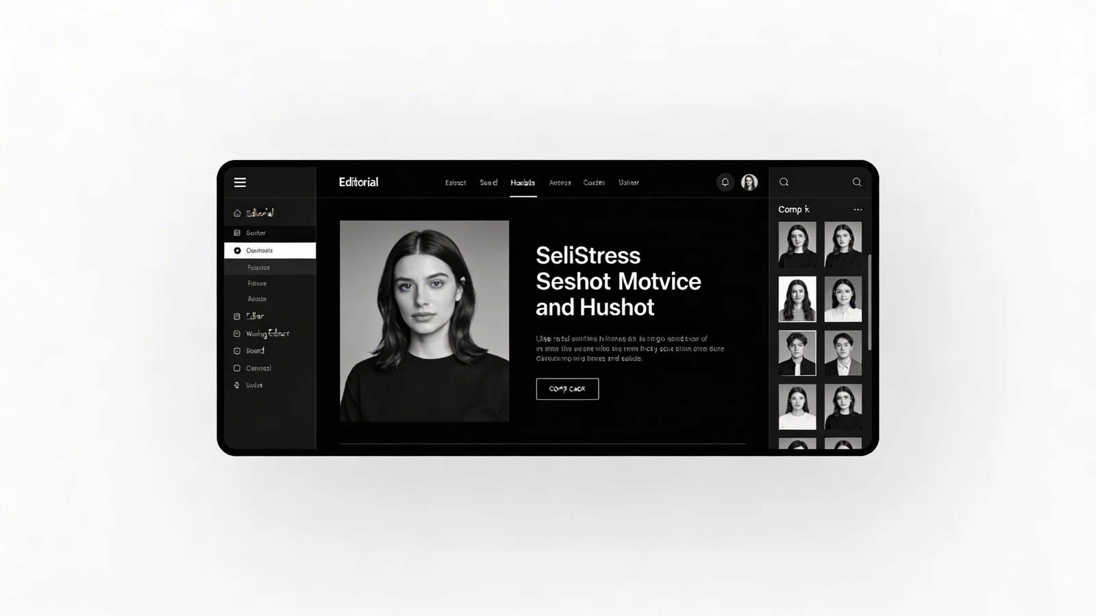
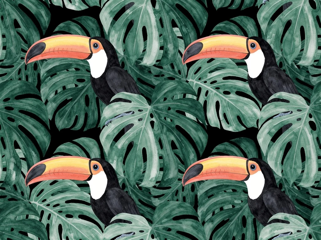
The Strategy: Many stunning digital art portfolio examples (especially in the fantasy and sci-fi niches) use dark mode—deep charcoal or pure black backgrounds. Why it works: A black background absorbs screen glare. It acts as a velvet frame, allowing the saturated colors, neon highlights, and deep shadows of your digital art to pop off the screen with cinematic intensity.
5. The "Frictionless Funnel"
A beautiful portfolio is useless if it doesn't generate income.
The Strategy: The best websites are designed as funnels. At the bottom of every gallery, there is a clear, highly visible Call to Action (CTA) button, such as "Inquire About Commissions" or "Hire Me for Freelance." Why it works: It removes all friction. An art director never has to hunt for your email address. You are actively guiding them toward the booking form while they are most impressed by your work.
You don't need to be a web developer to achieve these layouts. With Portfoliobox, you have access to dynamic masonry grids, dark mode themes, and immersive hero sliders, allowing you to build a stunning digital art portfolio in minutes — no coding required.