When you are building your first website as a freelance illustrator, staring at a blank template can be incredibly intimidating. How many images should you include? What color should the background be? How should you organize your galleries?
The fastest way to overcome this block is not to guess, but to study the digital art portfolio examples of established, working professionals. By analyzing how top-tier illustrators present their work, you can identify the structural rules of a successful portfolio and apply them to your own brand. Here are the core design strategies you should emulate.
1. The "Immersive Minimalist" Example
Many of the most successful digital art portfolio examples (particularly from concept artists working in film or gaming) utilize what we call "Immersive Minimalism."
What it looks like: The homepage features no text, no welcome message, and no sidebars. It is simply a massive, edge-to-edge, high-resolution image of their absolute best digital painting. The navigation menu is tucked away neatly at the top or side. Why it works: It forces the art director to focus entirely on the artwork. There is zero friction or distraction. It exudes confidence. How to apply it: Ditch the cluttered grid on your homepage. Choose your most breathtaking, technically flawless piece. Let that single image command the screen and prove your authority instantly.
2. The "Categorized Professional" Example
If you are a commercial illustrator who works across different industries (e.g., editorial illustration, children's books, and packaging design), throwing all your work onto one page will confuse clients.
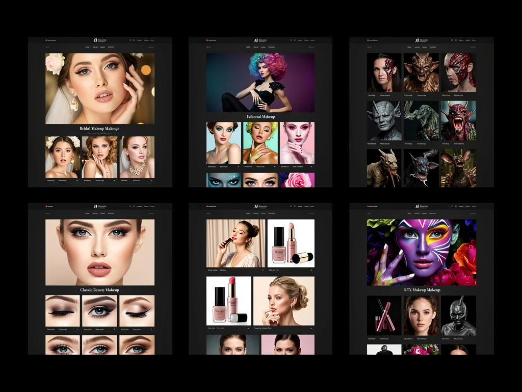
What it looks like: These digital art portfolio examples prioritize clear, distinct navigation. The homepage might feature a clean grid, but the menu is highly organized (e.g., "Editorial," "Publishing," "Personal Work"). Why it works: Art directors are busy. If an editor from a children's book publisher visits your site, they need to click "Publishing" and instantly see relevant work. How to apply it: Stop treating your portfolio like a chronological Instagram feed. Organize your work logically into distinct galleries based on the specific clients you are trying to attract.
3. The "Deep-Dive Case Study" Example
The best portfolios don't just show the final product; they show the journey.
What it looks like: Instead of clicking an image and seeing a slightly larger version of it, clicking a thumbnail opens a dedicated project page. This page includes the final illustration, but also the initial rough sketches, the color palettes explored, and perhaps a time-lapse video of the painting process. Why it works: It proves to commercial clients that your beautiful art is not a fluke. It shows that you have a reliable, professional pipeline and that you know how to solve visual problems. How to apply it: Take your three biggest projects and turn them into case studies. Add text explaining the brief you were given and how you executed it.
4. The "Dark Mode Luxury" Example
While white backgrounds are safe, many top digital art portfolio examples embrace dark mode (deep charcoal or black backgrounds).
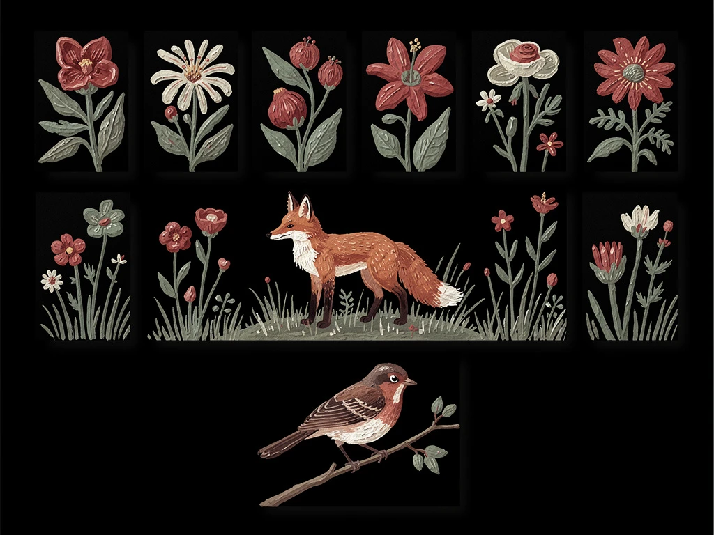
What it looks like: The entire website is dark, acting as a velvet frame for the artwork. Why it works: Digital screens emit light. A black background absorbs that light, allowing the vibrant, saturated colors of digital painting to pop off the screen with incredible intensity. It feels premium and cinematic. How to apply it: If your work features heavy contrast, glowing elements, or cinematic lighting, experiment with a dark-mode theme to instantly elevate your presentation.
Studying these examples is the first step; implementing them is the next. With Portfoliobox, you can effortlessly recreate these high-end digital art portfolio examples and build an agency-ready website in minutes — no coding required.