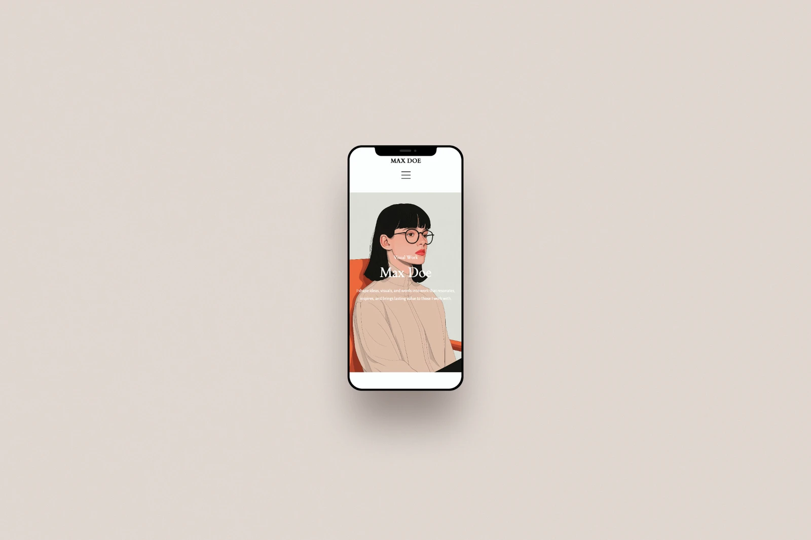
Most of the people who land on your portfolio this week will do it on a phone, mid-scroll, between something else. If your homepage was only ever checked on a laptop, there's a good chance you've never actually seen it the way most visitors do.
Portfoliobox builds every layout to adjust automatically for a smaller screen, but "automatic" isn't the same as "checked," and a five-minute look from your own phone is the easiest editing pass you'll do all month.
What changes on a smaller screen
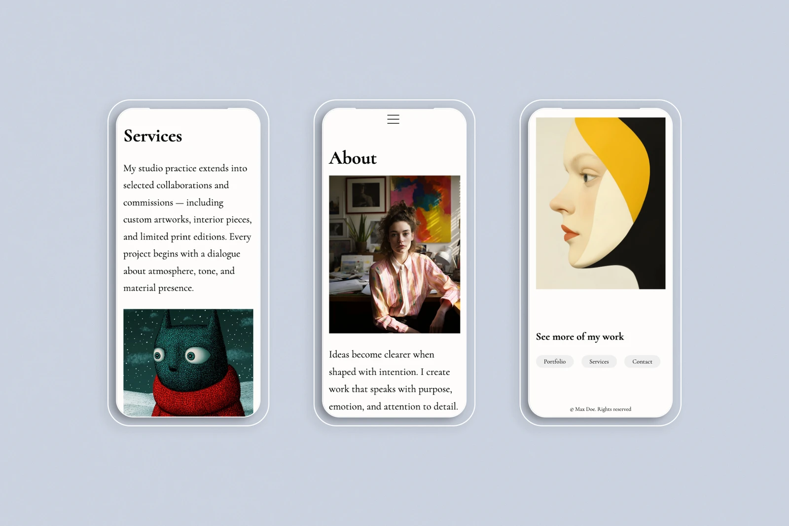
Multi-column grids collapse into a single column. Side-by-side text and image blocks stack instead of sitting next to each other. Navigation tucks into a menu icon instead of spreading across the top. None of that requires extra setup, but it does mean a layout that was carefully balanced on desktop can read differently once everything stacks vertically: longer scrolls, different pacing between images.
Three things worth checking on your own phone
Open your own site on your phone and pay attention to a few specific spots. Your homepage's first screen, what loads before anyone scrolls, should still say who you are and what you do without needing a scroll to find out. Buttons and links should be easy to tap without zooming in or missing by a few millimetres. And any text laid over an image should still be readable once that image is cropped tighter for a narrower screen.
Preview while you edit
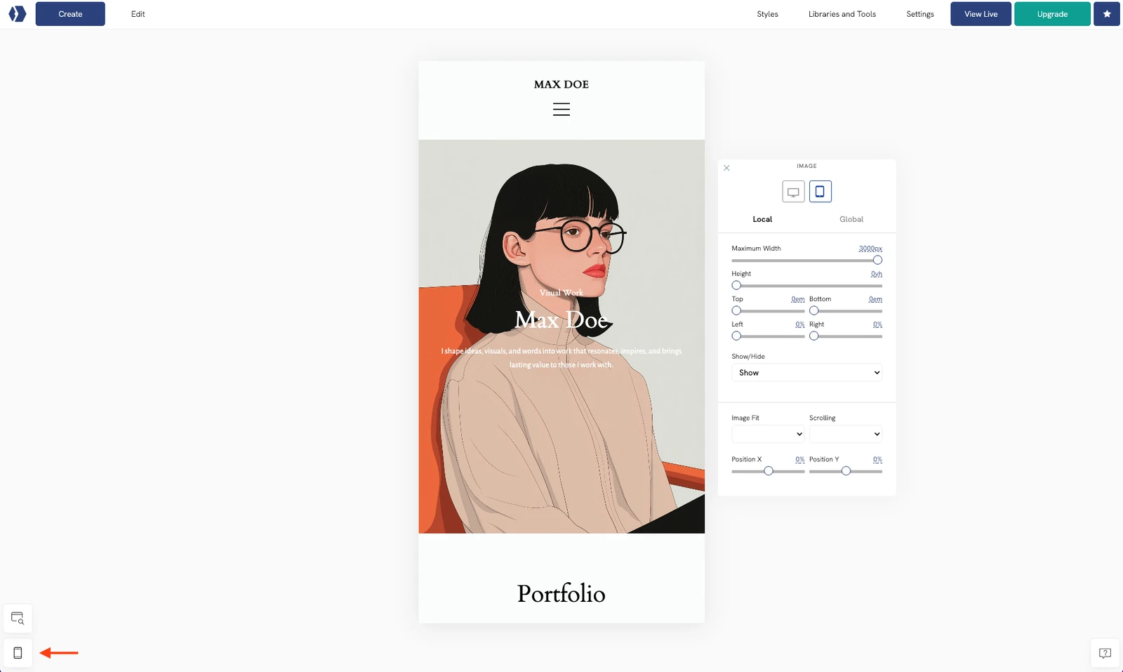
Changes in Portfoliobox go live immediately, so the time to check the mobile view is while you're still in the editor, not after. Switch to mobile preview before you close out of a section: it takes the same few seconds as checking the desktop view, and it catches the layout issues, an image cropped wrong, text too large or too small, all details that are far more visible on a phone than on a widescreen monitor. If something looks off, you can fix it on the spot.
A portfolio that looks great on a 27-inch monitor and reads awkwardly on a 6-inch screen is still, for most visitors, an awkward portfolio. Check it the way they will.
Browse mobile-ready templates or see how other creatives' sites look across devices in real portfolio examples.