Early in my fine art career, I suffered from a severe case of imposter syndrome. I was producing massive, highly detailed charcoal drawings that I was incredibly proud of. I knew the work was good. But whenever I met a gallery director or a collector at an opening, I would casually avoid giving them my website link.
My artist portfolio website was embarrassing. I had built it using a free, mass-market template. The background was a distracting gray pattern, the fonts were clunky, and the platform had compressed my high-resolution photos so badly that my charcoal drawings looked like blurry digital prints. I knew that if a high-end curator saw that website, they would immediately dismiss me as an amateur. Here is the story of how I stopped hiding my work, perfected my digital gallery, and finally established industry authority.
The Realization: Presentation is Perception
I was complaining to a mentor about how hard it was to get a gallery show. She asked to see my website. I reluctantly pulled it up on my phone. She took one look and said, "You are an artist. Your job is visual communication. Right now, your website is communicating that you don't care about details."
That hit me hard. I would spend 40 hours ensuring every smudge of charcoal on the paper was perfect, but I spent 20 minutes dragging those images into a generic web template. I realized that to the outside world, my presentation was my brand.
The Rebuild: Applying Gallery Standards
I completely tore down my artist portfolio website and started over, this time treating it with the same respect I gave my physical art.
1. The Purge (Less is More): My old site had 50 drawings on it. I deleted 40 of them. I curated the gallery down to my absolute 10 best pieces. A small, flawless collection communicates authority far better than a massive, inconsistent one.
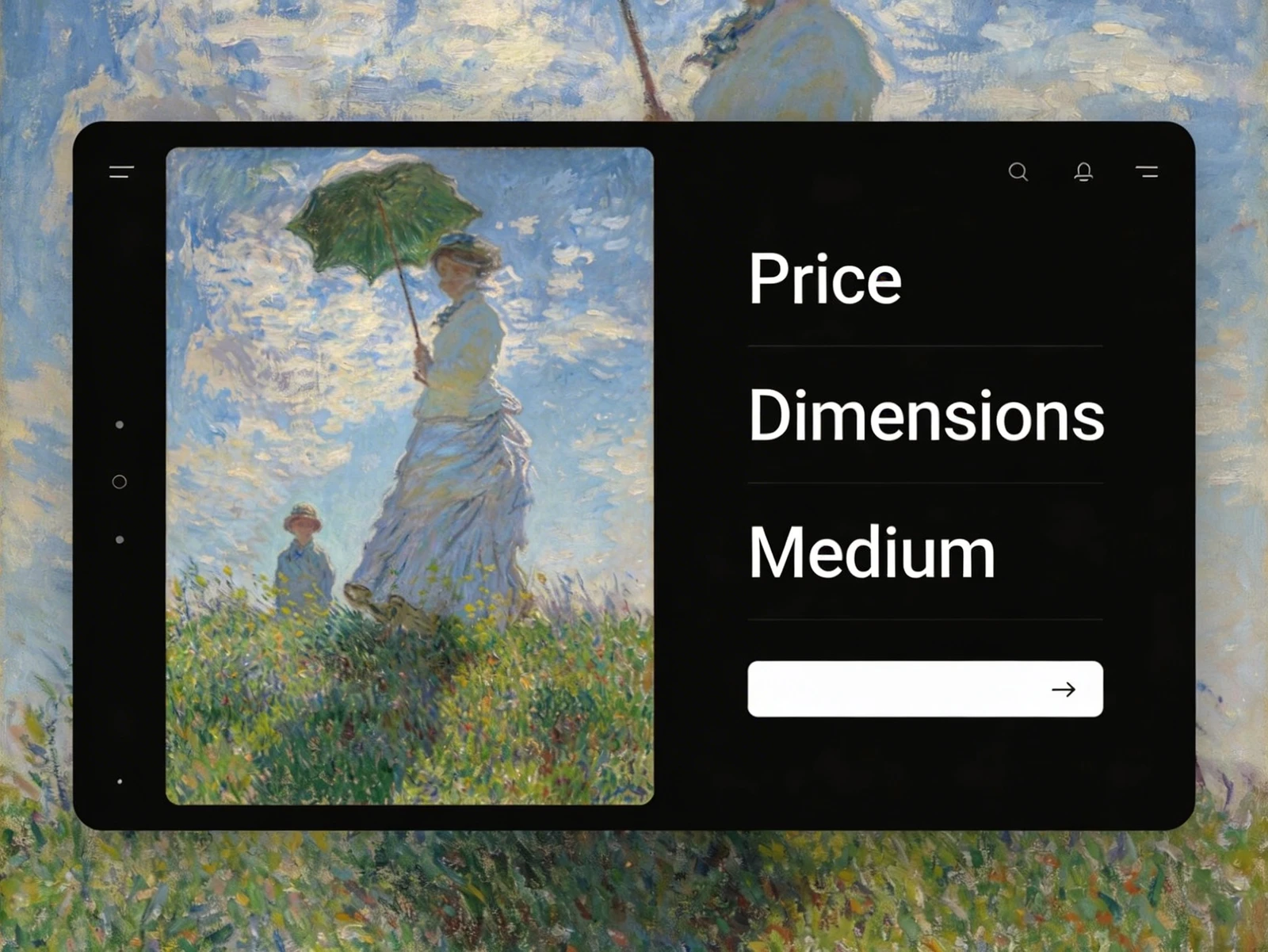
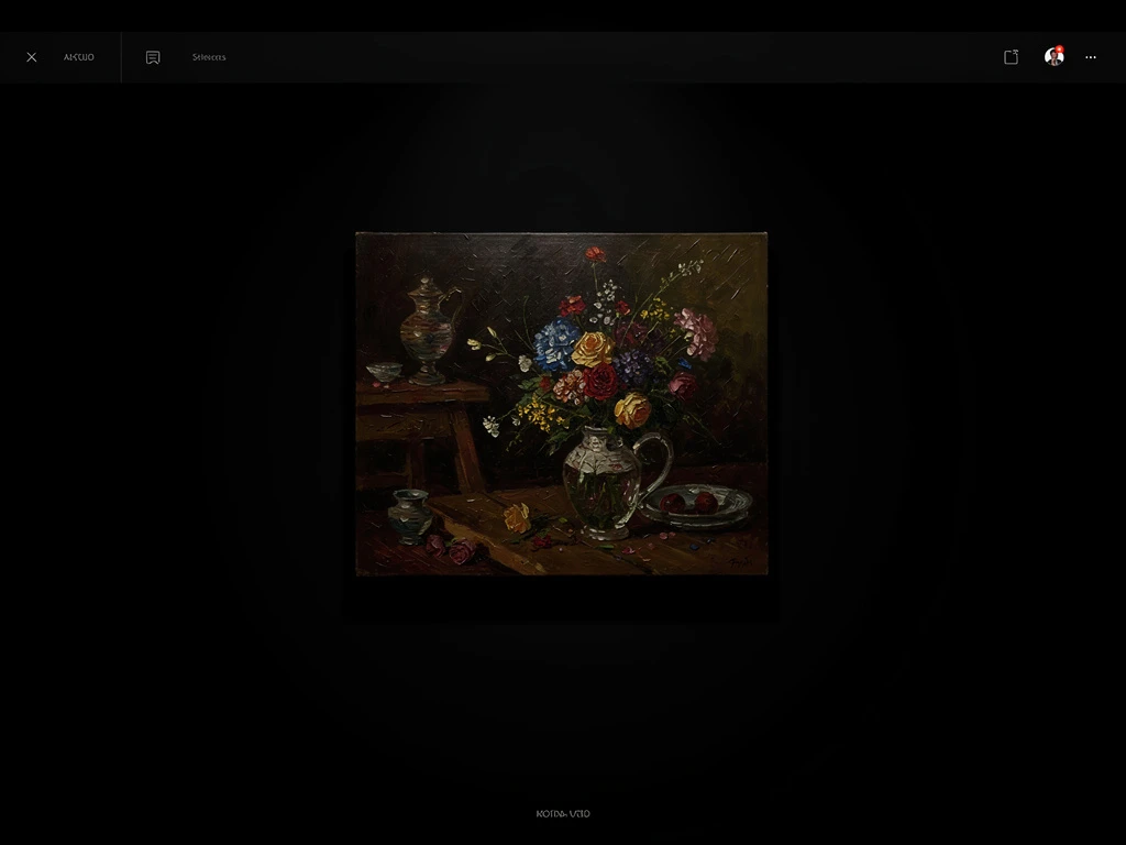
2. The Invisible Frame: I migrated to a premium platform designed specifically for creatives. I removed all the "web design" clutter. I set the background to pure gallery white. I changed the font to a sleek, minimalist sans-serif. I forced the website to disappear so the art could become the sole focus.
3. Providing Scale and Context: Because charcoal drawings can sometimes look flat on a screen, I added secondary photos. I included macro shots showing the actual texture of the paper and the charcoal dust. I included a photo of a drawing framed beautifully in a modern living room to prove its massive scale.
The Turning Point
A month after launching the new site, I attended a local art fair. I confidently handed out business cards pointing to the new URL.
Two days later, I received an email from an interior designer who had visited the site. They didn't just want one piece; they wanted to commission three large drawings for a corporate client. In the email, they specifically mentioned how "professional and luxurious" the work looked on the site. Perfecting my artist portfolio website didn't make me a better drawer, but it completely changed how the market perceived my value.
If you are hiding your work because your website looks cheap, it is time to upgrade. With Portfoliobox, you can effortlessly apply these high-end, minimalist gallery standards to your own work, building the authority you need to succeed — no coding required.