A few years ago, my makeup portfolio looked like a digital filing cabinet. It was a standard, white-background website with a basic grid of photos. It was functional, but it lacked soul. I was applying for lead makeup artist roles on high-end fashion editorials and consistently losing out to artists whose work wasn't necessarily better, but whose presentation felt vastly more expensive.
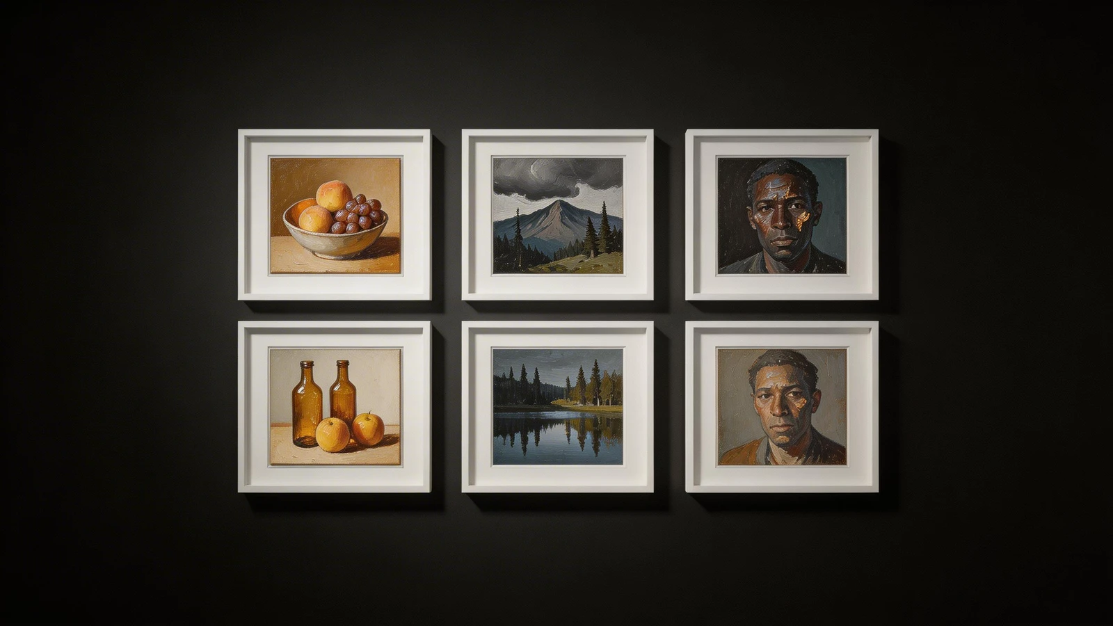
I realized I needed a massive rebrand. Instead of looking at other makeup artists for inspiration (which often leads to copying), I started studying high-end fine art and photography sites. The art portfolio website examples I analyzed completely transformed how I structured my own digital brand. If you are ready to elevate your presentation, here are the core design principles you can steal from the fine art world.
1. The "Single Masterpiece" Homepage
When I looked at top-tier art portfolio website examples, I noticed none of them cluttered their homepage with twenty different images. They didn't try to show everything they could do all at once.
Instead, they utilized the "Single Masterpiece" approach. The homepage featured one massive, edge-to-edge, high-resolution image of their absolute strongest work. How to apply this to makeup: Ditch the cluttered grid on your homepage. Choose your most breathtaking, technically flawless macro beauty shot or an auto-playing cinematic video reel of your SFX work. Let that single image command the screen and prove your authority instantly.
2. The Power of Asymmetrical Architecture
Standard website builders often force your images into perfectly uniform, square grids. It looks organized, but it also looks very corporate.
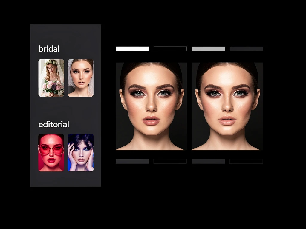
Fine artists often use asymmetrical masonry layouts. This allows them to mix portrait (vertical) and landscape (horizontal) images fluidly. It creates an editorial, magazine-style flow that forces the viewer's eye to wander dynamically across the page. How to apply this to makeup: When formatting your editorial or bridal galleries, use an asymmetrical grid. Place a tight, vertical macro shot of a glossy lip next to a wide, horizontal shot of the full fashion ensemble. It creates visual pacing and makes your portfolio feel like a curated exhibition.
3. Embracing the Dark Mode Aesthetic
Most commercial makeup artists default to a white background because it feels "clean." However, many of the most striking art portfolio website examples I studied utilized dark mode—deep charcoal or pure black backgrounds.
How to apply this to makeup: If your artistry leans toward dramatic evening wear, avant-garde editorial, or cinematic SFX, a white background will wash out your work. A black background acts as a velvet frame. It makes rich colors—like vibrant eyeshadows or deep red lips—pop off the screen with incredible intensity and luxury.
4. Contextual Case Studies
Fine artists rarely just hang a painting without a plaque explaining the medium and the inspiration.
How to apply this to makeup: Instead of just uploading a final tear sheet, create a case study page for major campaigns. Include the final shot, but also include the initial mood board, a breakdown of the specific skin prep products you used, and the creative brief you executed for the art director. This proves you are a strategic creative thinker.
You don't need a massive budget to achieve this level of design. With Portfoliobox, you can implement these stunning art portfolio website examples and build an agency-grade digital presentation in minutes — no coding required.