In the architecture profession, the presentation board is your ultimate pitch. Whether you are a student presenting at a final review, a firm competing for a major commission, or an architect showcasing work in a digital portfolio, the architecture presentation board layout dictates how your design is understood and received.
You can spend months developing a groundbreaking design, but if your boards are cluttered, confusing, or visually unappealing, the brilliance of your work will be lost. Conversely, a masterful layout not only communicates your design clearly but also establishes your brand's authority, signaling to clients and critics that you are a highly organized, strategic thinker.
Perfecting your architecture presentation board layout is both an art and a science. In this comprehensive guide, we will walk you through the essential steps to create boards that captivate audiences and elevate your professional standing.
Step 1: Establish a Clear Visual Hierarchy
The most common mistake in board design is a lack of hierarchy. When every drawing, render, and paragraph of text is the same size, the viewer's eye bounces around aimlessly.
Before you place a single image, you must decide what the most important element of your project is. Is it the dramatic exterior form? The innovative structural section? The urban masterplan?
- The Hero Image: Dedicate a significant portion of your board (or your first board, if it's a series) to a "hero image." This is usually a high-quality perspective render or a stunning physical model photograph that immediately communicates the essence of the project.
- Secondary Elements: Next in the hierarchy should be the essential orthographic drawings—plans, sections, and elevations. These should be large enough to read clearly but subordinate to the hero image.
- Tertiary Elements: Finally, fit in the supporting details: conceptual diagrams, detail sections, and text.
Step 2: Implement a Strict Grid System
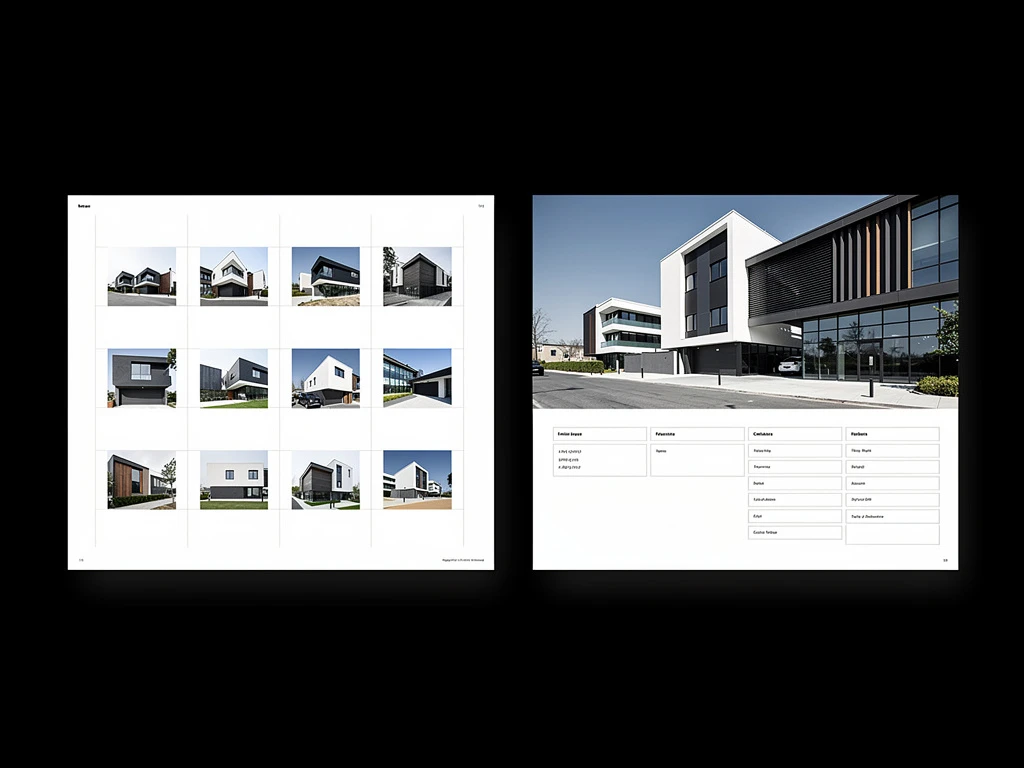
Architecture is about order and structure, and your presentation boards should reflect that. A grid system is non-negotiable for a professional layout.
A grid provides an invisible framework that aligns your drawings, text, and images, creating a sense of cohesion even when dealing with disparate elements.
- Create the Grid: In InDesign or Illustrator, set up a modular grid (e.g., 4 columns by 4 rows) with consistent gutters (the space between columns).
- Stick to the Grid: Every element must align with the grid lines. If a floor plan takes up two columns, ensure its edges align perfectly with the grid boundaries.
- Break the Grid Sparingly: Only break the grid for dramatic effect, such as allowing your hero render to bleed off the edges of the board.
Step 3: Manage White Space (Negative Space)
Many architects feel the urge to fill every square inch of their boards with information, fearing that empty space implies a lack of work. In reality, white space is your most powerful layout tool.
White space gives the viewer's eyes a place to rest. It acts as a frame, drawing attention to your most important drawings.
- Margins: Always establish generous margins around the edges of your board. Nothing looks more amateurish than text or drawings crammed against the paper's edge.
- Breathing Room: Leave ample space between different drawings. If a section and a plan are too close together, they become difficult to read individually.
Step 4: Master Typographic Discipline
Poor typography can ruin an otherwise excellent presentation board layout. Keep your text clean, legible, and minimal. Reviewers are there to look at your architecture, not read a novel.
- Limit Your Fonts: Use a maximum of two font families. A clean sans-serif (like Helvetica, Univers, or DIN) is usually best for architecture boards due to its modern, technical feel.
- Text Hierarchy: Use size and weight to establish hierarchy. Your project title should be the largest, followed by headings, and finally body text.
- Keep it Brief: Use bullet points and short paragraphs. Ensure your body text is large enough to be read from a few feet away (usually around 14pt-18pt, depending on the board size).
Step 5: Align the Horizon and Section Lines
When presenting multiple orthographic drawings, alignment is key to readability. If you have two floor plans on a board, they should be aligned horizontally or vertically whenever possible.
More importantly, if you are showing a section next to an elevation, or two sections side-by-side, try to align the ground lines. This creates a continuous datum line across the board, which visually grounds the project and makes it much easier for the viewer to understand the scale and relationship between the drawings.
Step 6: Use Color Strategically, Not Decoratively
Color should be used to convey information, not just to make the board look pretty. In architectural presentations, less is almost always more.
- Establish a Palette: Choose a muted, sophisticated color palette that complements your project. Earth tones, grays, and muted blues are safe and professional.
- Highlight Key Information: Use a single, vibrant accent color (like a bright red or yellow) strictly for highlighting important information, such as circulation paths in a diagram or the boundary of the site in a masterplan.
- Desaturate Context: In plans and sections, keep the surrounding context (neighboring buildings, terrain) in grayscale or light linework to ensure your proposed design stands out.
By rigorously applying these layout strategies, you transform your presentation boards from a mere data dump into a compelling visual narrative. A masterful layout not only highlights your design talent but cements your reputation as an organized, authoritative professional in the architecture industry.
Building your portfolio doesn't have to be complicated. With Portfoliobox, you can create a stunning portfolio website in minutes — no coding required.