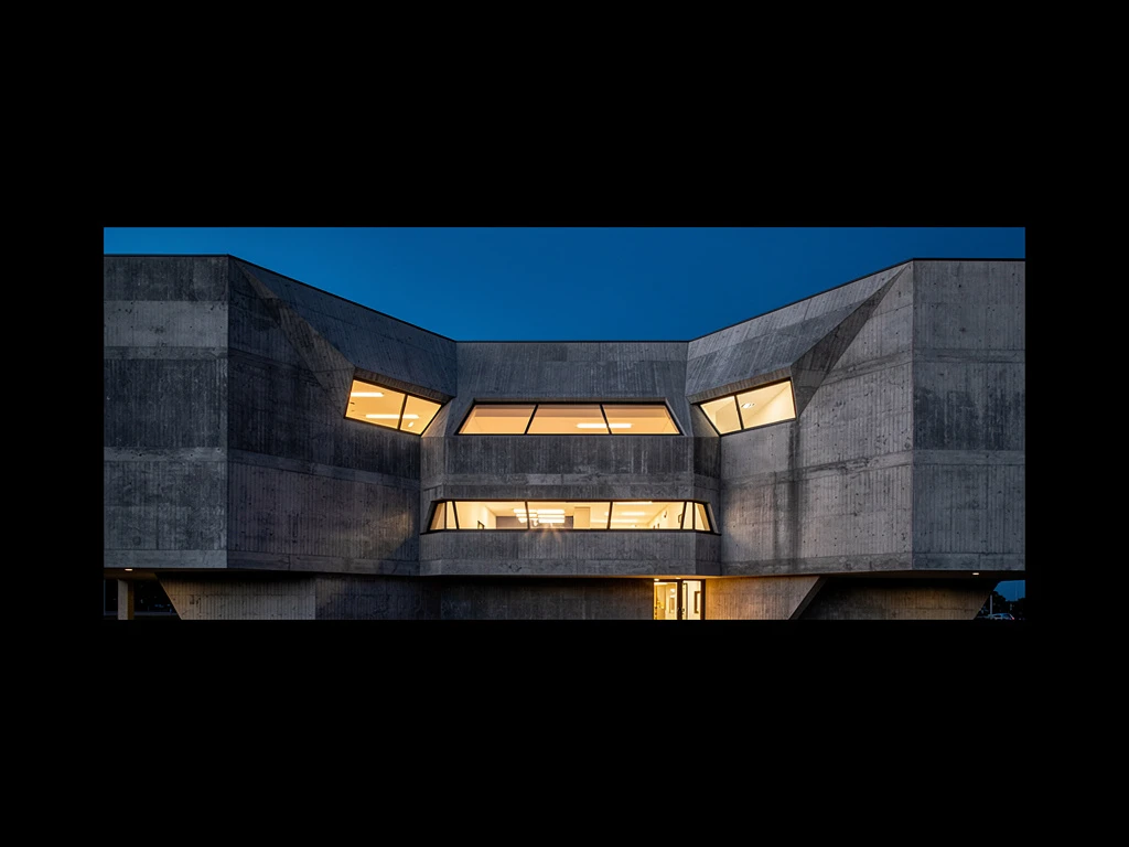
In the architecture profession, we dedicate our lives to designing spaces that shape human experience. Yet, when it comes time to present our work to the world, we often fail to design the experience of the presentation itself.
Whether you are pinning up drawings for an academic review, designing a spread for a digital portfolio, organizing an exhibition of your firm's work, or setting up a boardroom for a major client pitch, your "architecture display" is the crucial bridge between your ideas and your audience.
A brilliant design poorly displayed will be misunderstood or ignored. A mediocre design brilliantly displayed can win commissions. To build true industry authority, you must master the art of the display. Here is a step-by-step guide on how to perfect your architecture display across any medium.
Step 1: Define the Narrative and the Audience
Before you select a single rendering or print a single plan, you must ask two questions: Who is looking at this? and What story am I trying to tell them?
The display for an academic jury (who wants to see rigorous process and theoretical depth) must look entirely different from the display for a corporate client (who wants to see budget adherence, timelines, and a stunning final product).
Curate your work ruthlessly based on the audience. If you are displaying your work to win a civic commission, your display should highlight your public plazas and community engagement diagrams, not your high-end residential kitchen details. The narrative must dictate the curation.
Step 2: Establish a Clear Hierarchy of Information
The most common failure in any architecture display is visual noise. When an audience looks at a wall of drawings or a digital presentation, they need to know instantly where to look first.
You must establish a strict visual hierarchy.
- The Anchor: Every display needs an anchor—a massive physical model, a breathtakingly large hero rendering, or a dominant conceptual diagram. This is the visual magnet that draws the audience in.
- The Supporting Evidence: Surrounding the anchor should be the orthographic drawings (plans, sections, elevations). These should be smaller, demanding the viewer to step closer (or zoom in) to engage with the technical reality of the project.
- The Details: Finally, provide the granular data—wall sections, material palettes, and text—for the most engaged viewers who want to dig deep.
Step 3: Master Scale and Proportion
Architecture is fundamentally about scale, and your display must respect that.
If you are displaying physical drawings on a wall, print your most important sections and plans large enough to be legible from a few feet away. There is nothing more frustrating for a reviewer than having to squint at a 1:200 plan printed on an A4 sheet of paper.
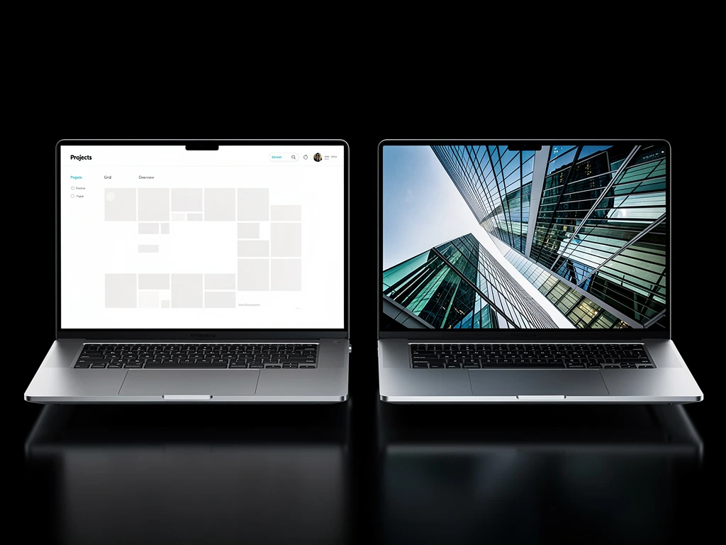
Conversely, if you are displaying digitally, remember that your audience is likely viewing it on a laptop screen or an iPad. Do not shrink a massive A0 presentation board down to fit on a 13-inch screen. The text will become unreadable, and the linework will turn to mud. Re-layout the information specifically for the scale of the screen.
Step 4: Control the Lighting (Physical and Digital)
Light defines architecture, and it defines your display.
In a physical exhibition or pin-up, lighting is critical. A beautifully crafted basswood physical model looks flat and lifeless under harsh fluorescent studio lights. Use directed spotlights to cast shadows across the model, highlighting the massing and texture just as the sun would highlight the real building.
In a digital display, control the "lighting" through contrast and color grading. Ensure your renderings have consistent exposure and contrast. If you place a very bright, daytime render next to a dark, moody evening render without a visual break, they will clash and disorient the viewer.
Step 5: Treat the White Space as a Material
Just as you design the voids in a building, you must design the white space in your display.
Ample negative space around your drawings and models acts as a frame, elevating the perceived value of the work. It gives the viewer's eyes a place to rest. When pinning up on a wall, do not overlap drawings or cram them edge-to-edge. When designing a portfolio spread, leave generous margins. The white space communicates confidence; it says that the work is strong enough to stand on its own without needing to fill every inch of the canvas.
Step 6: Consistency is the Key to Branding
To build industry authority, your display style must become your signature. When a client or critic sees your work, they should recognize it as yours before they even read the title block.
Develop a strict graphic standard for your displays. Use the same professional typefaces, the same standardized CAD line weights, and a consistent color palette across all your projects. Whether you are presenting a small pavilion or a massive masterplan, the graphic quality must be unwavering.
Perfecting your architecture display is the ultimate act of professional communication. By treating the presentation with the same rigor and care as the architecture itself, you elevate your brand and ensure your visionary ideas are clearly understood and deeply respected.
Building your portfolio doesn't have to be complicated. With Portfoliobox, you can create a stunning portfolio website in minutes — no coding required.