As a designer, your portfolio is your ultimate case study. When an art director or a potential client lands on your site, they are not just looking at your work; they are judging the vessel that holds it. You can have the most breathtaking brand identity projects, elegant UI interfaces, and meticulously kerned typography, but if your site breaks when viewed on an iPhone, you will be disqualified instantly.
We are living in a mobile-first world. Responsive design isn't a "nice-to-have" feature; it is the absolute baseline expectation for a professional working in the creative industry today.
The Reality of How Clients View Portfolios
A harsh reality every freelance designer must accept is that nobody is reviewing your portfolio on a calibrated 32-inch 4K monitor.
The hiring manager at an ad agency? They are opening your link on their phone during a 15-minute commute. The startup founder looking for a brand re-design? They are viewing your site on an outdated tablet at a coffee shop.
If your horizontal scroll gallery requires them to aggressively swipe and zoom just to read the project overview, they will simply close the tab and move to the next candidate. Responsive design guarantees that your typography scales correctly, your meticulously chosen margins remain elegant, and your grids gracefully fall into single columns without breaking the user experience.
Your Website is Your First Deliverable
If you are applying for a UI/UX, graphic, or digital design role, your portfolio website is actively treated as part of your interview. It serves as proof that you understand fundamental web principles.
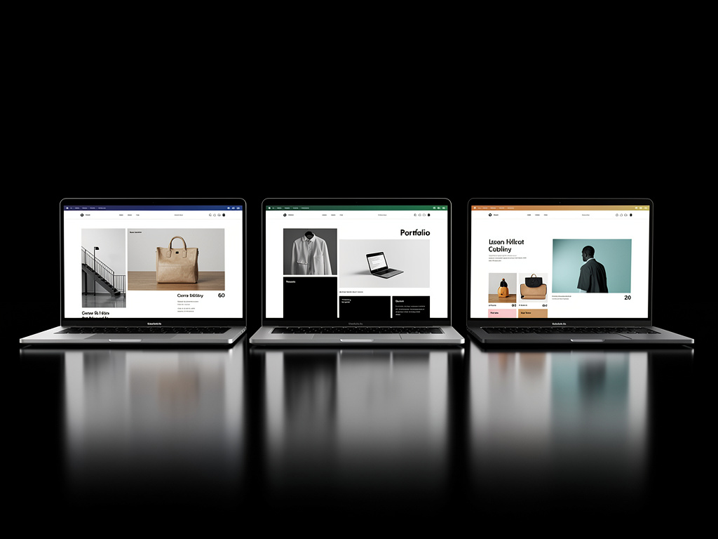
When your portfolio natively adapts its layout across a 13-inch laptop, a desktop monitor, and a mobile device without sacrificing aesthetic integrity, it subconsciously communicates that you understand hierarchy, scalability, and modern digital constraints. If your work looks stunning on desktop but chaotic on mobile, the client assumes you lack attention to detail and do not understand responsive digital behavior.
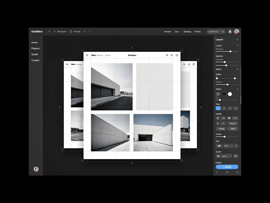
Fluidity Over Fixed Widths
Many designers accustomed to print struggle with transitioning from fixed layouts to a liquid canvas. Designing for the web is designing for variables.
Instead of obsessing over pixel-perfect arrangements on a single artboard, you need to think systematically about how elements relate to each other as the viewport shrinks. Modern portfolio builders manage complex CSS media queries for you, ensuring your case studies are accessible no matter the resolution.
Building a fully responsive portfolio doesn't require writing code from scratch. With Portfoliobox, the heavy lifting of responsive CSS is built directly into every gallery, typography option, and layout template, allowing your work to look immaculate on absolutely every screen.