When an early-career visual creative builds their first online portfolio, they frequently suffer from massive 'Imposter Syndrome.' They secretly fear their actual graphic design or photography is not good enough to secure a corporate contract.
To hide their perceived incompetence, they attempt to distract the recruiter with the website itself. They select massive, highly complicated website templates explicitly designed to act like digital fireworks. They install massive spinning loading icons, complicated JavaScript hover-effects that make the images twist and spin when the mouse touches them, and chaotic background videos that play automatically.
This is the ultimate B2B conversion killer. Corporate Art Directors evaluate portfolios based entirely on raw visual capability. If an Art Director has to wait eight seconds for a complicated 3D animation to finish playing just to navigate to your 'Contact' page, they will close the tab immediately. In the high-end B2B market, silence equals confidence. Here is exactly why radical minimalism converts higher than complex UI programming.
The 'Museum Plaque' Philosophy
If you walk into the Louvre in Paris, the museum walls are completely bare. The architecture is utterly silent. The plaques placed directly beneath the masterpieces are written in tiny, stark typography.
The museum operates on a foundational rule: The frame must never be louder than the art.
The Digital Application: When you introduce complex 'Hover Animations' or neon-gradient backgrounds to your digital portfolio, your User Interface (UI) is physically screaming at the viewer. It creates massive cognitive overload.
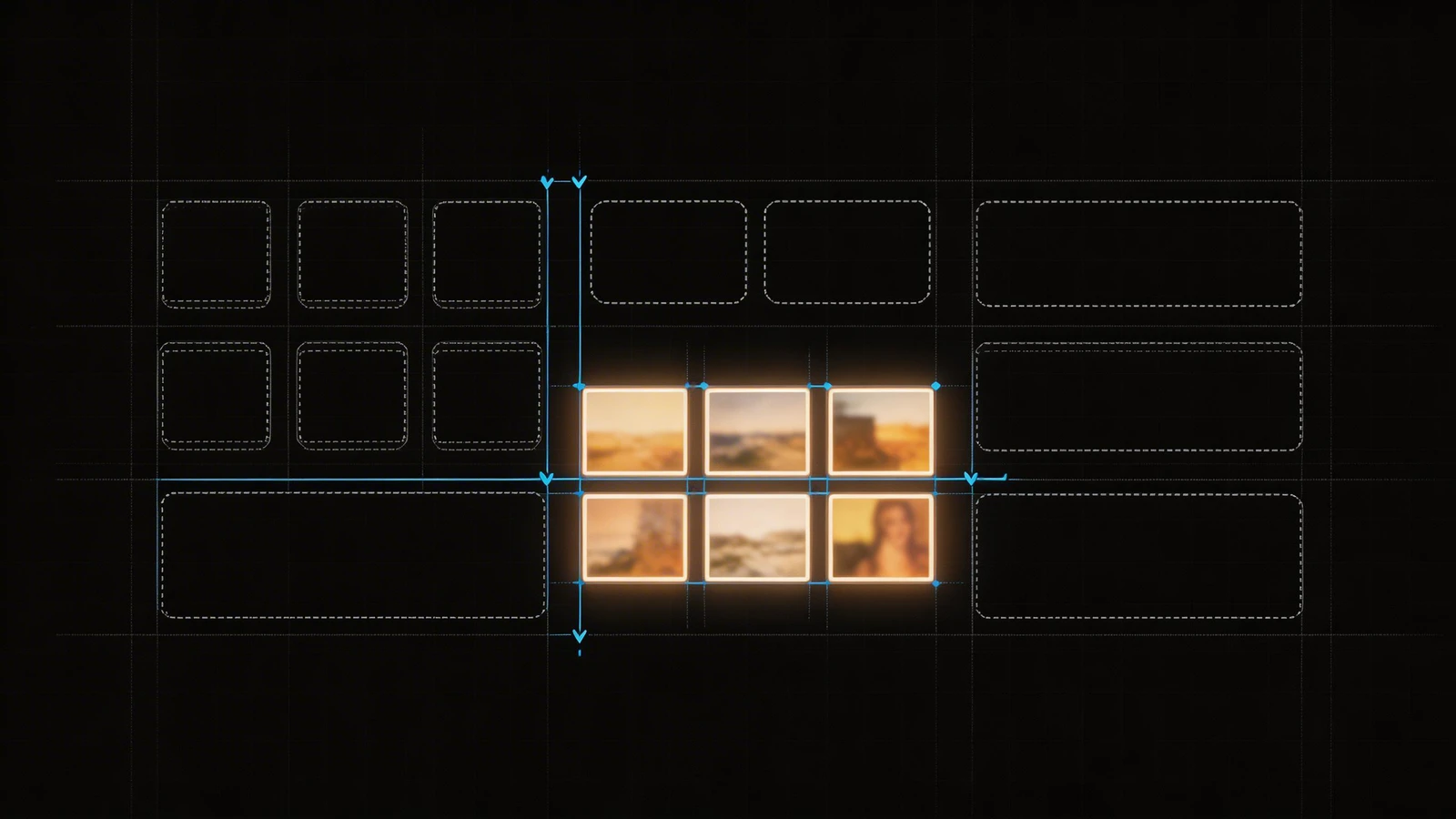
You must utilize a "Simple Portfolio" layout perfectly mimicking a physical museum wall.
- The background must be pure
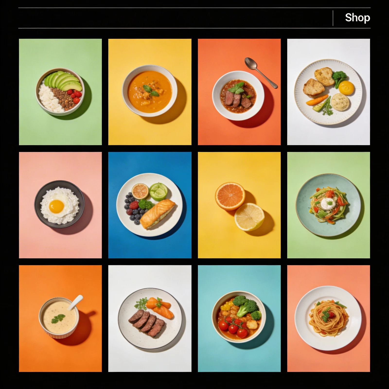
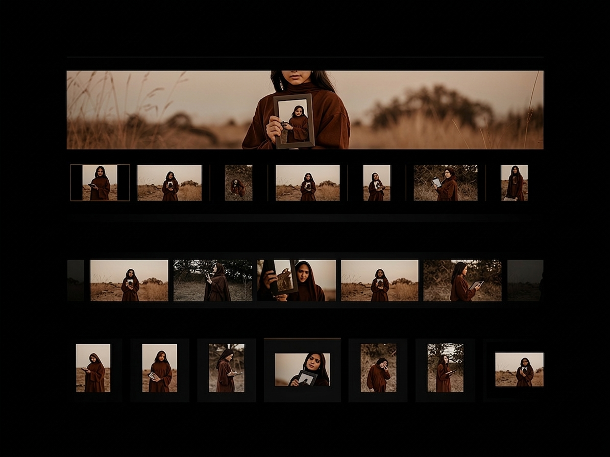
#FFFFFFwhite or#000000black. - Eliminate all borders around your imagery. Let the images float completely isolated in massive negative space margins.
- Your navigation menu must be tiny, stark, and practically invisible until the user actively hunts for it.
Minimalist architecture subconsciously signals massive ego validation. It proves you are so confident in your raw photography or design skills that you require zero digital tricks to hide behind.
Increasing Instant "Page Velocity"
A massive, incredibly complex portfolio website is physically heavy. If your homepage template includes thousands of lines of hidden JavaScript designed to execute complex animations, the file size of the website skyrockets.
The Bounce Rate Reality: If an Agency Director clicks your URL on their smartphone while riding the subway, a heavy, complicated website will take five to eight seconds to load. Statistical data proves that if a website takes longer than three seconds to load, 50% of the audience will hit the "Back" button and leave forever (this is known as the "Bounce Rate").
Radical minimalism protects your conversion funnel strictly through speed. A simple portfolio template strips away all complex code executing the animations. The server has to calculate almost nothing. The result is a lightning-fast URL that loads a breathtaking, 4K resolution image onto the Art Director's smartphone screen in 0.8 seconds, securing their attention natively before they have the chance to leave.
Elevating Navigational Legibility
A hiring manager clicking through thirty portfolios an hour is desperate for speed. They just want to find your Resume, view your Top 5 projects, and leave.
If your website utilizes "unconventional" navigation (like forcing the recruiter to click a tiny spinning globe icon hidden in the bottom left corner to access the menu), they will become furiously annoyed.
Minimalism guarantees legibility. A simple portfolio provides conventional B2B architecture: a clear logo on the Top-Left, a clean text-menu on the Top-Right detailing exactly three options (Work, About, Contact). You are respecting the corporate timeline flawlessly.
Commanding corporate attention requires eliminating all digital friction. By building your visual footprint on Portfoliobox, successful creatives leverage stripped-down, uncompressed masonry grids and utterly silent, lightning-fast UI architecture designed explicitly to prioritize the artwork over the algorithm — no coding required.