The core challenge of presenting architecture digitally is scale. You are attempting to take an object that weighs four million pounds—an object a human being physically walks through to experience its volume and light—and compress that entire sensory experience into a flat 13-inch laptop screen.
When a standard website builder presents you with a generic grid, it completely ignores the spatial reality of your work. If you drop a wide-angle landscape photograph of an exterior facade next to a highly technical microscopic floor-plan, the viewer's brain experiences cognitive whiplash.
To successfully translate the physical world into the digital one, your portfolio architecture layout must follow a strict, cinematic visual anatomy. Here is how world-class firms organize their project pages to control the viewer's spatial perception.
The Environmental 'Hero' Anchor
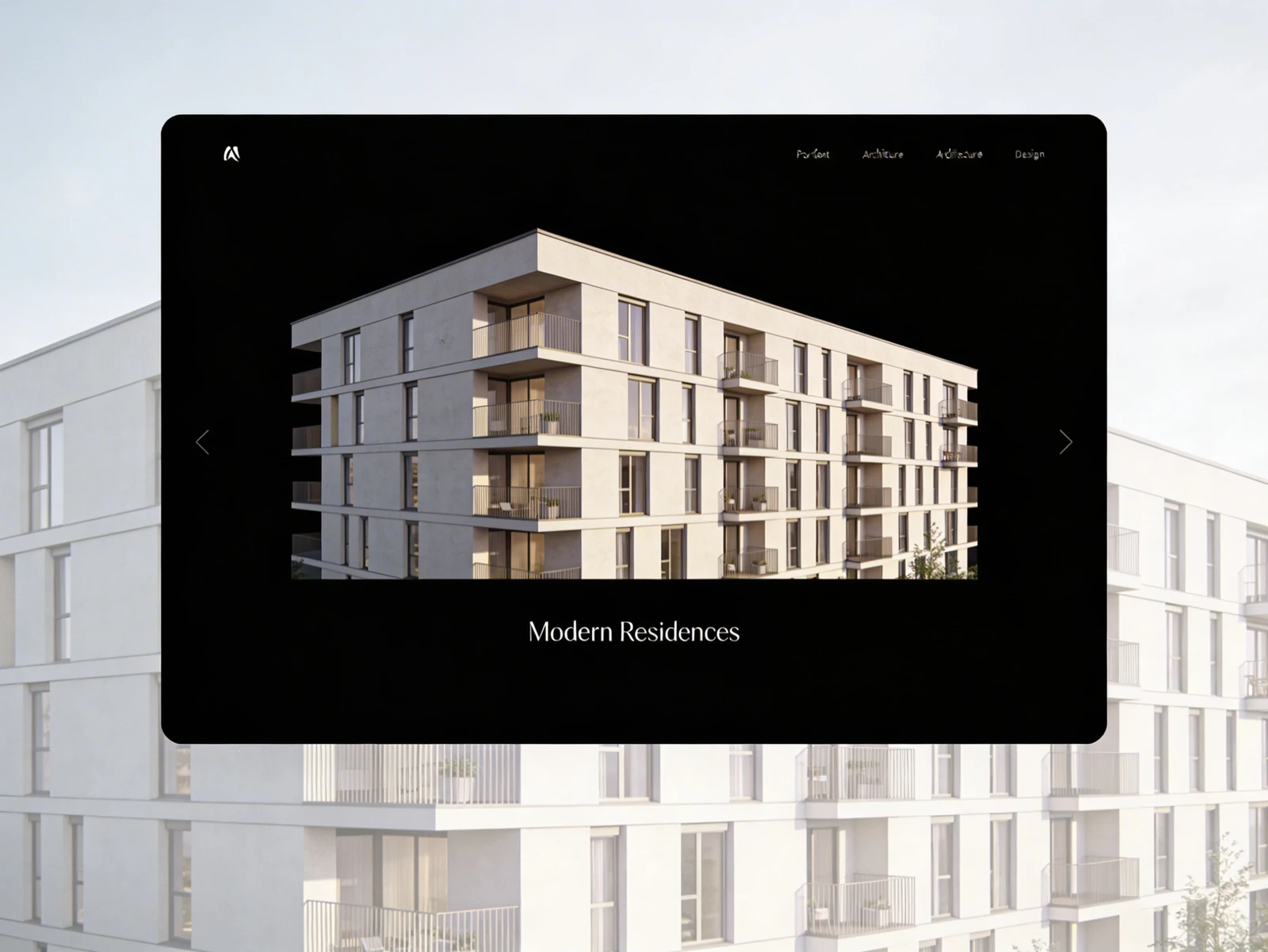
Every successful architectural project page begins identically: with a massive, full-browser-width Hero image.
This image serves a very specific psychological purpose: Context. You must anchor the building to the earth immediately. Do not start your portfolio presentation with an isolated 3D model floating in a white void. The first image must show the environment. Is the building clinging to a rocky cliff in Norway? Is it wedged tightly between two historic brick buildings in Brooklyn?
By establishing the geographical environment immediately, you inform the viewer of the massive constraints you were forced to design around before they even read your first paragraph.
The Concept of 'Progressive Zooming'
Once the environment is established by the Hero image, the rest of the web layout must follow a cinematic "progressive zoom." You are visually walking the recruiter closer and closer into the building as they scroll down the page.
Layer 1: The Macro (Scale and Site) Directly beneath the Hero image, feature your Site Plans and external Massing models. This shows how the building's geometry interacts with the neighborhood or the topography from a birds-eye view.
Layer 2: The Medium (Structure and Space) As the viewer continues to scroll, the layout zooms in. Now you show the interior sections, the floor-plan circulation routes, and the wide-angle interior renders. This layer proves you understand how human beings move through and inhabit the volume you created.
Layer 3: The Micro (Material and Joinery) At the very bottom of the visual grid, you execute the tightest zoom. Dedicate a final gallery to the physical materials. Show the macro-photography of the rusted Corten steel facade fading into the poured concrete foundation. Show the exact CAD detailing of a bespoke window mullion. This final transition from the 'Macro Cityscape' down to the 'Micro Steel Bolt' proves your absolute technical mastery.
Leveraging Negative Space for Blueprints
A floor plan or an exploded-axonometric diagram is inherently chaotic. It is composed of thousands of intersecting vector lines.
If your website layout forces these complex drawings to sit tightly against other photographs, the page becomes visually exhausting. The visual anatomy of a premium layout dictates that technical drawings must "breathe." When you insert a dense blueprint into your portfolio, ensure the website block applies massive padding (negative white space) entirely around the image. Isolating the drawing mimics the experience of laying a blueprint out on a massive, empty drafting table, commanding the viewer's complete focus.
The Absolute Ban on 'Slider' Galleries
For architecture, forced image sliders (carousels) are a navigational disaster.
An architecture recruiter wants to examine your floor plan while simultaneously comparing it to your external render. If those two images are trapped on a timed image slider that automatically scrolls every three seconds, you actively prevent the recruiter from studying your logic.
Your layout must always utilize vertical stacking or uncompressed masonry grids where all images are simultaneously visible or easily scrollable. Never hide vital structural data behind a forced user click.
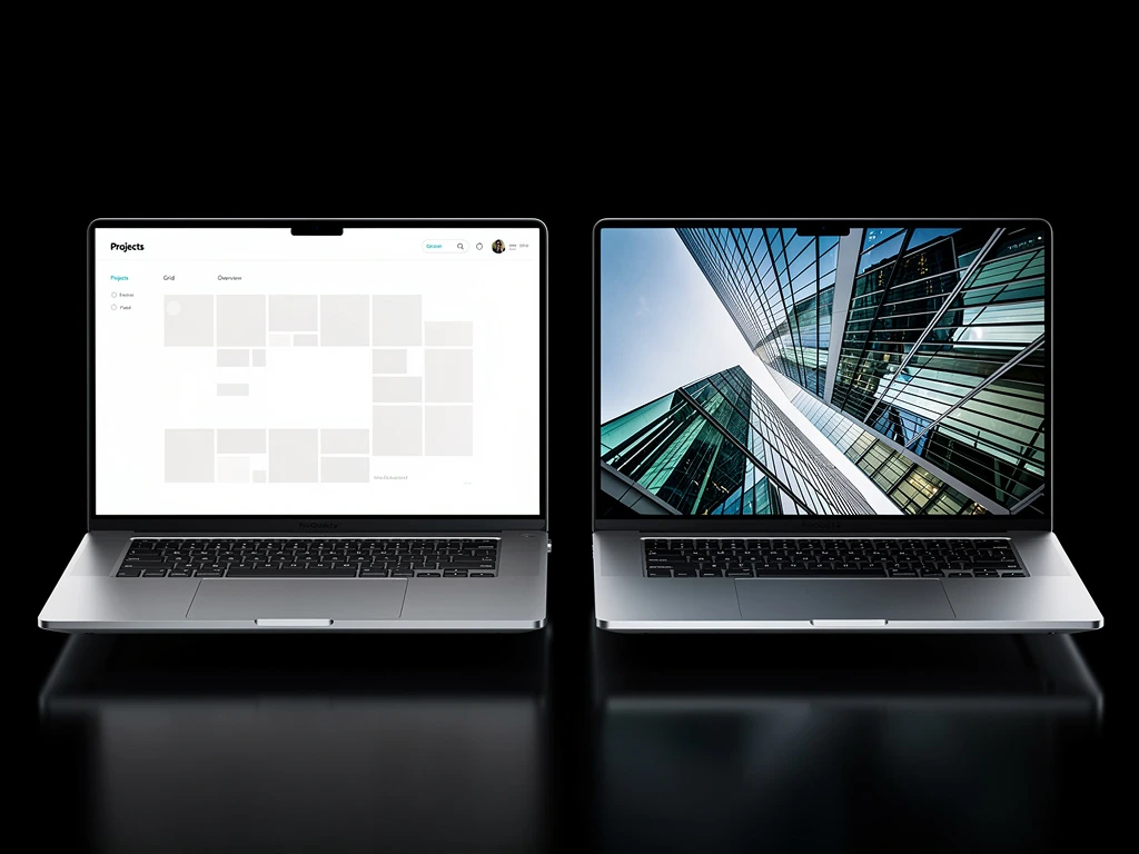
Translate your heavy concrete forms into flawless digital interfaces seamlessly. By utilizing Portfoliobox, you guarantee your architectural blueprints and massive uncompressed environmental renders load instantaneously inside beautiful, responsive vertical grids — no coding required.