When photographers finally decide to launch a digital photo portfolio, the very first hurdle they hit is layout anxiety. They spend hours agonizing over whether a masonry layout perfectly interlocking their vertical and horizontal crops is superior to a rigid, minimalist grid.
However, high-level creative directors and magazine editors do not hire photographers based on how cleverly a website template stacks thumbnails. They hire based on emotional impact. The layout is merely the invisible frame holding the narrative together. If your sequence of imagery feels like a random data dump of your hard drive, the most expensive layout in the world will not save you.
The secret to perfecting your portfolio isn't the CSS grid. The secret is the sequence.
Editing for the 'Hero' Position
Before a client even scrolls, they are met with the 'Hero' section of your website. This is the above-the-fold real estate that defines your brand in less than three seconds.
Inexperienced photographers often use slideshows here, cycling through five distinctly different genres of photography rapidly to prove they are "versatile." This is a fatal mistake. Versatility at the hero level translates to confusion.
Your hero image must be your single strongest, most undeniable photograph. It should instantly communicate your specific niche—whether that is stark architectural photography, high-end bridal, or moody documentary portraiture. Do not ask the viewer to wait for a slider to transition. Hit them immediately with your masterwork.
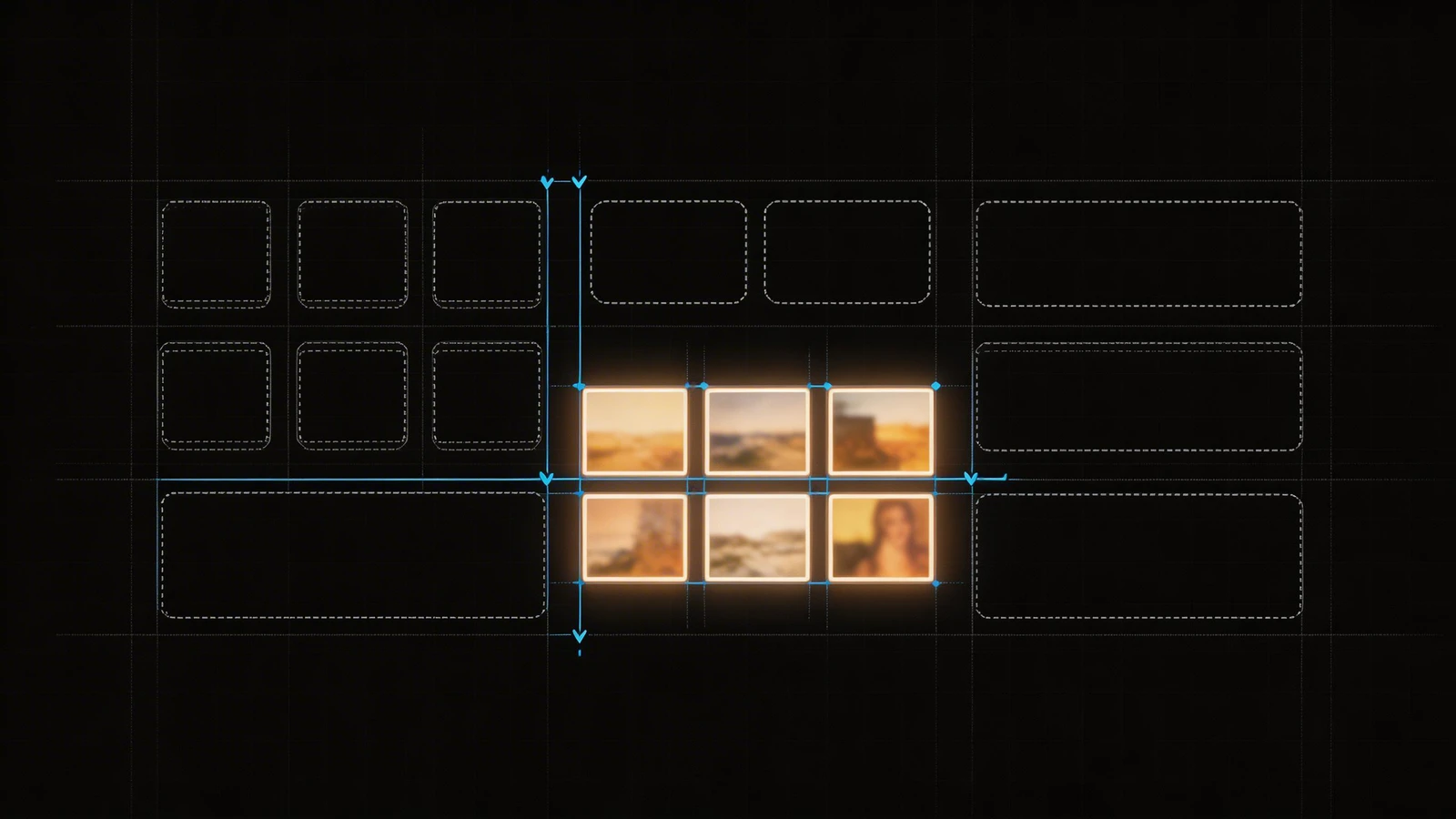
The Rhythm of the Grid: Pausing the Eye
Once the user begins scrolling down your gallery layout, you dictate the rhythm of their eyes.
If you place eight incredibly complex, visually dense photographs next to each other on a grid, the viewer's brain experiences visual fatigue. They will scroll past your best work simply because their eyes cannot find a resting point.
To fix this, utilize pacing. Intersperse a highly detailed landscape or group portrait with a minimalist detail shot—a close-up of hands, a texture, or a vast negative space. This forces the viewer's eye to physically pause and reset before absorbing the next complex frame. The best photo portfolio layouts breathe; they do not scream.
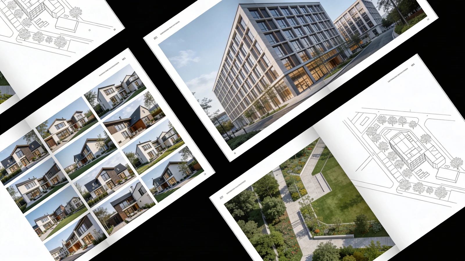
Vertical vs. Horizontal: The Formatting Trap
Many photographers fall into the trap of only displaying images that fit neatly into horizontal 16:9 boxes, cropping out the power of their vertical portraits just to make the website template look symmetrical.
A professional photo portfolio layout bends to the photography, the photography does not bend to the layout. You must select a website builder that natively supports uncropped, unmetered display layouts. If a portrait demands to be seen vertically, let it command the vertical space. Stagger your grid to respect the original camera aspect ratios.
Structuring the 'Deep Dive' Projects
Instead of throwing seventy unrelated images onto your homepage, utilize the homepage as an appetizer. The actual layout should funnel clients into specific, deeply curated 'Projects' or 'Case Studies'.
If you shot an incredible editorial fashion campaign in the desert, build a dedicated sub-page for it. This allows the layout to tell the chronological story of that shoot from dawn to dusk, accompanied by a brief paragraph explaining the client brief and your lighting approach. Clients hire photographers who can execute complete visions, not just those who get lucky with a single shot.
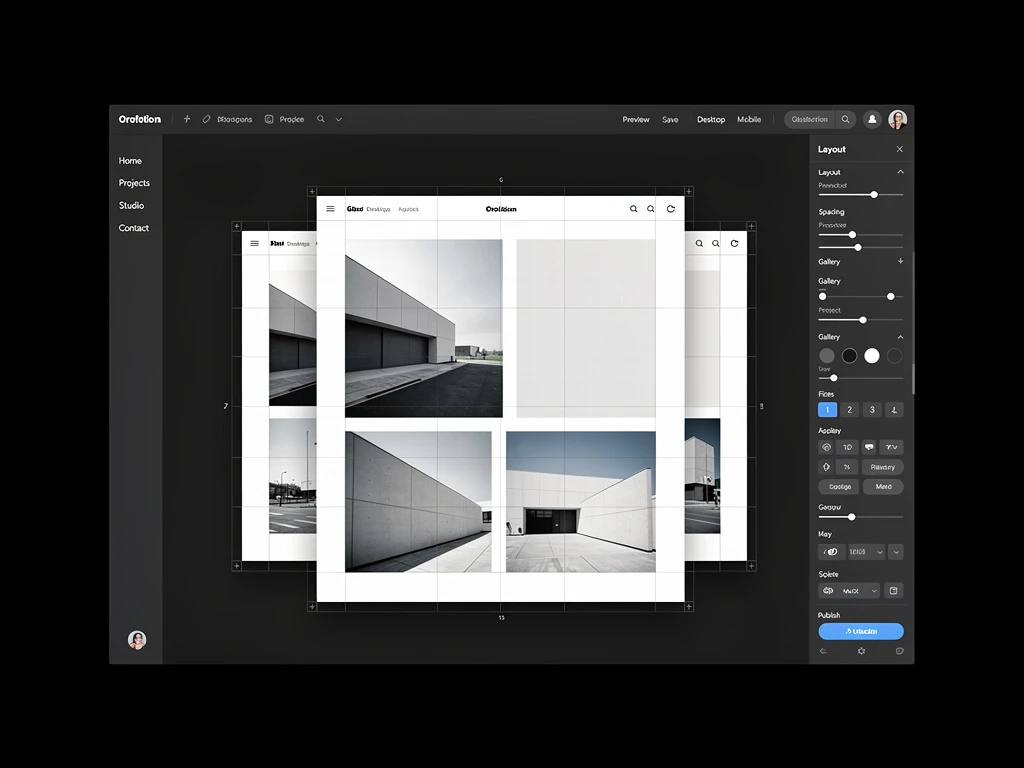
Building an elite layout doesn't require compromising your art for algorithms. With Portfoliobox, you can create a stunning portfolio website built specifically to respect native image ratios and unmetered galleries in minutes — no coding required.