As graduation approaches for creative students—whether in graphic design, photography, illustration, or architecture—the panic of building a portfolio sets in. You are suddenly competing not just against your classmates, but against thousands of established professionals in the global job market.
When art directors and hiring managers review entry-level applications, they can usually spot a student portfolio website within three seconds. They are often cluttered, visually exhausting, and filled with academic exercises rather than real-world solutions. If you want to jump the line and secure a premium agency job or high-paying freelance contracts right out of school, your website must look like it belongs to a seasoned professional. Here is a deep dive into the anatomy of a winning student portfolio website.
1. The Anatomy of the Edit (Hiding the Classroom)
The biggest mistake students make is uploading every assignment they completed over their four-year degree. A hiring manager does not care about the color theory exercise you did in your freshman year.
The Professional Architecture: You must curate your work brutally. A student portfolio website should never feel like a chronological archive. You should only display the 4 to 6 absolute best projects that represent the exact type of commercial work you want to be hired for. A small portfolio of flawless, highly polished work will always beat a massive gallery of inconsistent student assignments.
2. The Anatomy of the Case Study (Proving Intellectual Value)
Students often rely entirely on aesthetics. They upload a flat JPEG of a poster design and assume the visual is enough. However, agencies do not hire junior creatives just to make things look pretty; they hire them to solve business problems.
The Professional Architecture: Do not just build image galleries; build case studies. When an art director clicks on your project, they should see the final polished asset, but they also need to see the "messy middle." Include photos of your initial wireframes, your mood boards, and your rough sketches. Write two paragraphs explaining the strategic brief (even if it was a self-initiated project) and how you executed it. Demystifying your process proves you have a professional, reliable pipeline.
3. The Anatomy of the Layout (Visual Pacing)
If you use a cheap, mass-market website builder, it will force your work into a rigid, uniform square grid. This auto-crops your images and creates a boring, monotonous scrolling experience.
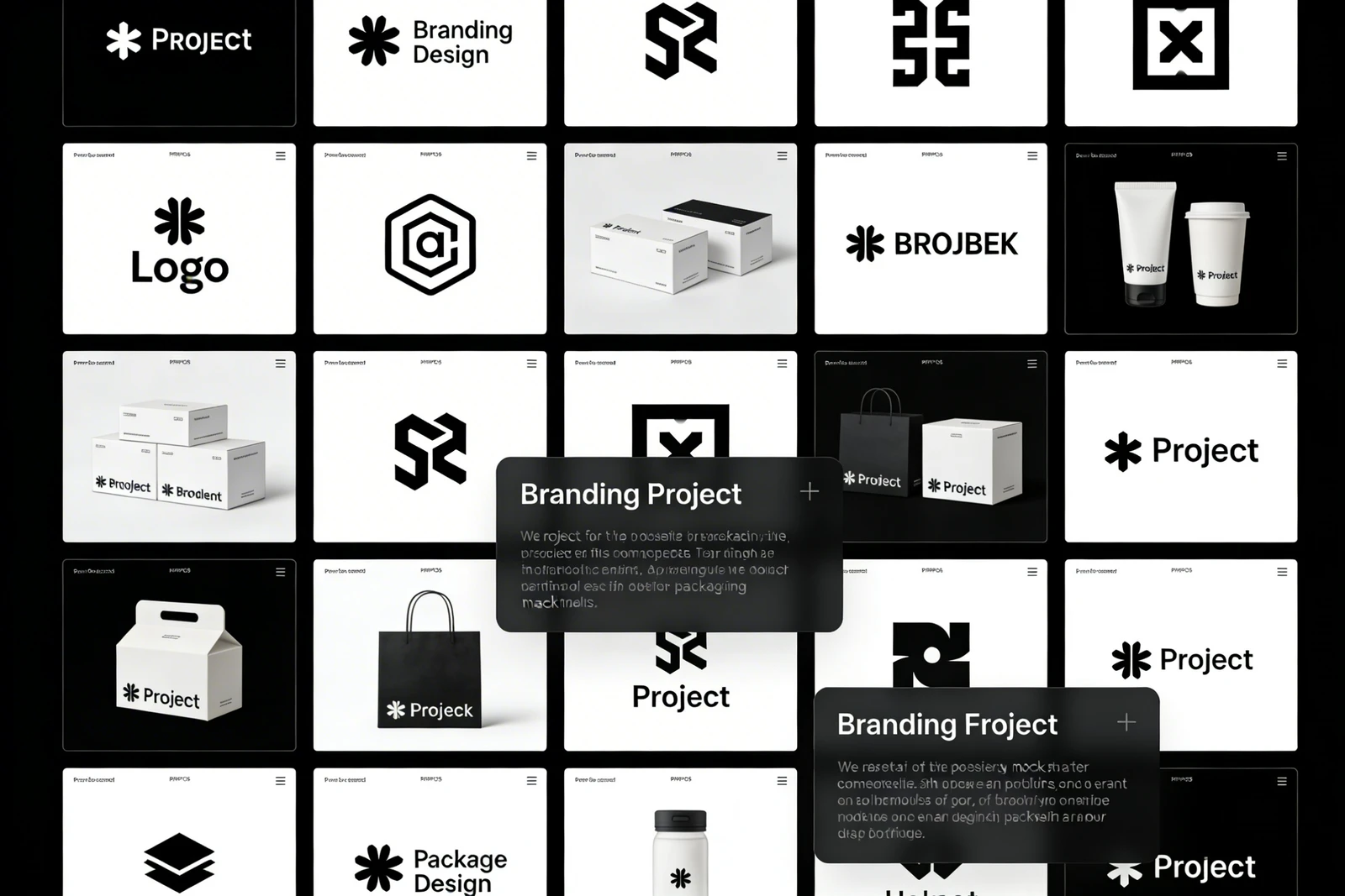
The Professional Architecture: Stand out from your classmates by using dynamic, asymmetrical masonry layouts. Place a massive, full-screen horizontal image next to two smaller vertical studies. Increase the negative space (padding) between your projects significantly. This mimics the layout of a high-end editorial magazine, proving you understand visual pacing and luxurious presentation.
4. The Anatomy of the Interface (The Invisible Frame)
Students love to prove how "creative" they are by over-designing their website interface. They use bright background colors, complex scroll animations, and whimsical typography. This creates visual clutter that competes with the actual portfolio work.
The Professional Architecture: The best presentation is invisible. Replicate a high-end contemporary art gallery. Use a stark white or deep black background. Use a clean, geometric sans-serif font. When the website design disappears, the vibrant details of your creative work command 100% of the viewer's attention.
To transition from student to professional, you need a platform that understands premium visual presentation. With Portfoliobox, you have access to the minimalist layouts, dynamic masonry grids, and uncompressed rendering required to build a world-class student portfolio website — no coding required.