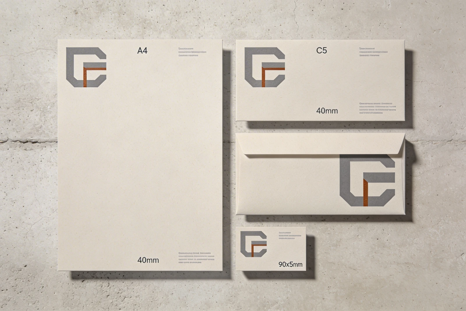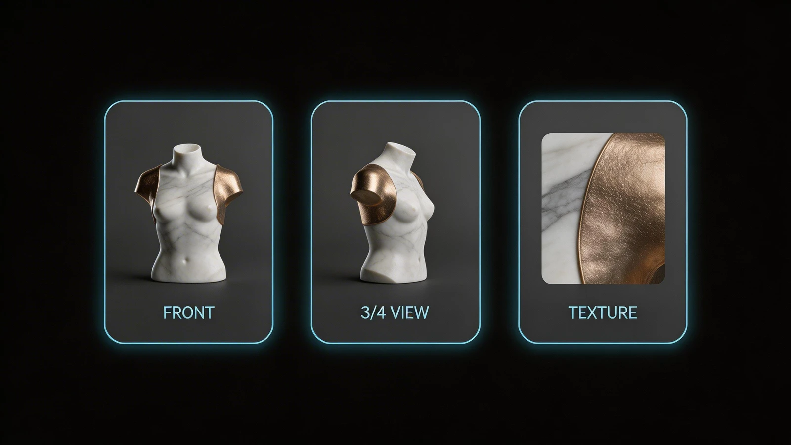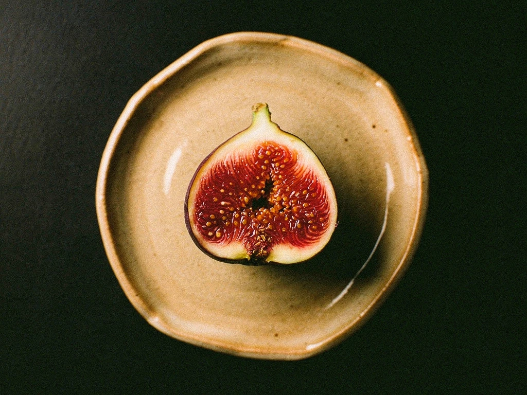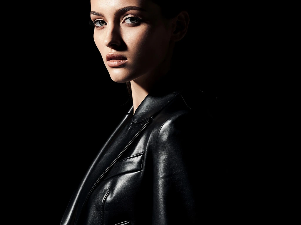
For creative directors, stylists, interior designers, and brand strategists, the final output is often a physical space, a photoshoot, or a comprehensive brand identity. But before that physical reality exists, the project lives as a mood board.
Historically, mood boards were physical collages of magazine clippings. Today, they are digital. However, many creatives make the mistake of presenting these digital mood boards by simply sending a client a messy Pinterest link or a chaotic Google Drive folder. This is a massive failure in presentation. If you are charging a client thousands of dollars for creative direction, the inspiration itself must look expensive. You must build a dedicated mood board website. Here is a deep dive into the architecture required to build a presentation that secures high-end client approval.
1. The Architecture of Focus (Removing Distractions)
When you send a client to Pinterest, you are sending them to a platform designed to distract them. The interface is cluttered with ads, suggested pins, and external links.
The Professional Solution: A professional mood board website must be a closed, focused environment. The architecture requires a "White Cube" aesthetic. The background should be stark gallery white or pure black. There should be no external links, no navigation menus to unrelated projects, and absolutely no ads. The client's attention must be forced entirely onto the curation of your images.
2. The Asymmetrical Masonry Grid
A mood board is, by definition, a collage. If you use a standard website template that forces your images into a rigid, uniform square grid, you destroy the organic flow of the inspiration.
The Professional Solution: The core architecture of a successful mood board website relies on an asymmetrical masonry layout. You must be able to interlock a massive, wide-angle architectural photograph with a tight, vertical macro shot of a fabric texture. This varied sizing creates a dynamic, editorial rhythm that feels intentionally curated rather than algorithmically generated.
3. The Power of Intentional Negative Space
Amateur mood boards are chaotic because the images are crammed together edge-to-edge. It creates visual noise, making it impossible for the client to parse the individual elements.
The Professional Solution: Luxury is defined by space. You must inject massive amounts of negative space (padding) between the images in your masonry grid. This invisible frame gives the images room to breathe. It allows the client to appreciate the texture of a specific reference photo before moving on to the next, elevating the perceived value of your curation.
4. Contextualizing the Imagery (The Typography)
A mood board of just images can be interpreted in a dozen different ways. You must guide the client's emotional response.
The Professional Solution: Integrate sleek, minimalist typography directly into the layout. Beneath a specific grouping of images, include a brief, one-sentence caption explaining why those images were chosen (e.g., "Note the brutalist concrete textures contrasting with the warm, organic lighting"). Use a clean sans-serif font. The text should act as a subtle guide, ensuring the client understands the strategic direction behind the aesthetic.
Presenting creative direction requires a platform that offers absolute layout freedom. With Portfoliobox, you can utilize dynamic masonry grids and deep typographical controls to build a pristine, professional mood board website in minutes — no coding required.