Three years ago, I was stuck in the freelance trenches. I was a highly skilled brand identity designer, working 60 hours a week, but I was constantly competing on price. I was taking on $500 logo projects because I couldn't seem to attract the $5,000 corporate retainers I knew I was capable of executing.
I blamed the market. I blamed the algorithm. I blamed everything except the actual problem: my digital presentation. My website was built on a free, mass-market template. It was cluttered with ads, my images were heavily compressed and blurry, and the layout was a rigid, boring square grid. It looked like a hobbyist's blog, not a luxury design agency. The turning point in my career happened the day I decided to stop presenting myself as a cheap freelancer. Here is the story of how upgrading to a professional portfolio website completely scaled my business.
The Revelation: Perception is Reality
I pitched a massive rebranding project to a boutique hotel chain. I put hours into the proposal. They ended up hiring a different designer who, frankly, was not as technically skilled as I was.
I reviewed the winning designer's website, and it hit me like a ton of bricks. Their website was a masterclass in luxury presentation. It used massive, uncompressed images. The typography was elegant. It looked like an editorial magazine. I realized that corporate clients are actively looking to minimize risk. They don't want to hire a messy freelancer; they want to hire a structured professional. The way you present your work dictates the price you can charge for it.
The Rebuild: Applying Agency Standards
I decided to completely tear down my website and build a professional portfolio website from scratch, applying strict agency standards.
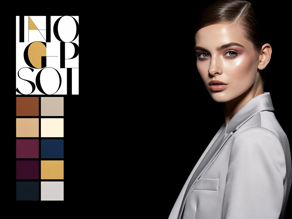
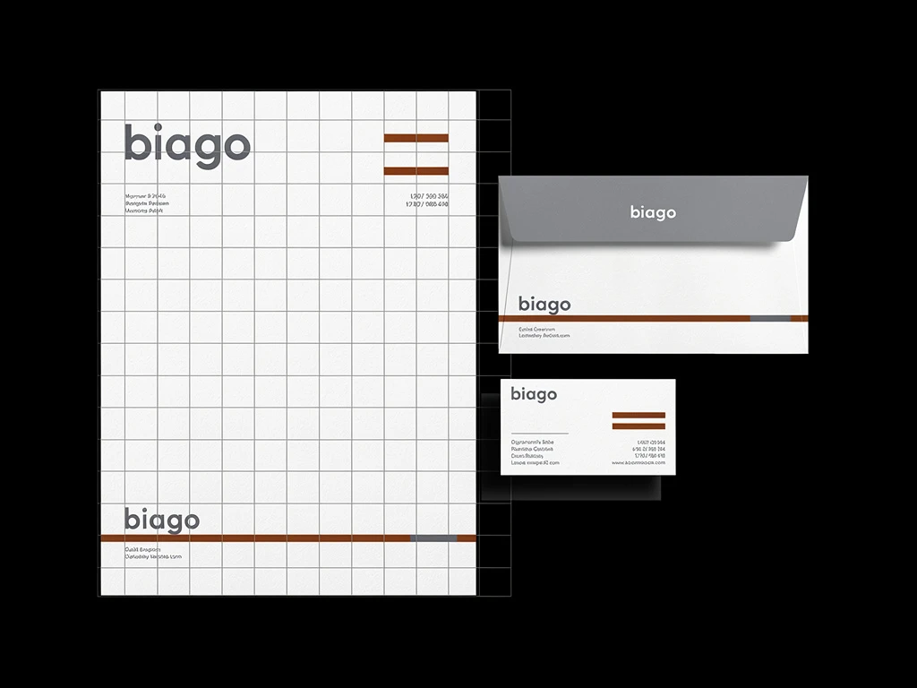
1. The "White Cube" Aesthetic: I ditched the cheap, textured backgrounds of my old template. I migrated to a premium platform designed for creatives. I set the background to stark white and used a clean, geometric sans-serif font. The interface became an invisible frame, forcing my colorful branding projects to command the screen.
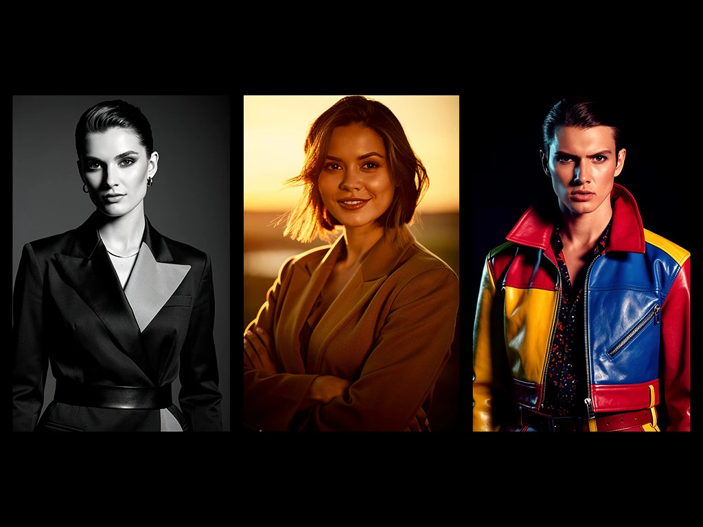
2. Visual Pacing: Instead of a boring, uniform grid, I used an asymmetrical masonry layout. I placed a massive, full-screen image of a logo mockup next to two smaller vertical images of business cards. This created a dynamic, curated scrolling experience that felt expensive.
3. Proving the Process: I stopped uploading flat JPEGs. I turned my galleries into case studies. I included photos of my rough sketches and wrote brief paragraphs explaining the strategic problem-solving behind the designs. I proved to the client that they were paying for my brain, not just my mouse clicks.
The Breakthrough
The final step was integrating a clean e-commerce booking system directly onto the site, allowing clients to pay for a $200 initial consultation seamlessly.
Within a month of launching the new, highly curated site, I stopped getting emails haggling over $50. Two months later, the hotel chain that had originally rejected me reached out for a new project—they had kept my new URL on file and were blown away by the rebrand.
If you are tired of competing on price, you must elevate your presentation. With Portfoliobox, you get the uncompressed rendering, minimalist layouts, and zero-commission commerce tools you need to build a world-class professional portfolio website — no coding required.