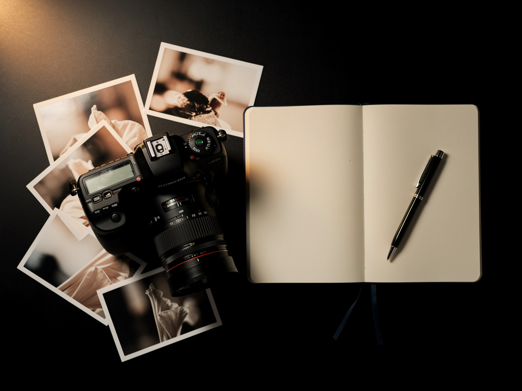
When an agency calls a creative director to pitch you as the lead makeup artist for a major campaign, they don't send a link to your Instagram or a messy Dropbox folder. They send a link to your presentation website.
In the high-stakes commercial beauty industry, a presentation website acts as your digital pitch deck. It must instantly communicate your technical skill, your aesthetic range, and your professionalism. If your website is slow, disorganized, or visually unappealing, you will lose the job before you even get an interview. Here is a deep dive into mastering presentation websites specifically for the makeup industry.
The Architecture of a Pitch
Unlike a general blog or a social media feed, presentation websites are architected with a singular goal: to guide the viewer toward booking you. This requires a highly structured, frictionless user experience.
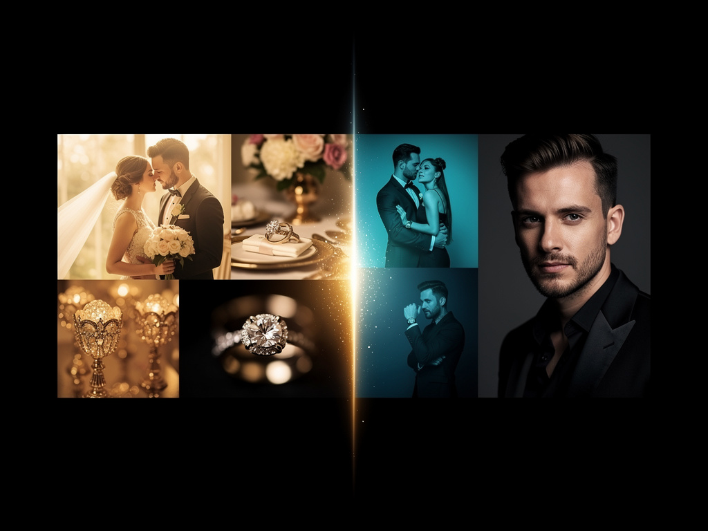
The art director reviewing your site is likely looking at ten other artists that day. Your site architecture must be instantly intuitive. Ensure your main navigation is simple and always accessible, typically categorized by the disciplines you shoot:
- Commercial / Advertising
- Editorial / High Fashion
- Beauty / Skincare (Macros)
- Red Carpet / Celebrity
If an art director is casting a skincare commercial, they need to click "Beauty / Skincare" and immediately see your flawless, unretouched skin work. Do not make them hunt.
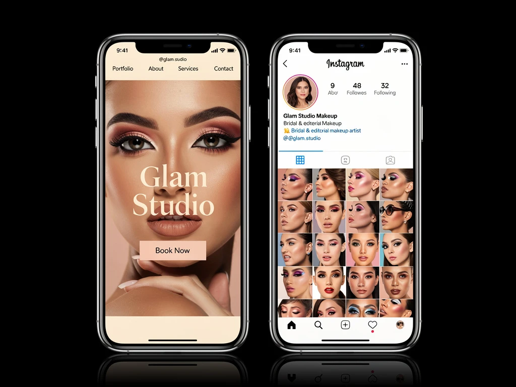
The Importance of the "Hero" Image
Your homepage is the most critical real estate on your presentation website. You have roughly three seconds to make an impression.
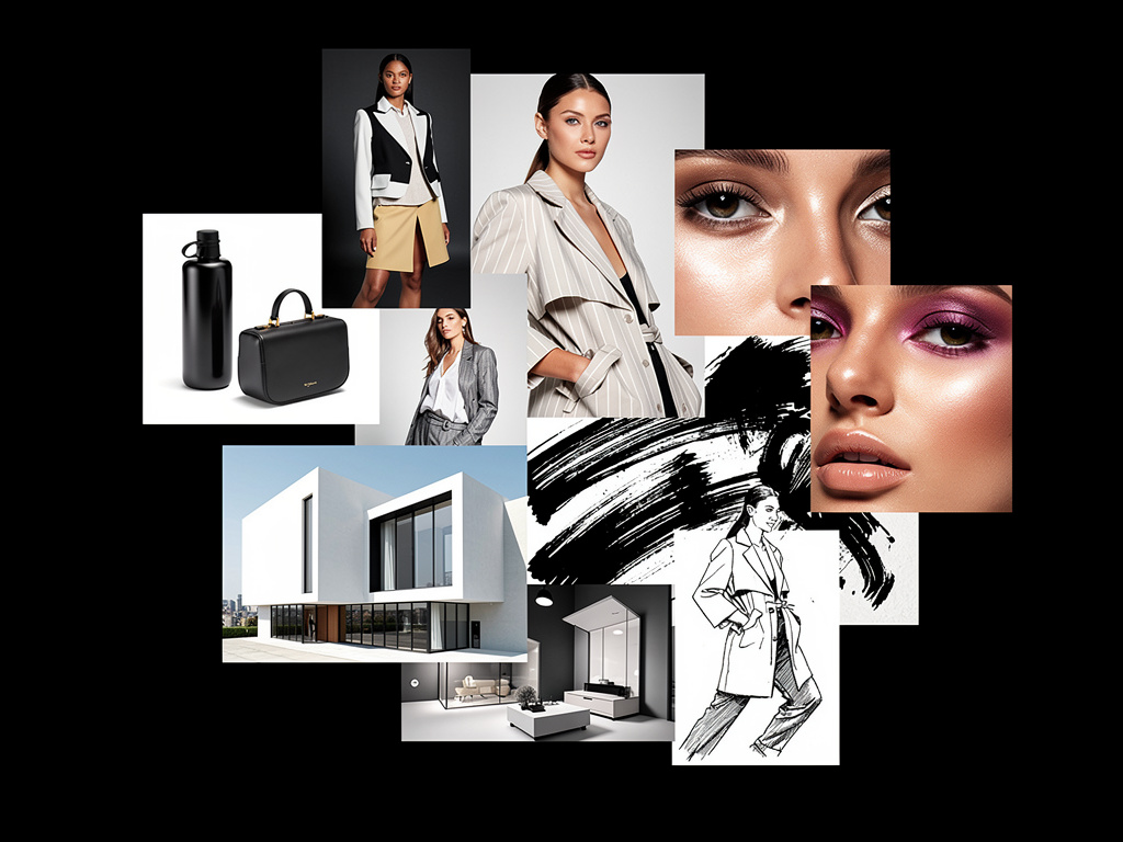
You must feature a "hero image" or a hero video. This is a massive, high-resolution visual that spans the top of your homepage. It must be your absolute strongest piece of work. For a makeup artist, this is usually a stunning macro beauty shot or an auto-playing cinemagraph of a model showcasing flawless skin texture. If the hero image is weak, the client will rarely scroll down to see the rest of your portfolio.
Ruthless Editing and Curation
Presentation websites require ruthless editing. One of the biggest mistakes makeup artists make is treating their website like an archive rather than a curated exhibition.
If you have a gallery with 50 images, the client will only look at the first five. If those first five are not your best work, you lose. It is vastly superior to have a gallery of only 8 perfect, publication-ready tear sheets than a gallery of 40 mediocre ones. You are judged entirely by your weakest image. Remove anything that does not reflect the caliber of work you want to be hired for today.
The Professional "About" and "Contact" Pages
While your images sell your skill, your "About" page sells you. High-end clients need to know they can trust you on a high-pressure set.
Your biography should be concise and written in the third person. Highlight your training, your major publications (Vogue, Harper's Bazaar), and any notable celebrity clients or brand campaigns. Crucially, your contact page must be frictionless. Provide a direct professional email address (not a generic Gmail account) and a simple contact form.
Building an elite presentation website is the fastest way to signal your value to the industry. With Portfoliobox, you can create a stunning, agency-grade digital presentation in minutes — no coding required.