Building a digital portfolio is often the most stressful part of a creative professional's career. When you finally sit down to build the site, staring at a blank template can be paralyzing. You are a master of your specific craft—whether that is photography, illustration, or copywriting—but you are not necessarily a web developer.
Because of this paralysis, many freelancers simply drag their images into the default template provided by a cheap website builder and call it a day. The result is a generic, corporate-looking website that actively devalues their creative brand. If you want to command high-end rates and secure premium clients, you must architect your website deliberately. Here is how to apply professional portfolio website ideas to elevate your brand from amateur to agency-grade.
Idea 1: The "Invisible Frame" Approach
The biggest mistake creatives make is assuming their website needs to look highly "creative." They add bright background colors, complex animations, and custom mouse cursors. This is a massive error. When a client is confused by a website's navigation, they leave.
How to implement: Treat your website like a high-end contemporary art gallery. The walls of a gallery are stark white for a reason. Strip away all the web design elements. Set your background to pure white or deep charcoal black. Use a clean, minimalist sans-serif font. Make the interface completely invisible. When the website disappears, the vibrant colors and details of your creative work become the sole focus of the client's attention.
Idea 2: Transition from "Galleries" to "Case Studies"
Uploading a flat JPEG of a finished project with zero context is a missed opportunity. Clients don't just hire you for the final image; they hire you for your ability to solve their problems reliably.
How to implement: Build deep-dive case studies. When a client clicks on a project, don't just show the final logo or photograph. Show the rough sketches. Show the lighting diagrams. Show the rejected color palettes. Write a brief paragraph explaining the client's initial brief and the specific strategy you used to execute it. Demystifying your process proves your intellectual value and justifies premium pricing.
Idea 3: The Asymmetrical Editorial Layout
Generalist website builders force your work into rigid, uniform square grids. This auto-crops your compositions and creates a boring, monotonous scrolling experience. It makes your website look like a database.
How to implement: Ditch the uniform grid. Use a platform that allows for asymmetrical masonry layouts. Place a massive, full-screen horizontal image next to two smaller vertical studies. Increase the negative space (the padding) between the images dramatically. This varied sizing creates "visual pacing," making your website feel like a curated, high-end editorial magazine.
Idea 4: Contextual Mockups
A digital file on a screen feels cheap. You must prove the physical value of your work.
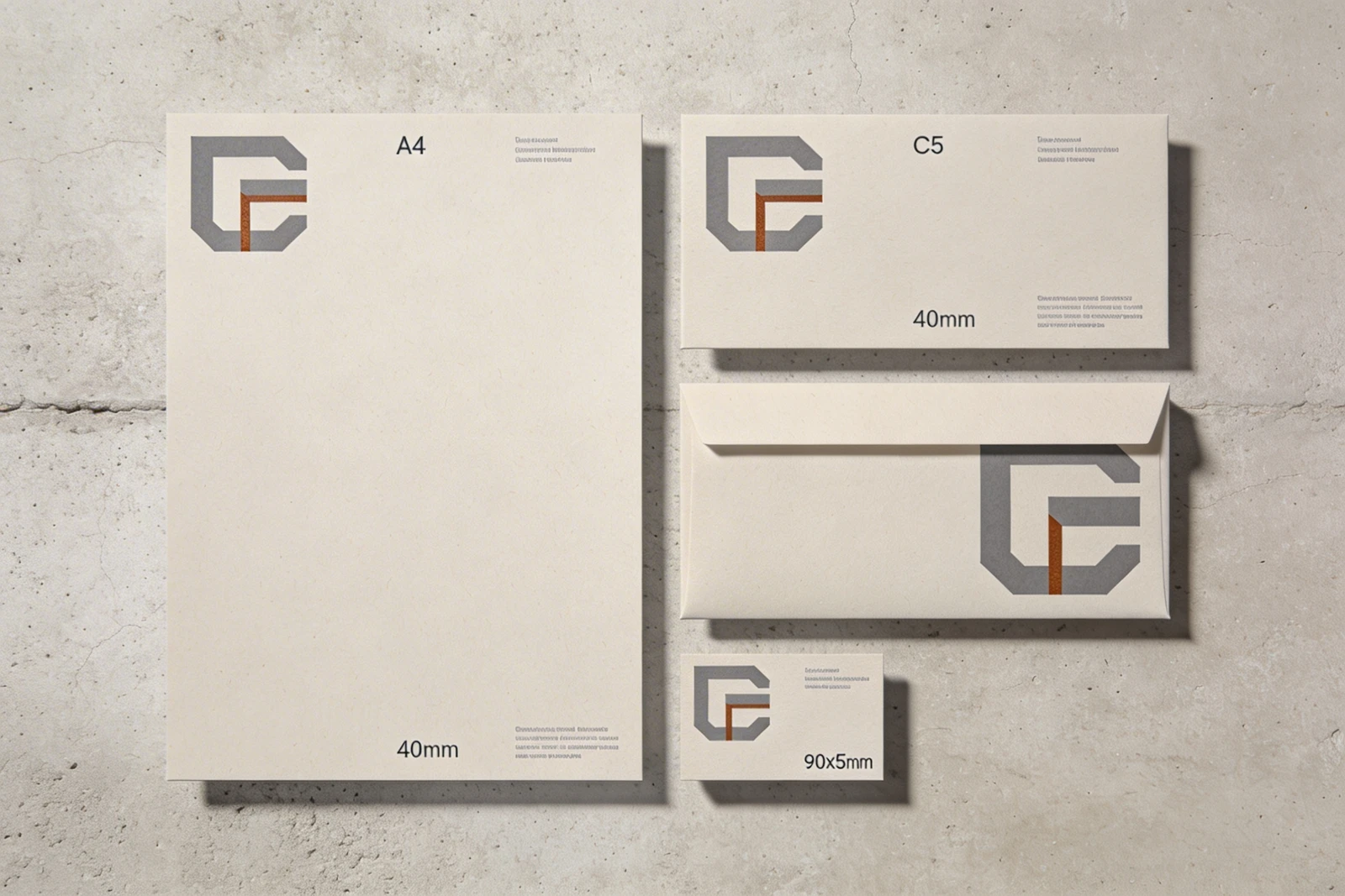
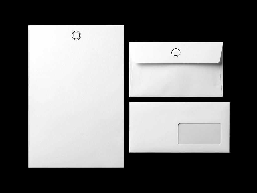
How to implement: Never just upload a flat file. If you designed a brand identity, use high-resolution digital mockups to show that logo embossed on a leather notebook or printed on a premium business card. If you are a photographer, show the photo beautifully framed in a modern living room. Contextualizing your work in the real world significantly increases its perceived value.
Executing these ideas requires a platform built specifically for creatives. With Portfoliobox, you have access to the minimalist layouts, massive uncompressed imagery, and dynamic masonry grids required to implement these premium portfolio website ideas — no coding required.