You have spent years honing your craft. Your hard drive is full of stunning branding projects, elegant UI designs, and clever illustrations. But when you send your website link to art directors, the response is crickets.
If your work is great but you aren't booking clients, the problem usually isn't your talent—it is your portfolio page design.
Many designers fall into the trap of over-designing their portfolio container, making it so complex or confusing that the actual work gets lost in the noise. The solution is to approach your portfolio with a UX mindset, stripping away friction and guiding the client exactly where you want them to go. Here is a guide to mastering your portfolio page design.
The Problem: The "Over-Designed" Portfolio
Designers love to show off. When building a portfolio, the temptation is to use every trendy technique available: scroll-hijacking, complex WebGL animations, hidden menus, and experimental typography.
The problem is that the people hiring you—art directors, creative directors, and business owners—are incredibly busy. When an art director has to review fifty portfolios in an afternoon, they do not want to hunt for a hidden navigation menu. They do not want to wait for a 15-second loading animation. If your portfolio page design creates friction, they will simply close the tab and move on to the next candidate.
Your portfolio is the frame; your work is the painting. When the frame is louder than the painting, you have failed the fundamental task of presentation.
The Solution: Designing for Clarity and Conversion
To book more clients, your portfolio page design must prioritize clarity, speed, and usability. Here is how to fix the most common portfolio design issues.
1. Establish a Clear Visual Hierarchy
When a user lands on your homepage, their eye should naturally flow from the most important element to the least.
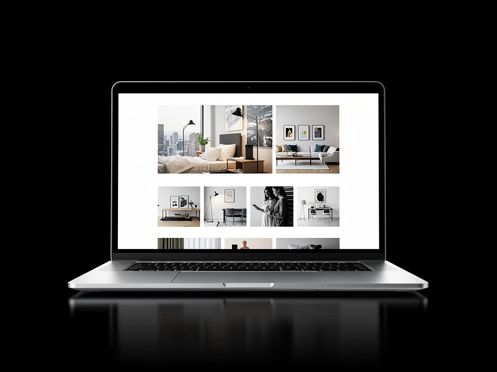
Start with a clear, concise hero statement that explains exactly who you are and what you do (e.g., "I am a brand designer specializing in sustainable tech"). Immediately below this, feature your strongest work. Do not bury your case studies behind multiple clicks. Use a clean grid layout that allows your project thumbnails to breathe. The hierarchy should dictate that the work is always the loudest element on the page.
2. Kill the Hamburger Menu on Desktop
While hamburger menus are necessary for mobile design, they add unnecessary friction on desktop layouts. If you only have three pages (Work, About, Contact), there is absolutely no reason to hide them behind a click.
Expose your navigation. Put it clearly in the header. Make it effortless for a potential client to switch from viewing your case studies to reading your bio. Seamless navigation keeps the user on your site longer, increasing the chances of an inquiry.
3. Structure Your Case Study Pages
The design of the individual project page is where deals are closed. Do not just upload a single massive JPEG of your project.
Design the case study page to tell a story. Use a full-width hero image to grab attention. Then, use typography and whitespace to break down the brief, the process, and the solution. Alternate between full-width imagery and text blocks to create a pleasing rhythm as the user scrolls. Good portfolio page design guides the reader through your thought process logically and beautifully.
4. Optimize for Mobile and Performance
A beautiful desktop site is useless if it breaks on an iPhone. A significant percentage of your traffic will be mobile. Your portfolio page design must adapt fluidly, ensuring that text remains legible and images scale appropriately without requiring the user to pinch and zoom.
Furthermore, optimize your image assets. Use modern formats like WebP or compress your JPEGs aggressively. A portfolio that loads in under two seconds demonstrates technical competence and respect for the user's time.
5. Always Provide a Next Step
The biggest mistake in portfolio page design is leading the user to the end of a project and leaving them hanging. What do you want them to do next?
At the bottom of every case study, include clear calls to action. Offer a "Next Project" button to keep them browsing your work. More importantly, include a prominent "Hire Me" or "Let's Talk" button that leads directly to your contact form. Design the flow so that reaching out to you feels like the natural conclusion to viewing your work.
The Invisible Portfolio
The best portfolio page design is almost invisible. It gets out of the way and allows your creative work to shine. By prioritizing user experience, clear navigation, and strategic calls to action, you transform your website from a confusing art project into a professional client-booking machine.
Building your portfolio doesn't have to be complicated. With Portfoliobox, you can create a stunning portfolio website in minutes — no coding required. Utilize their clean, UX-optimized templates to present your work flawlessly and start booking more design clients today.