A beautiful homepage grid is designed to capture a client's attention. But the actual booking happens on the individual portfolio page.
Many graphic designers spend three weeks obsessing over the exact alignment of their homepage masonry layout, but completely neglect the individual case study pages beneath it. When a visitor clicks on a specific project—say, your branding suite for a local brewery—and they are met with a single, tiny unformatted image and no text, the professional illusion collapses.
If you are generating traffic but failing to secure freelance commissions, your core conversion failure is happening at the project level. To transform casual browsers into paying clients, you must optimize your individual portfolio page design utilizing these exact psychological and structural rules.
1. Eradicate 'Dead End' Routing
The most fatal flaw in individual portfolio page design is the creation of 'dead ends'.
When a creative director reaches the absolute bottom of an incredible, expansive branding case study, what happens? On amateur sites, nothing happens. The page simply ends. The user is forced to manually scroll all the way back to the top of the browser to click the 'Home' button and start over.
This friction kills conversions. Every single project page must include fluid routing at its conclusion. When the user finishes reading a case study, there should be a prominent, elegantly designed "Next Project: [Project Name]" button immediately available. Keep them trapped in a continuous loop of your brilliant work.
2. Inverting the Text-to-Image Ratio
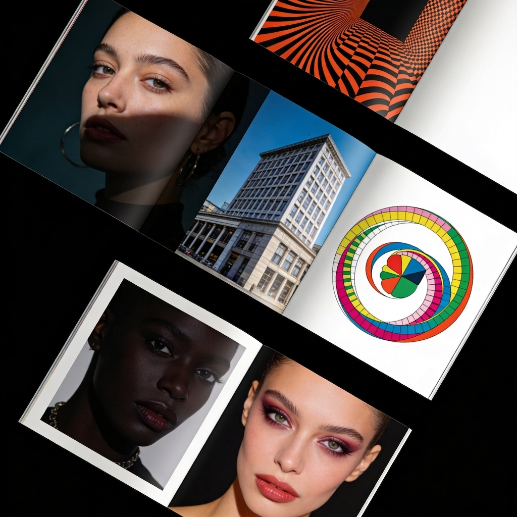
Designers are inherently visual creatures, leading them to upload twenty massive images of a logo while completely ignoring the value of copywriting.
However, clients hire designers to solve business problems, not just to draw shapes. If your portfolio page lacks text, the client has zero context regarding the complexity of the problem you solved.
To optimize conversion, enforce a strict "Context Block" at the very top of the individual page, immediately below the primary hero image. This block should concisely outline:
- The Client: (Who they are)
- The Challenge: (What was broken)
- The Solution: (Why your design fixed it)
After that text block is consumed, you may bombard them with your massive, uncompressed visual deliverables.
3. The Power of the Inline Call to Action (CTA)
If you just laid out a stunning 3,000-pixel-long case study detailing how you completely revitalized an e-commerce brand's User Interface, the client reading it is highly activated. They are currently thinking, "I wish my app looked like this."
Do not waste this emotional peak. Right next to the final polished imagery of the case study, insert a subtle but actionable Call to Action (CTA). A simple hyperlinked sentence stating, "Looking to modernize your mobile application? Let's discuss your interface," natively embedded inside the project page will pull massive conversion rates compared to hoping they find your dedicated contact tab.
4. Utilize 'Progressive Disclosure' for Assets
An optimized portfolio page design never shows the client everything at once. It utilizes the concept of 'Progressive Disclosure'.
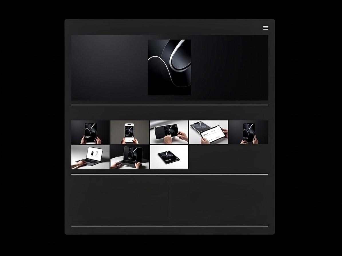
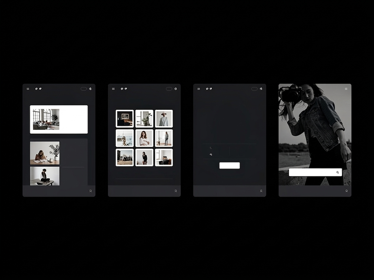
Do not cluster all of your branding mockups into a single, dense 6-image grid at the top of the page. Spread them out. Frame a wide shot of the new logo on a storefront banner. Force the user to scroll down to read a single paragraph of text. Then hit them with a massive, full-screen macro shot of the textured business card.
By strategically dripping the visuals sequentially down an extended vertical layout, you artificially increase the time the user spends on the page. In digital marketing, increased 'Time on Page' directly correlates with increased brand trust and conversion likelihood.
Converting web traffic into money requires a platform engineered around frictionless architecture. With Portfoliobox, you can build dense, high-converting individual case studies complete with automatic 'Next Project' routing and elegant inline text blocks in minutes — no coding required. Explore design templates to get started.