When you cross the threshold from Graphic Designer to Senior Product or UX/UI Designer, the deliverables you are hired to produce change dramatically. You are no longer responsible for a single marketing graphic; you are responsible for maintaining the visual and functional logic of massive, multi-platform digital products utilized by millions of users.
To secure a Lead Product Design role at a technology company, your portfolio must demonstrate your ability to construct and manage a global Design System—the comprehensive library of reusable components, typography scales, spacing rules, and interactive states that govern an entire application.
The fundamental problem is one of presentation. Design systems are inherently microscopic and exhaustingly dense. If you simply export 400 artboards of button states and dump them onto your website, the hiring manager will bounce due to catastrophic cognitive overload. Here is the architectural guide to structuring dense design systems effortlessly.
The Macro to Micro Narrative Arc
The biggest mistake designers make when presenting systems is skipping straight to the atoms without showing the entire organism.
No one cares about your perfectly constructed 4-pixel border-radius logic if they do not understand what the application actually does. When structuring a Design System case study on your portfolio, strictly enforce a 'Macro to Micro' narrative:
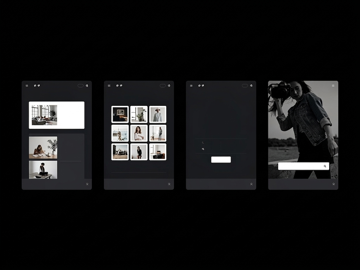
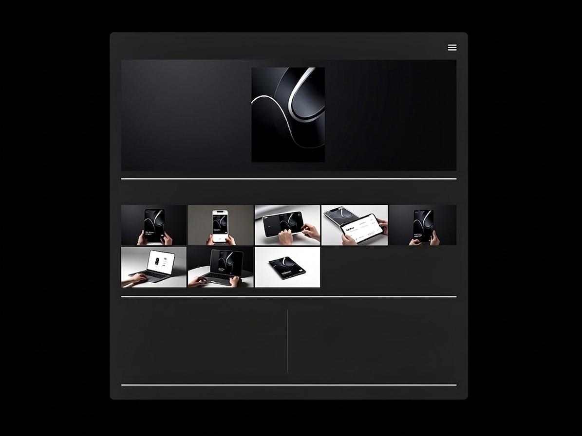
- The Hero App: Begin the case study with a gorgeous, high-fidelity mockup of the final, polished product operating in the real world (e.g., an app running on an iPhone).
- The Problem: Briefly explain the chaos that existed before the design system. Was the engineering team wasting hours rebuilding buttons? Was the brand visually fractured?
- The Micro Foundation: Now you can zoom in. Show the baseline typography scales, the primary color tokens, and the spacing grid logic.
- The Component Library: Finally, illustrate how those baseline tokens assemble into complex interactive components (Navigation bars, Modals, Cards).
By providing the polished context first, the dense technical library beneath it suddenly has tangible meaning.
Grouping by 'Functional Anatomy'
A design system is not a random collection of vector shapes; it is functional architecture. If your portfolio displays an error dialogue box right next to a branding color palette, the narrative is incoherent.
You must utilize clear typographic sub-headers within your portfolio layout to group the system structurally. Segment your presentation into distinct visual buckets:
- Core Tokens (Colors, Shadows, Typography)
- Interactive Elements (Buttons, Toggles, Sliders)
- Data Display (Tables, Avatars, Badges)
- Navigation (Tabs, Breadcrumbs, Sidebars)
This explicit grouping proves to an engineering manager that your brain is organized logically, mirroring the exact folder structure they will use in their React or Swift codebase.
Show, Don't Just Tell, The Interaction
Providing a static flat image of a slider component is useful, but providing a visual demonstration of how that slider behaves when a user clicks it is undeniable proof of seniority.
A premium design system portfolio heavily curates interactive states. Instead of uploading static screenshots of "Hover," "Active," and "Disabled," utilize your portfolio's ability to embed lightweight videos or high-resolution GIFs. Show the micro-interactions. Show how the input field shakes violently and turns red when a user enters the wrong password. When a hiring manager can literally see the kinetic logic of your system, your perceived value skyrockets.
Restraining the Data Dump
You do not need to show every single screen of a 500-page application to prove you built a design system. You only need to show enough to prove that the system scales.
Curation remains your most valuable tool. Select the three most complex components you engineered, highlight the logic behind them comprehensively, and rely on the overarching narrative to carry the rest. A hiring manager assumes that if you can perfectly logic out an incredibly dense multi-variant data table, you also know how to make a standard dropdown menu.
Presenting complex data architectures requires a digital platform that respects heavy assets and vast negative space. With Portfoliobox, Senior UX Designers can effortlessly embed high-fidelity interaction videos alongside massive, uncompressed spacing grids to cleanly present their massive systems — no coding required. Explore design templates to see how other designers structure their systems effectively.