When a fine artist decides to build a website, the most common mistake is focusing entirely on the artwork and ignoring the architecture of the site itself. They assume that if the paintings are good, the website structure doesn't matter.
However, high-end art collectors and gallery curators do not just buy art; they buy into a brand. If your website is confusing, cluttered, or difficult to navigate, it signals that you are an amateur. To command premium prices, your digital presentation must be as meticulously crafted as your canvas. By studying the industry's most successful online portfolio examples, we can identify a very specific, repeatable architecture. Here is a deep dive into the anatomy of a world-class digital gallery.
1. The Power of the Single Image
Amateur artists treat their homepage like a messy studio floor, scattering 30 small thumbnails across the screen.
The Professional Architecture: Look at the online portfolio examples of top contemporary artists. Their homepages are starkly minimalist. They feature a single, massive, high-resolution photograph of a signature piece. Why it works: This "Hero" image acts as a psychological anchor. It proves your technical mastery instantly, commanding respect before the viewer even clicks a menu button. It establishes a luxurious, confident tone.
2. The Asymmetrical Masonry Grid
When an artist uses a mass-market website builder, they are often forced into a rigid, uniform square grid. This ruins the composition of wide landscapes or tall vertical portraits by auto-cropping them.
The Professional Architecture: Successful online portfolio examples utilize dynamic, asymmetrical masonry layouts. A massive vertical portrait sits perfectly alongside two smaller horizontal studies. Why it works: It breaks the monotony of scrolling. It creates "visual pacing," mimicking the experience of walking through a physical gallery where paintings of different sizes are hung deliberately to guide the viewer's eye.
3. The Contextual Project Page
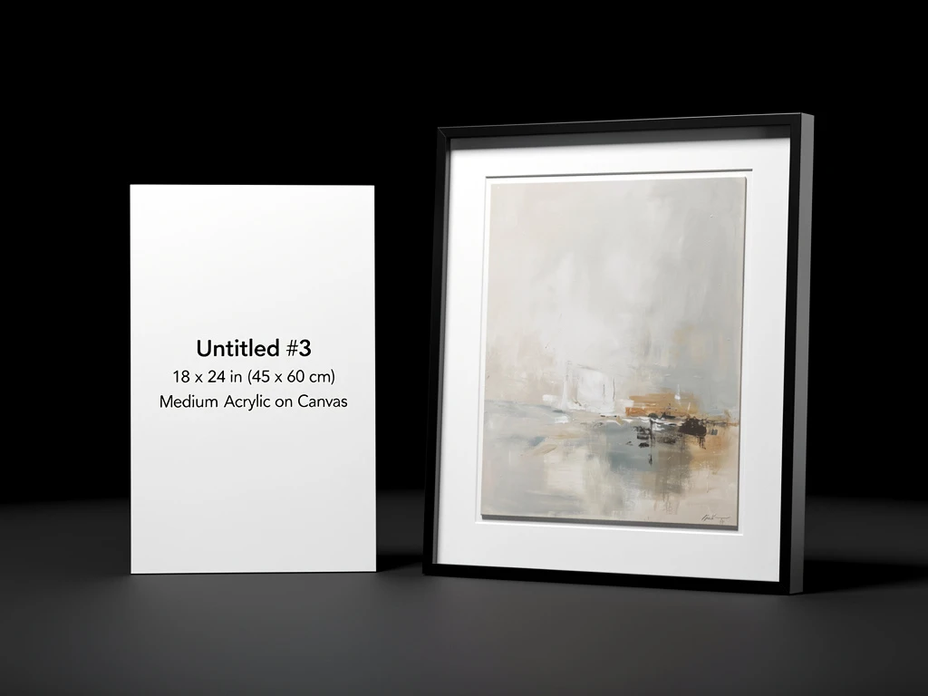
A flat JPEG of a painting on a white screen provides zero context. The collector cannot tell if the painting is the size of a postcard or the size of a wall.
The Professional Architecture: Elite artists do not just show the final image; they build case studies. When you click on a painting, you are taken to a dedicated page. You see the flat scan, but you also see a macro-photograph zoomed in on the thick impasto texture. You see a photograph of the painting hanging in a beautifully lit living room. Why it works: It proves the physical reality of the object. It helps the collector visualize the art in their own home, significantly increasing the likelihood of a sale.
4. The Invisible Navigation
The final hallmark of a successful art portfolio is the complete lack of distracting "web design."
The Professional Architecture: There are no textured backgrounds, no cursive fonts, and no complex animations. The navigation menu is small, clean, and tucked away. The background is pure gallery white or deep charcoal black. Why it works: The design becomes an invisible frame. It gets entirely out of the way, allowing the rich colors and textures of the fine art to command 100% of the viewer's attention.
You don't need a degree in web development to achieve this high-end architecture. With Portfoliobox, you have access to the exact asymmetrical grids, uncompressed rendering, and minimalist layouts used in the world's best online portfolio examples — no coding required.