In the high-stakes world of architectural client pitches, the design itself is often only half the battle. You can propose the most innovative, sustainable, and cost-effective building imaginable, but if the client cannot understand it, they will not buy it.
We frequently hear from incredibly talented architects who are frustrated by losing commissions to firms with arguably inferior designs. When we review their pitch materials, the problem is almost always the same: a profound failure in architecture presentation board layout.
Architects are trained to create complex, data-rich drawings. However, when presenting to a client—whether it's a couple building their dream home or a corporate board funding a new headquarters—those same drawings can cause confusion and alienation if not laid out correctly.
Here is a breakdown of the most common layout problems that kill architecture pitches, and the specific layout solutions you need to master to start booking more clients.
The Problem: The "Data Dump" Layout
The most pervasive problem in architecture presentations is the "data dump." Eager to prove how much work they have done, architects will cram every single drawing, sketch, and detail section onto their boards.
The resulting layout is a chaotic mosaic of line weights and text. For a layperson (the client), this is deeply overwhelming. They do not know where to look first. Instead of feeling excited by the design, they feel confused and anxious—which are the exact opposite emotions you want them to feel before asking them to sign a multi-million dollar contract.
The Solution: Strategic Curation and the "Hero" Image
Your presentation board is not an archive; it is a sales tool. You must curate ruthlessly.
- Establish a Visual Anchor: Every board (or every slide in a digital deck) must have a single, dominant "hero" image that occupies at least 40% to 50% of the layout. This should be an evocative, easily understandable perspective rendering that captures the emotional core of the project.
- Subordinate the Technicals: The orthographic drawings (plans, elevations) should be placed secondary to the hero image. They are there as supporting evidence for the client who wants to look closer, not as the main attraction.
- Embrace Negative Space: Leave ample white space around your drawings. It acts as a visual palate cleanser, making the board feel calm and authoritative rather than panicked and overcrowded.
The Problem: The Disjointed Narrative
Another common layout failure occurs when the board lacks a clear narrative sequence. If a board has a floor plan in the top left, a detail section in the top right, a render in the bottom left, and site analysis in the bottom right, the client's eye bounces around aimlessly.
There is no logical progression of thought. Because the layout lacks structure, the client subconsciously assumes that your management of their project will also lack structure.
The Solution: The Architectural Circulation Path
You must design the "circulation path" for the viewer's eyes using grid systems and alignment, guiding them through the story of the project.
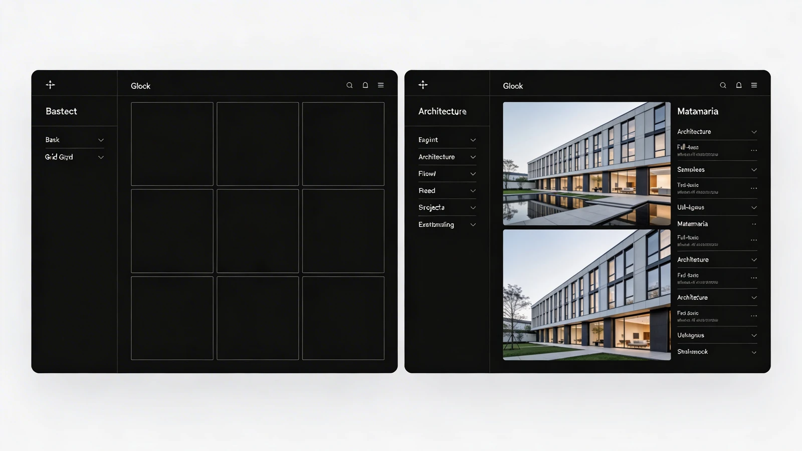
- The Grid: Always use a strict underlying grid (e.g., a 4-column layout) to align your drawings. This creates an invisible order that feels inherently professional.
- The Narrative Sequence: Structure the board to mimic how you want to tell the story. In Western cultures, we read top-left to bottom-right. Place your site context or concept diagram in the top left (the beginning of the story), the main plans in the center (the middle), and the experiential renders in the bottom right (the climax).
- Datum Lines: Align your floor plans horizontally. Align your sections so the ground lines match up. This creates continuous visual datum lines across the board, tying disparate drawings into a cohesive whole.
The Problem: Illegible Typography and Line Weights
Finally, many architects use the same CAD templates for client presentations that they use for construction documents. The result is a presentation board covered in microscopic text, complex dimension strings, and line weights that turn into a muddy gray blur when printed or projected.
If a client has to squint to read your board, you have already lost them.
The Solution: Presentation-Specific Formatting
You must create a separate graphic standard specifically for client presentations.
- Ditch the Dimensions (Mostly): Remove all extraneous dimension strings, structural grid lines, and complex annotations from your plans. Keep only room names and major, overall dimensions.
- Simplify the Linework: Use a simplified line weight hierarchy. Poise the walls (fill them in solid black or dark gray) so the spatial layout is instantly recognizable from across the room.
- Legible Typography: Use a maximum of two clean, sans-serif fonts. Ensure your body text is large enough to be read comfortably from three feet away.
By identifying these common problems and applying these strict layout solutions, you transform your architecture presentation board from a confusing data dump into a persuasive, elegant narrative. Mastering this skill is one of the most direct paths to elevating your firm's brand and booking more high-value clients.
Building your portfolio doesn't have to be complicated. With Portfoliobox, you can create a stunning portfolio website in minutes — no coding required.