The chasm between commercial photography and the fine art world is vast. A commercial client wants to see versatility, speed, and energetic lighting that sells a product. A fine art gallery curator, however, is looking for a sustained conceptual thesis.
Therefore, applying standard commercial web layouts to a fine art 'picture portfolio' inevitably ends in rejection. If you send a Chelsea gallery owner an endless, chaotic grid of unrelated single images, they will instinctively assume you lack the intellectual discipline required for a solo exhibition.
Submitting to the fine art space—whether for grants, gallery representation, or museum curation—requires an incredibly restrained digital structure. Your website must mimic the hushed, deliberate pacing of a physical museum. Here is how to achieve that.
Organize by Strict Projects, Not Genres
Commercial photographers organize their sites by genre: "Portraits," "Landscapes," "Weddings." This is death in the fine art world.
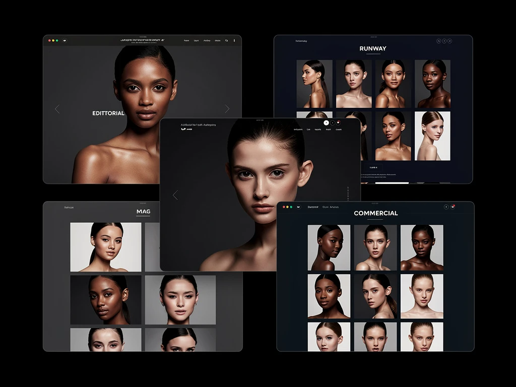
Fine art curators do not care about your ability to shoot a random good portrait. They care about projects. Your website's main navigation must be immediately divided into specific, titled bodies of work.
Instead of a generic 'Landscapes' tab, the navigation should read: The Neon Desert: Nocturnal Studies 2022-2024. When a curator clicks that title, they expect to see a cohesive, sustained visual exploration of that exact thesis, often consisting of 15 to 25 tightly related photographs that share identical editing parameters and identical lighting styles.
Enforce Restrictive Negative Space
Museums build white walls specifically to eliminate distractions so the art commands total attention. Your digital picture portfolio must do the same.
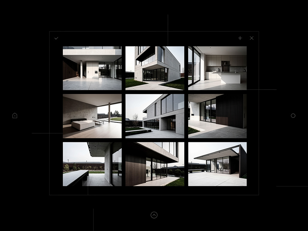
A massive mistake fine art photographers make online is using busy, full-bleed masonry grids where the edges of the pictures touch each other indiscriminately. This forces the images to visually fight. Instead, you must utilize extreme negative space.
Present your images one by one. Utilize a layout where a user must scroll horizontally or vertically through a vast expanse of stark white or deep neutral black before hitting the next photograph. Give each image psychological breathing room. The physical distance between the digital images artificially communicates weight and importance.
Integration of the Artist Statement
In fine art, the context is often just as important as the visual. A project is rarely submitted without an accompanying Artist Statement.
However, do not hide your statement on a separate "About" page. The text must be integrated directly into the framing of the project itself. At the very top of your Neon Desert gallery, before the first photograph appears, feature an elegant, perfectly formatted block of text. This statement should concisely explain the conceptual framework of the series, the physical location, and the emotional intent. Let the curator read the thesis, and then let them scroll through the visual proof.
Strict Technical Consistency
A fine art body of work is judged heavily on its discipline. If you are showcasing a project of architectural studies, all 20 images in that project must conform to the same technical rules.
If the first 10 images are shot horizontally in a 4:5 aspect ratio, the remaining 10 cannot suddenly jump to 16:9 cinematic crops unless there is a stated conceptual reason for it. The aspect ratio, the color grading, and the contrast curve must remain absolutely locked. Your digital website must respect these native aspect ratios perfectly without automatically cropping your carefully composed work into rigid square thumbnails just to satisfy a template.
Entering the fine art space requires a digital environment that gets entirely out of the way of your work. With Portfoliobox, you can effortlessly implement massive white-space margins, strictly isolated single-image galleries, and beautiful typography blocks designed exclusively to mimic the museum experience — no coding required.