A photograph that sings in a slideshow can fall flat in a grid. An illustration series built for vertical scroll loses its rhythm when squeezed into thumbnails. The work doesn't change, but the way it's presented does, and that difference is often what separates a portfolio that gets remembered from one that gets forgotten three tabs later.
Portfoliobox builds galleries the way creatives actually think about their work: not as one format, but as many.
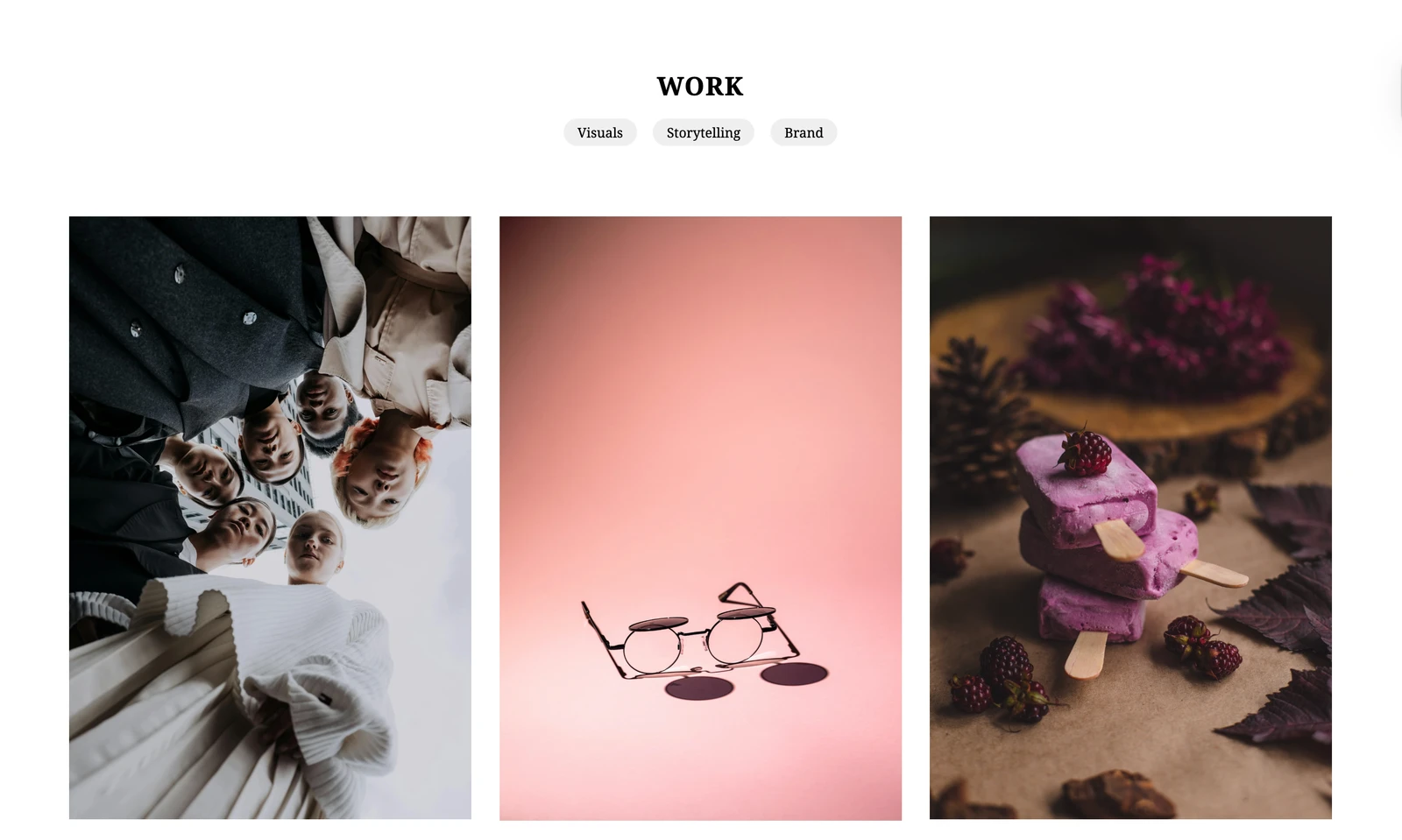
More ways to show a series than you'll ever need
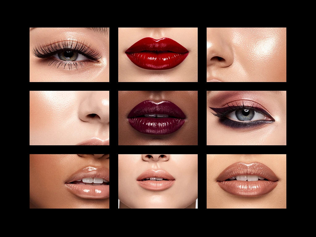
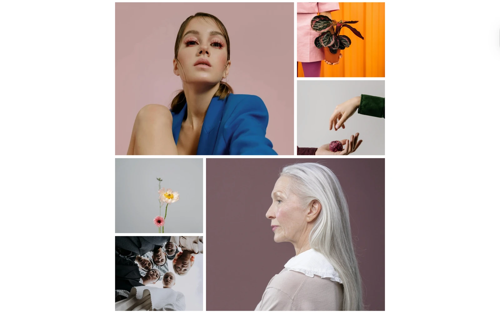
Most portfolio builders give you a grid and call it a day. Portfoliobox has more than 40 gallery layouts across five categories: thumbnail grids, vertical scrolls, horizontal scrolls, slideshows, and a handful of creative, non-standard styles built for work that doesn't fit a box.
That range matters because different work asks for different pacing. A wedding photographer might want a slow, full-bleed slideshow that lets each image breathe. An architect might want a horizontal scroll that mimics walking through a building. A model's composite card wants a tight, scannable grid. The point isn't to pick the "best" layout; it's to pick the one that matches how you want the work to be read.
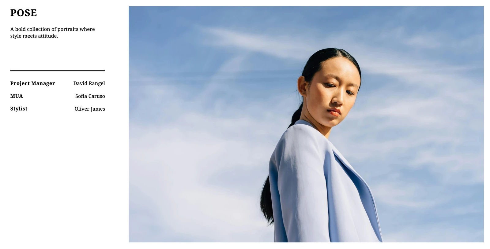
A different template for every page, because pages do different jobs
Here's the part most builders don't let you do: use a different template on every single page. Your gallery page can run a creative slideshow layout while your about page runs something minimal and text-forward, and your contact page runs something else entirely. Each page gets the layout that suits its job, instead of forcing one template to do everything adequately and nothing well.
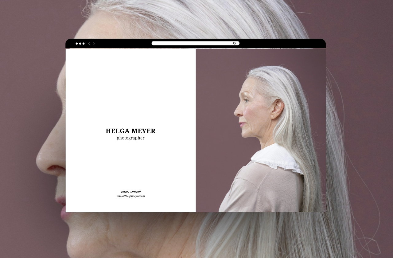
Start from one of the hundreds of templates built for photographers, designers, architects, models, makeup artists, illustrators, and artists, or start from a blank page if you'd rather build from nothing. Either way, every colour, font, spacing value, and background is yours to change.
The small details that make a gallery feel finished
Layout gets the work seen, but the details are what make it feel professional. Add captions and alt text so context travels with the image, and so search engines and screen readers can actually understand what they're looking at. Use the built-in lightbox so visitors can view a piece full-screen without leaving the page. Add borders, shadows, or subtle animations where they help the work, and skip them where they don't. Video support means motion work sits right alongside stills, with no separate platform required.
None of this is about adding bells and whistles for their own sake. It's about removing every small reason a visitor might have to second-guess what they're looking at.
Your portfolio's gallery is the first real conversation you have with a visitor. Give it a layout that matches your work, not the other way around.
Browse hundreds of templates by niche or see how other creatives have set theirs up in real portfolio examples.