While a User Experience (UX) designer obsesses over whether a button should exist, the User Interface (UI) designer obsesses over exactly how that button looks, feels, and reacts when a human clicks it.
UI design is an aesthetic, highly technical pursuit. When an Art Director or a Lead Frontend Engineer evaluates a UI designer portfolio, they are not primarily looking for dense, 4,000-word essays documenting user research groups. They are actively hunting for pixel-perfect visual execution. They want proof that you understand color theory, complex typographic hierarchy, negative space, and modern interaction logic.
If your portfolio layout degrades your UI screenshots through heavy compression, or clutters your clean interfaces with a messy website navigation, you will be rejected. Here is exactly how to format a top-tier UI digital portfolio.
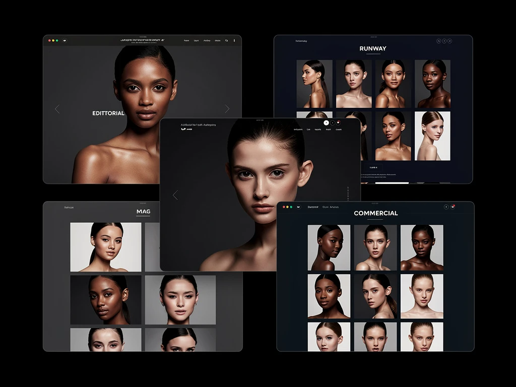
1. The Necessity of the High-Resolution 'Hero'
A UI portfolio must hit the viewer with immediate, undeniable visual impact.
Your homepage, and the top of every individual case study, must utilize a massive Hero image banner. This image should be an uncompressed, high-fidelity export of your most complex, beautiful App Screen. The entire goal of this image is to prove your visual competence within three seconds. If the drop-shadows are muddy, or the vector icons are pixelated because you used a cheap website builder that compresses uploads, your perceived value instantly drops to zero.
2. Emphasize the 'Micro' Within the 'Macro'
UI design is the mastery of microscopic details. An amateur portfolio only ever shows the 'Macro'—zoomed-out, full screenshots of an entire website.
A professional UI designer natively integrates 'Micro' shots into their layout. Do not simply show the entire e-commerce checkout page. Directly beneath it, feature a massive cropped-in visual specifically highlighting the complex calendar-date-picker you designed. Show the subtle inner-shadow you applied to the input field. Show the exact hex-code spacing you utilized for the "Submit" state.
By blowing up these tiny interface elements to extreme sizes on your portfolio, you forcefully direct the Art Director's exact attention to your meticulous craftsmanship.
3. The Interactive State Demonstration
Static flat images are no longer sufficient to secure modern senior UI roles. Modern interfaces are kinetic; they move, they glow, and they react to cursor focus.
Your portfolio must demonstrate your ability to execute 'Micro-Interactions'. When outlining a complex navigation menu in your case study, embed a high-resolution, lightweight looping GIF or WebM file. Visually show the hiring manager what happens when a mouse hovers over the dropdown. Does it snap instantly, or does it utilize a smooth 0.3-second ease-out CSS transition? Proving you design with kinetic physics in mind separates you entirely from standard graphic designers.
4. The 'Design System' Style Guide
A brilliant UI designer does not simply paint individual pages; they build scalable visual systems.
To prove you are ready to work alongside a React or Swift development team, you must showcase your 'Tokens'. At the bottom of every incredible UI project, include a 'Style Guide' graphic. This graphic should clearly display:
- The base Typography scale (from H1 down to Micro-copy)
- The global Primary and Secondary color swatches.
- The standard grid logic (e.g., an 8pt or 4pt grid system).
By providing the exact blueprints that an engineer would need to actually code your design, you establish yourself as a highly technical, production-ready asset.
Your UI portfolio website must be as meticulously engineered as the applications you design. With Portfoliobox, you gain access to an architecture that supports massive, uncompressed Hero graphics, fluid GIFs, and absolute typographical control to guarantee your interface work remains pristine — no coding required. Check out design examples to see how other designers showcase their work.