In the physical Fine Art world, the "White Cube" is law. Every prestigious contemporary art gallery on the planet paints its walls pure, blinding white. The sociological theory is that a stark white wall provides absolute neutrality, refusing to compete with the painting and forcing the viewer's entire focus onto the canvas itself.
Consequently, 99% of digital art portfolios mindlessly copy this physical aesthetic. They utilize pure #FFFFFF hex code backgrounds, assuming that mimicking the physical museum guarantees B2B representation.
However, digital screens do not function like physical walls. A physical white wall reflects ambient room light softly. A digital white screen actively blasts microscopic LED light directly into the collector's retina. If you are a traditional artist who paints heavily shadowed, moody, or luminous subjects, placing your art on a blindingly bright white website actively destroys it. Here is the B2B framework for abandoning the White Cube and weaponizing "Dark Mode" digital galleries.
The Physics of 'Contrast Washout'
The human eye constantly adjusts dynamically to the brightest light source in its field of vision.
If a collector lands on your portfolio website, and your website background is pure digital white, their pupils physically constrict to block out the harsh glare of the screen. The Catastrophe: Because their pupils have constricted to protect themselves from the white background, they physically cannot see the subtle, dark tones inside your painting. The rich, dark velvet blues and pitch-blacks you spent hours glazing onto the canvas suddenly look like dull, muddy grays. The website UI (User Interface) is actively fighting the painting for contrast, and the UI is winning.
When to Execute Digital Inversion
You should never use Dark Mode simply because it looks "cool" or "edgy." A B2B artist uses Dark Mode strictly as a mathematical contrast multiplier.
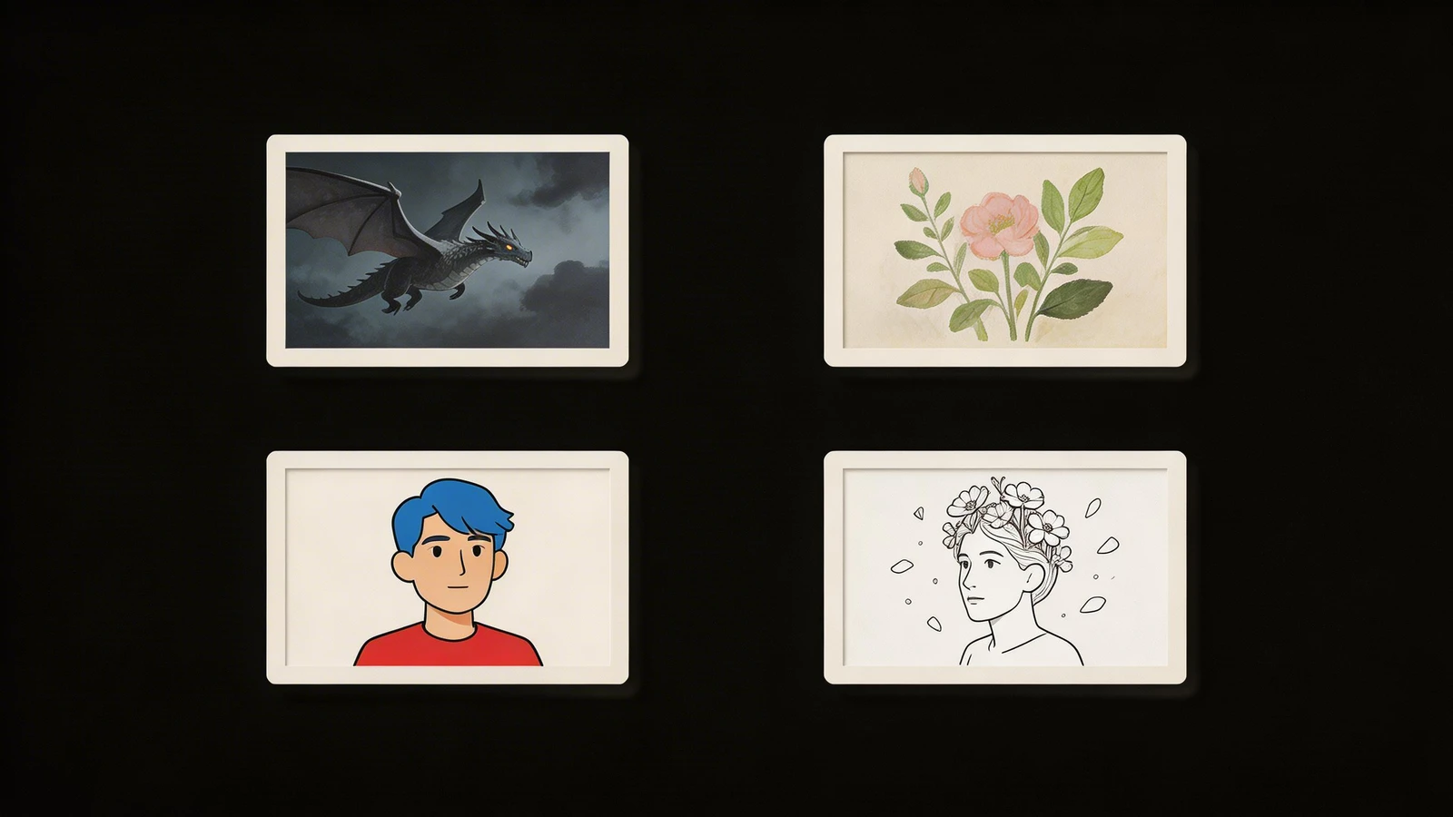
You must analyze the native color palette of your physical canvases. Execute Dark Mode (#000000 Background) If You Paint:
- Chiaroscuro / Classical Realism: If you paint like Caravaggio (utilizing massive, pitch-black shadows to frame a single brightly-lit figure), a dark UI absorbs the edges of the canvas, making the illuminated figure appear to glow explosively off the screen.
- Neon / Luminous Pigments: If you paint utilizing shockingly bright, high-key fluorescent colors (neon pinks, acid greens) layered over dark grounds, a black UI provides the structural negative space required to make those specific wavelengths vibrate mathematically.
Formatting the 'Dark Typography'
The most frequent mistake artists make when they successfully pivot to Dark Mode is failing to adjust their typography.
If you use pure, burning white text (#FFFFFF) on top of a pure black website background (#000000), the text will cause "Halation." To the human eye, the white text will physically appear to blur and bleed into the black background, causing massive eye strain for the gallery curator trying to read your Artist Statement.
The Typographical Fix:
To execute a luxury, museum-quality Dark Mode layout, you must lower the contrast of the text slightly.
Instead of pure white, format your website builder to utilize a very soft, sophisticated "Cool Gray" (e.g., Hex Code #CCCCCC or #B3B3B3) for all paragraph text. This ensures the collector can read your dense, 300-word Artist Biography comfortably without experiencing retinal fatigue.
Controlling how the human eye digests your physical art online requires absolute architectural sovereignty. By executing your portfolio on Portfoliobox, visual artists effortlessly deploy devastatingly clean Dark Mode layouts, uncompressed structural grid rendering, and precision typography-color mapping required to maximize physical contrast natively — no coding required.