When an art director, magazine editor, or prospective bridal client lands on your website, they do not read your biography first. They do not look at your pricing page. Their eyes immediately snap to the main homepage grid.
Those initial three seconds dictate the entirely of your professional perceived value. If your homepage portfolio pictures lack impact, tension, or polish, the client bounces immediately. This above-the-fold real estate is ruthless; it must be occupied exclusively by your absolute best work.
However, many creatives suffer from 'photographer's bias'—they choose images based on how difficult the shoot was, rather than how impactful the final result is to a stranger. To cure this bias and optimize your site for bookings, avoid sentimental attachments and follow these 5 critical selection strategies.
1. Prioritize Emotional Resonance Over Technical Perfection
It is easy to select an image for your homepage simply because it is the sharpest, most perfectly lit photograph you have ever taken. But technical execution rarely stops a scrolling client.
Emotional resonance is what halts the eye. A slightly grainy portrait with piercing, undeniably human eye-contact will hold a viewer on your site much longer than a perfectly lit, incredibly sterile studio product shot. Select your portfolio pictures based on what they make the viewer feel, rather than what they prove you know about your camera's histogram.
2. Eliminate The 'Near Matches'
When organizing a main gallery grid, photographers often include two or three images from the exact same setup. Perhaps one model is looking left, and the other is looking slightly right.
This dilutes your impact. Showing 'near matches' subconsciously tells the client that you lack the editorial discipline to choose a clear winner. If you have five amazing shots from a single magazine editorial, pick only the single strongest frame for the homepage. You can feature the remaining sequential shots inside a dedicated 'Case Study' sub-page instead.
3. Establish Your Color Palette Immediately
A high-end website is not just a collection of random good photos; it is a unified aesthetic experience.
When selecting imagery for your primary grid, consider the aggregate color theory. If you are a moody, dark-and-desaturated wedding photographer, do not place a wildly neon, highly saturated test-shoot image in the middle of your homepage grid simply because it is a "good shot." That single image breaks your brand's visual identity. Ensure the pictures on your homepage 'speak' to each other cohesively, sharing a consistent tonal workflow.
4. Include a 'Breath' Image
A grid consisting entirely of dense, complex, multi-subject photographs is exhausting to look at. The eye will simply glaze over the screen because it has nowhere to rest.
When selecting your homepage lineup, actively choose at least one abstract, minimalist, or detail shot (e.g., a quiet macro shot of texture, a vast empty landscape, a tightly cropped silhouette). This 'breath' image creates intentional negative space within your grid, providing visual relief so the viewer has the mental energy to appreciate the complex photographs surrounding it.
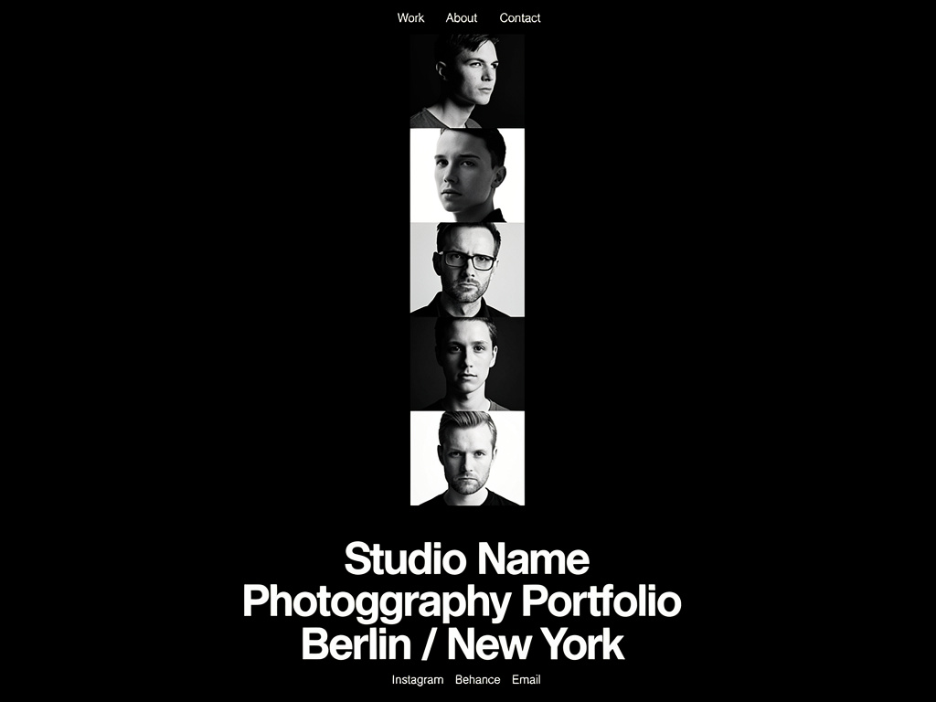
5. Select Images with Direct Eye Contact for 'Heroes'
If your website utilizes a massive, full-screen Hero banner before the grid begins, the psychology of human connection must be leveraged.
Web conversion metrics heavily favor direct eye contact. An image where the subject is staring piercingly through the lens directly at the viewer creates an immediate, unbreakable tension. It physically commands the viewer to stop scrolling and engage with the page. Save your vast, faceless landscapes for the scrolling grid beneath; use humanity to hook them at the top.
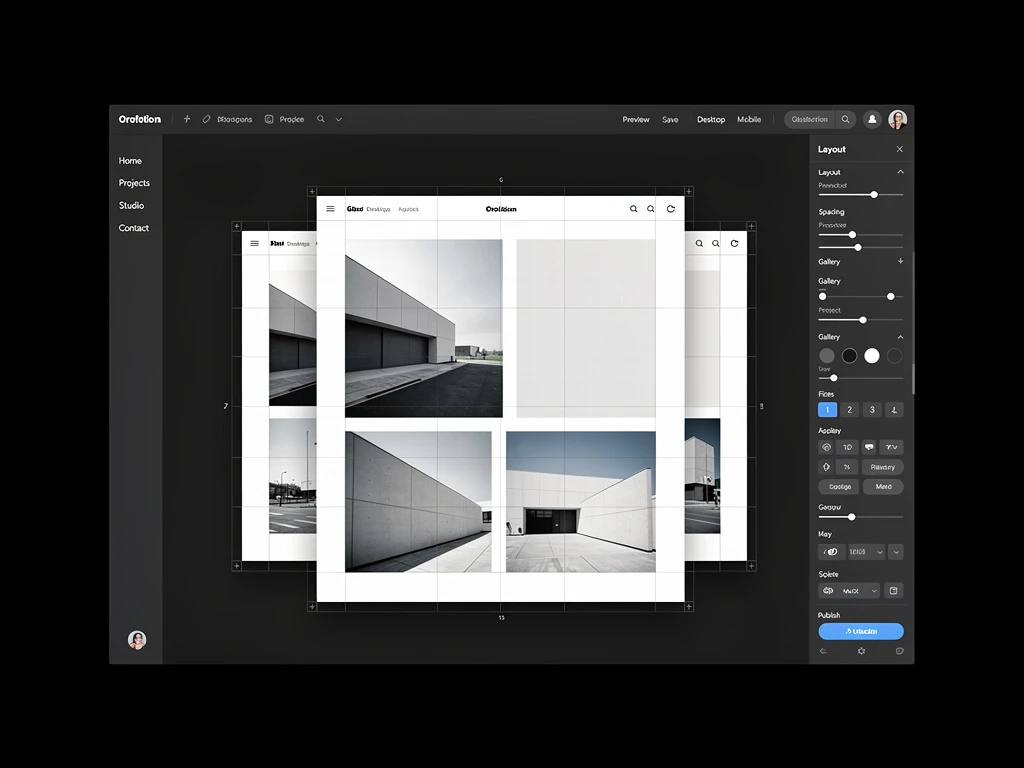
Creating a striking grid doesn't require a degree in web development. With Portfoliobox, you can upload your boldest photography and let dedicated creative structures perfectly align and render your uncompressed visuals in minutes — no coding required.