I still remember sitting in on a major design competition jury a few years ago. The stakes were high—a multi-million dollar cultural center in a major European city. Two firms had made it to the final round. Firm A presented a design that was, structurally and spatially, a masterpiece. It was innovative, sustainable, and daring. Firm B presented a design that was good, but arguably safer and less inspired.
Yet, Firm B won the commission unanimously.
Why? Because Firm A's presentation boards were a disaster. They were crammed with dense text, microscopic line drawings, and clashing color palettes. The jury spent half their allotted time just trying to figure out where the main entrance was. Firm B, on the other hand, presented a masterclass in presentation board architecture layout. Their boards told a clear, compelling story that the jury immediately grasped and fell in love with.
That day, I learned a crucial lesson: in the architecture industry, your design is only as good as your ability to communicate it. Your presentation boards are the physical manifestation of your architectural brand. If they are chaotic, you are perceived as chaotic. If they are masterful, you are perceived as a master.
Here is how you can elevate your architecture brand by perfecting your presentation board layout.
The Board is a Building: Design It Like One
Many architects treat presentation boards as an afterthought—a necessary evil to get the drawings out of the computer and onto the wall. This is a massive missed opportunity.
You must approach the layout of your board with the same rigor you apply to the design of a building. A building has structure, circulation, hierarchy, and focal points. Your board needs exactly the same things.
When a client or a critic looks at your board, where does their eye enter? How do they move through the information? If you haven't designed a clear "circulation path" for their eyes, they will get lost.
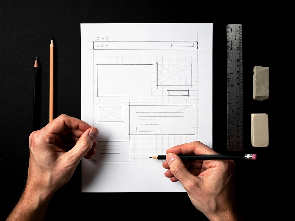
Use a strict grid system to create the "structure" of the board. Align your plans and sections to create a sense of order. Use negative space (white space) the same way you use plazas and courtyards in urban design—to provide breathing room and highlight the surrounding masses.
Tell a Story, Don't Just Dump Data
The biggest mistake I see in presentation board architecture layout is the "data dump." Architects want to prove how hard they worked, so they put every single sketch, diagram, and detail section they produced onto the board.
This dilutes the impact of your strongest work. A great presentation board tells a story. It has a beginning (the site and the concept), a middle (the spatial resolution and plans), and an end (the experiential renders and details).
Be ruthless in your curation. If a drawing doesn't advance the narrative or clarify the design, leave it off the board. Your brand is built on your ability to synthesize complex information and present a clear, unified vision, not on your ability to generate endless PDFs.
The Power of the "Hero" Image
In the story of your project, there must be a protagonist. In board layout, this is the "hero image."
This is typically a large, evocative rendering or a beautifully lit photograph of a physical model that captures the essence of the project's atmosphere. It should be the largest element on the board, acting as the anchor for the entire layout.
When a client walks into a presentation room, the hero image is what captures their heart from across the table. The orthographic drawings—the plans and sections—are what satisfy their logical brain once they step closer. If you don't have a strong hero image to grab their attention first, they may never bother to decipher your floor plans.
Brand Consistency Across Every Pitch
Think of the most successful architecture firms in the world. OMA, BIG, Herzog & de Meuron. You can often identify their work just by looking at the graphic style of their presentation boards, before you even see the building design. They have established a distinct graphic brand.
To elevate your own brand, you need consistency. Develop a graphic standard for your boards and stick to it across all your projects.
- Typography: Choose one or two professional typefaces and use them exclusively.
- Color Palette: Develop a consistent approach to color—whether that means strict black-and-white linework with one accent color, or a muted, earthy render style.
- Line Weights: Standardize your CAD line weights so your drawings always look crisp and professional.
When a client sees your portfolio or walks into your pitch, they shouldn't just see a collection of random projects. They should see a cohesive, highly professional brand. Mastering your presentation board architecture layout is the fastest, most effective way to communicate that authority.
Building your portfolio doesn't have to be complicated. With Portfoliobox, you can create a stunning portfolio website in minutes — no coding required.