When you look at the websites of the most successful illustrators in the industry—artists who consistently book major book covers, high-end editorial spreads, and AAA game studio contracts—their websites often look effortless.
It is easy to assume they are successful simply because their art is good. While the art must be excellent, their digital presentation is rarely accidental. The industry's best online art portfolio examples share a very specific, deliberate structural anatomy. If you want to command the same level of authority and book premium clients, you must understand how these sites are built. Here is a deep dive into the architecture of a winning portfolio.
1. The Anatomy of the Homepage: The "Hero" Statement
Amateur portfolios use the homepage as a storage locker, displaying a massive grid of every thumbnail the artist has ever created.
The Professional Approach: Top-tier online art portfolio examples utilize the "Hero" statement. The homepage consists of a single, massive, edge-to-edge image (or an auto-playing, silent video loop). There is almost no text, save for the artist's name and perhaps a three-word specialty descriptor (e.g., "Sarah Smith | Concept Artist"). Why it works: It forces the client to immediately confront the artist's absolute best work. It establishes dominance, removes visual clutter, and sets a premium, cinematic tone for the rest of the viewing experience.
2. The Anatomy of the Gallery: Editorial Pacing
When you click into the galleries of successful artists, you rarely see rigid, uniform square grids.
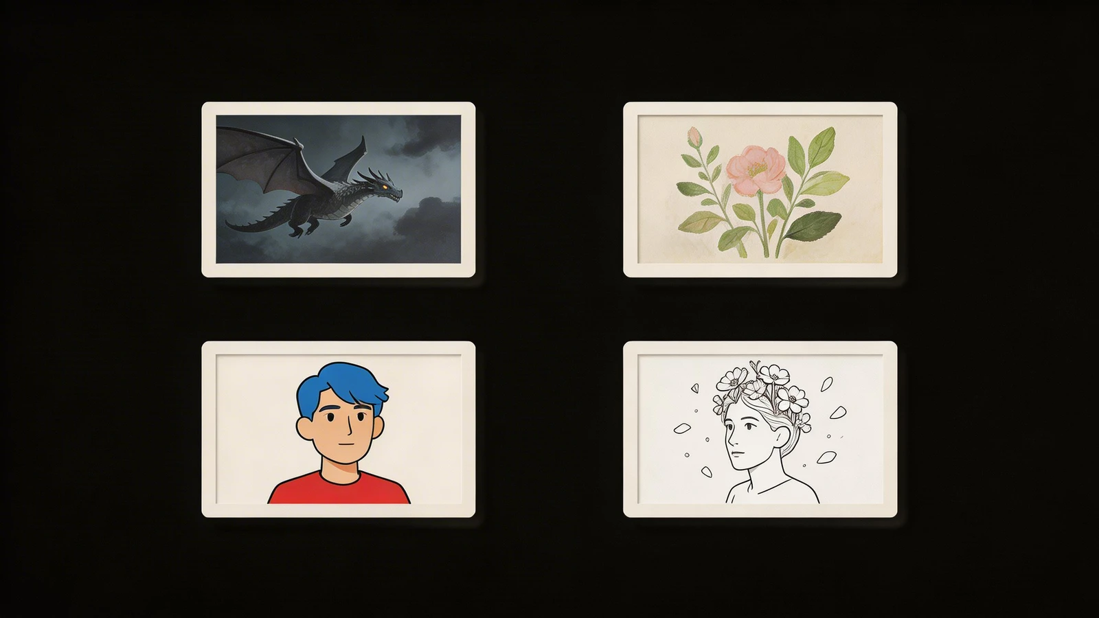
The Professional Approach: They use dynamic, asymmetrical masonry layouts. A tall, vertical character illustration is placed carefully next to a wide, horizontal environment painting. Why it works: This creates visual pacing. It breaks the monotony of endless scrolling and makes the website feel like a curated art book or a high-end magazine spread. It proves the artist understands composition not just within their paintings, but in their digital presentation as well.
3. The Anatomy of the Project Page: Proving the Pipeline
This is the biggest separator between hobbyists and professionals. Hobbyists just show the final image.
The Professional Approach: The best online art portfolio examples feature dedicated case study pages. When you click an image, you are taken to a page that details the entire project. It includes the final render, but also the initial rough sketches, the color scripts, and a brief description of the client's creative brief. Why it works: Art directors need to minimize risk. Showing your process proves that your beautiful final image wasn't a fluke. It proves you have a reliable, professional pipeline and can execute a commercial brief under pressure.
4. The Anatomy of the Interface: The Invisible Frame
The final shared characteristic of elite portfolios is what you don't see.
The Professional Approach: You will not find bright background colors, wacky fonts, or complex animations. The interface is entirely minimalist, often utilizing stark white or deep black (dark mode) backgrounds. Why it works: The design acts as an invisible frame. It gets out of the way so the vibrant colors and intricate details of the illustration can command 100% of the viewer's attention.
You can reverse-engineer this success for your own brand. With Portfoliobox, you have access to the same immersive hero sliders, dynamic masonry grids, and minimalist frameworks used in the world's best online art portfolio examples — allowing you to build an agency-grade website in minutes, with no coding required.