The chasm between commercial illustration and "Fine Art" is immense. Commercial illustration (designing a beer label or painting a video game background) is explicitly designed to solve a client's problem. Fine Art (gallery exhibitions, museum curation, and grant-funded residencies) is explicitly designed to interrogate culture and push academic boundaries.
Because the end goal is fundamentally different, the digital portfolios used to apply for these positions must be fundamentally different.
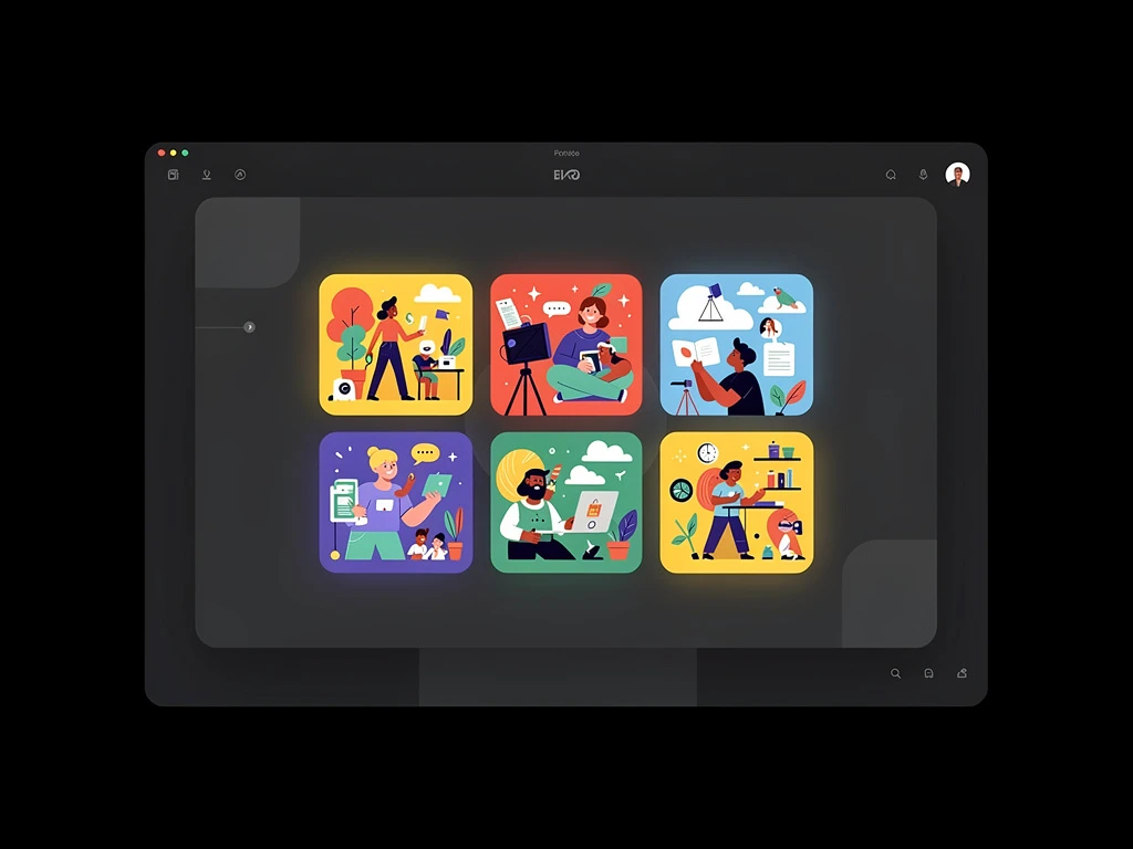
If you attempt to secure a prestigious gallery exhibition using a standard, flashy commercial illustration website filled with animated graphics and "Hire Me!" buttons, the gallery curator will instantly reject you as a commercial sell-out. The Fine Art world demands absolute, uncompromised academic severity. Here is exactly how to structure an online portfolio for elite Fine Art submissions.
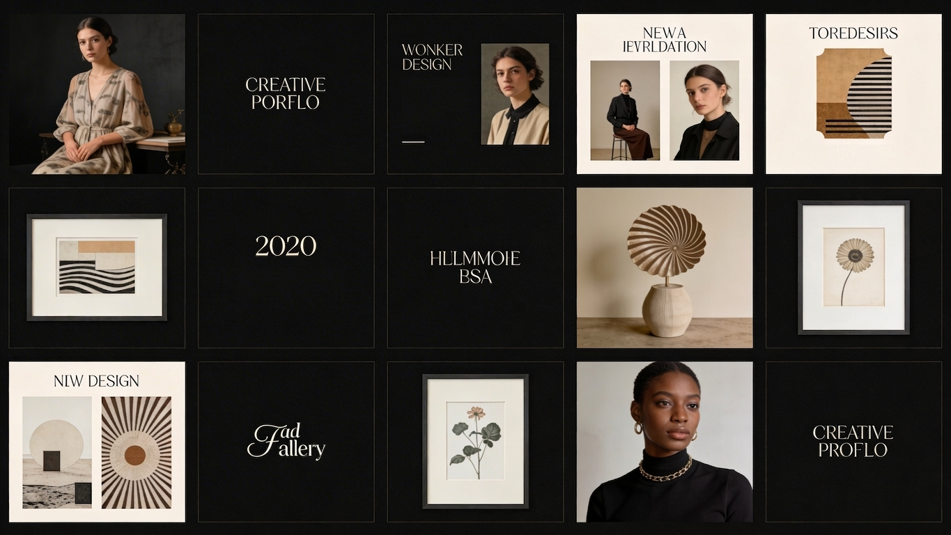
1. Establishing The 'White Cube' Aesthetic
In the physical world, elite contemporary art galleries purposely utilize the "White Cube" format (blank white walls, zero windows, zero distractions) to force the viewer into direct psychological confrontation with the artwork.
Your digital portfolio must meticulously emulate this physical phenomenon. Eradicate all visual noise from your website builder.
- The background color must be pure, blinding "#FFFFFF" white.
- Eliminate all Drop Shadows, Borders, or "Hover Animations" over your images.
- The navigation menu should be incredibly small, tucked securely into a corner using an ultra-thin, sterile font (like Helvetica or Inter).
By stripping away all commercial digital formatting, you instantly train the curator's brain to analyze your online images with the exact same reverence they apply to physical paintings inside a museum.
2. Formatting the 'Didactic Label'
A commercial illustrator might just title a painting "Cool Sci-Fi Landscape." That is professional suicide in the Fine Art world.
Every single image uploaded to a Fine Art digital portfolio must be mathematically accompanied by a "Didactic Label"—the exact structural text block you read on the wall at a museum.
The Digital formatting Rule: Directly beneath or immediately beside the JPEG, you must display this rigid text layout:
- Title of the Work (Italicized)
- Year of Creation
- Medium (e.g., Oil on Linen, or Digital Vector Projection)
- Dimensions in Inches/Centimeters (e.g., 48" x 60")
When a grant committee reviews your digital portfolio, they need to know if the painting on their screen is the size of a postage stamp or the size of a billboard. Giving them immediate dimensional context proves you are an integrated academic artist, not an amateur hiding behind a screen.
3. The Centrality of the 'Artist Statement'
In commercial illustration, nobody cares about your philosophical opinions; they just want the drawing finished by Friday. In Fine Art, your philosophy is often more valuable than the drawing itself.
The most important page on a Fine Art portfolio is not the gallery; it is the "Context" page.
You must integrate two massive B2B academic documents directly into the digital navigation:
- The Artist Statement: A 300-word academic thesis explaining the sociological, emotional, or structural themes your art investigates.
- The CV (Curriculum Vitae): A rigid, bulleted list detailing your past Gallery Exhibitions, Academic Degrees, Publications, and artistic Grants.
If your website forces a curator to download a suspicious PDF file just to read your Artist Statement, you introduce massive digital friction and risk rejection. These documents must be seamlessly integrated as gorgeous, typography-heavy native web pages within your portfolio architecture.
Dominating the gallery ecosystem requires a website that mathematically understands academic silence. By hosting your Fine Art submissions on Portfoliobox, ambitious artists effortlessly deploy the stark 'White Cube' layouts, elegant didactic typography, and pristine image rendering demanded by elite global curators — no coding required.