The single fastest way to lose a potential high-paying client is a confusing, labyrinthian website navigation system.
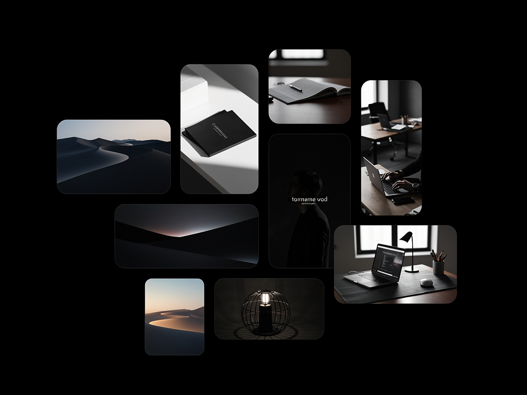
It is incredibly common to see brilliant photographers and spectacular illustrators launch portfolios that visually stun, but completely fail from a usability standpoint. They utilize hidden hamburger menus on desktop, illegible tiny fonts, and convoluted sub-pages requiring six clicks to find an email address. You do not need a degree in web development to structure a site correctly, but you do need to understand the fundamental principles of User Experience (UX).
Here is how to approach the architecture of your online portfolio with the precision of a seasoned web developer, ensuring that your target audience finds exactly what they need instantly.
The Rule of "Don't Make Me Think"
The core philosophy of successful web development is absolute clarity. When an art director lands on your homepage, they should instantly understand two things explicitly: who you are, and what you do.
Do not use overly clever, abstract titles for your navigation links. A link to your illustrations should not be labeled "Visual Musings." A link to your biography should not be titled "The Architect Behind the Lens." You are forcing the user to guess.
Use standard, globally recognized naming conventions. "Work," "About," and "Contact" exist as a standard for a reason. They require zero cognitive load. Professional clients value their time above all else; respect that by removing friction from the user journey.
The "Three-Click" Maximum
A fundamental UX rule dictates that a user should be able to reach any vital piece of information on your website in three clicks or less from the homepage.
If a producer wants to view your specific reel for automotive cinematography, they should not have to click "Commercial Work," then "Categories," then "Video," then "Automotive," and finally "Showreel." This deep nesting actively frustrates users.
Flatten your website architecture. If you specialize in multiple distinct fields (for example, "Wedding Photography" and "Commercial Product Photography"), create two primary galleries directly accessible from the main navigation bar. Do not bury your most profitable services behind layers of unnecessary sub-menus.
Mobile Priority is Mandatory
When conceptualizing the structure of your site, many creatives sit at a large desk utilizing a 27-inch monitor, optimizing their padding and margins for massive screens. However, more than half of your potential clients will open your link on an iPhone.
A professional web developer designs responsively, often adopting a "mobile-first" approach. When drafting your navigation, consider how it functions when condensed into a thumb-sized screen. Massive hero images must scale properly so the text remains readable. Buttons must be large enough to tap comfortably without zooming in.
Fortunately, specialized portfolio builders eliminate the need for you to write the complex media queries required for flawless responsive CSS.
By stripping away complexity and focusing purely on the frictionless delivery of your work, you present yourself as a highly competent professional. With Portfoliobox, the underlying web development architecture is mathematically optimized for you, leaving you free to focus solely on uploading your most brilliant creative work to an elegant, highly functional space.