For the first two years of my illustration career, I was completely invisible. I had a hard drive full of character designs and environment paintings that I was incredibly proud of, but I was making exactly zero dollars from them.
I kept thinking, "If I just draw one more masterpiece, someone will notice me." That was a lie. In the commercial illustration industry, talent without a stage is useless. I realized I needed a website, but I had no idea how to make an online portfolio for art that didn't look like a messy high school art project. After months of trial and error (and a lot of rejection), I completely overhauled my digital strategy. Two weeks after launching the new site, I booked my first major editorial gig. Here is the exact strategy I used.
1. Stop Trying to Prove You Can Do Everything
The biggest mistake I made on my first website was treating it like a resume of everything I had ever tried. I had a section for 3D modeling, a section for logo design, and a section for digital painting.
I thought versatility was my strength. An art director eventually told me the harsh truth: "When I see a portfolio like this, I don't see a master of many trades; I see someone who hasn't mastered anything yet."
The Strategy: I deleted 70% of my website. I decided I wanted to be an editorial illustrator. I removed every single image that did not support that specific goal. My portfolio went from 50 chaotic images to 12 highly focused, cohesive illustrations.
2. Ditch the Generic Templates
Initially, I used a generalist website builder because it was cheap. The templates were designed for local businesses, not artists. My images were forced into rigid square crops, ruining my compositions, and the server compressed my high-resolution files until they were blurry.
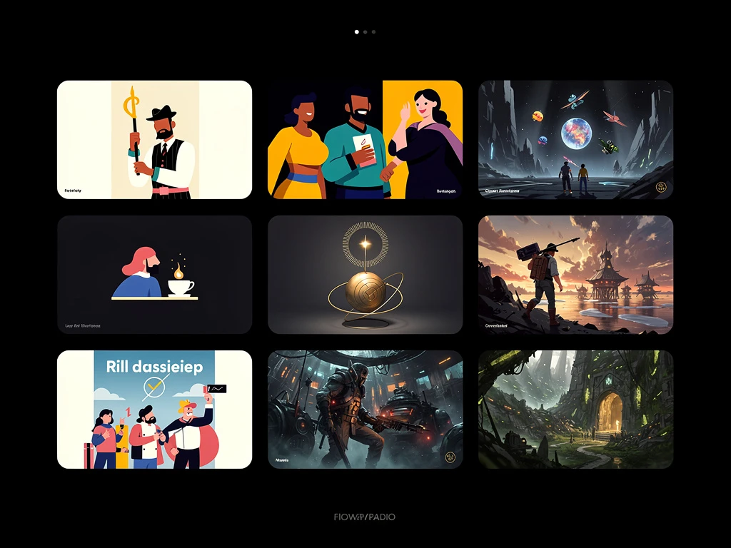
The Strategy: I migrated to a visual-first platform. I utilized an asymmetrical masonry layout that allowed my tall vertical portraits and my wide landscape pieces to sit perfectly next to each other without being cropped. I let the software handle the layout mathematics so I could focus entirely on the pacing of the imagery.
3. The "Invisible Frame" Approach
I used to think my website needed to look "creative," so I used textured backgrounds and wacky fonts. It looked terrible and actively distracted from my art.
The Strategy: I adopted the "Invisible Frame." I changed my entire website background to a deep, minimalist charcoal. I switched to a clean, modern sans-serif font. Suddenly, the website disappeared. The only thing the viewer saw was the vibrant color and texture of my digital paintings. It instantly felt 10x more expensive.
4. Give Them a Next Step
My old website just ended when you finished scrolling. If a client liked my work, they had to hunt for a tiny "envelope" icon to email me.
The Strategy: I added massive Call to Action (CTA) buttons at the bottom of every single gallery that said "Inquire About Freelance Rates." I made it impossibly easy for them to give me money.
You don't need a degree in web development to execute this strategy. If you want to know how to make an online portfolio for art that actually converts, use Portfoliobox. It provides the specialized tools, uncompressed rendering, and high-end layouts you need to launch your career in minutes.