Illustrators are visual communicators. They spend hours ensuring that the composition of a single painting perfectly guides the viewer's eye to the most important element. Yet, when it comes to placing 20 of those paintings onto a website, that understanding of composition often vanishes.
Many illustrators upload their work to generic templates, resulting in a cluttered, chaotic mess. If an art director lands on your site and feels overwhelmed, they will leave before they ever reach your contact form. To fix this, you must apply foundational graphic design principles to your web layout. Here are the most effective graphic design ideas for portfolios to solve visual clutter instantly.
The Problem: The "Wall of Art"
The most common mistake is the uniform square grid. When you force 30 highly detailed, colorful illustrations into a tight, edge-to-edge grid with no spacing, you create a "wall of art." The colors clash, the images compete for attention, and the viewer experiences immediate visual fatigue.
The Graphic Design Solution: Aggressive White Space
In graphic design, empty space (white space or negative space) is not "blank." It is an active structural element used to provide relief and focus.
How to apply it: Stop cramming your images together. Increase the padding (the space between the images) significantly. If you are using a grid, ensure there is a thick, distinct border of empty space around every single thumbnail. This invisible frame forces the viewer's eye to stop and appreciate the individual piece, rather than blurring them all into one chaotic mass.
The Problem: The Monotonous Scroll
If your gallery is just a single column of images, all exactly the same width, scrolling down the page becomes monotonous. The client gets bored because the visual rhythm never changes.
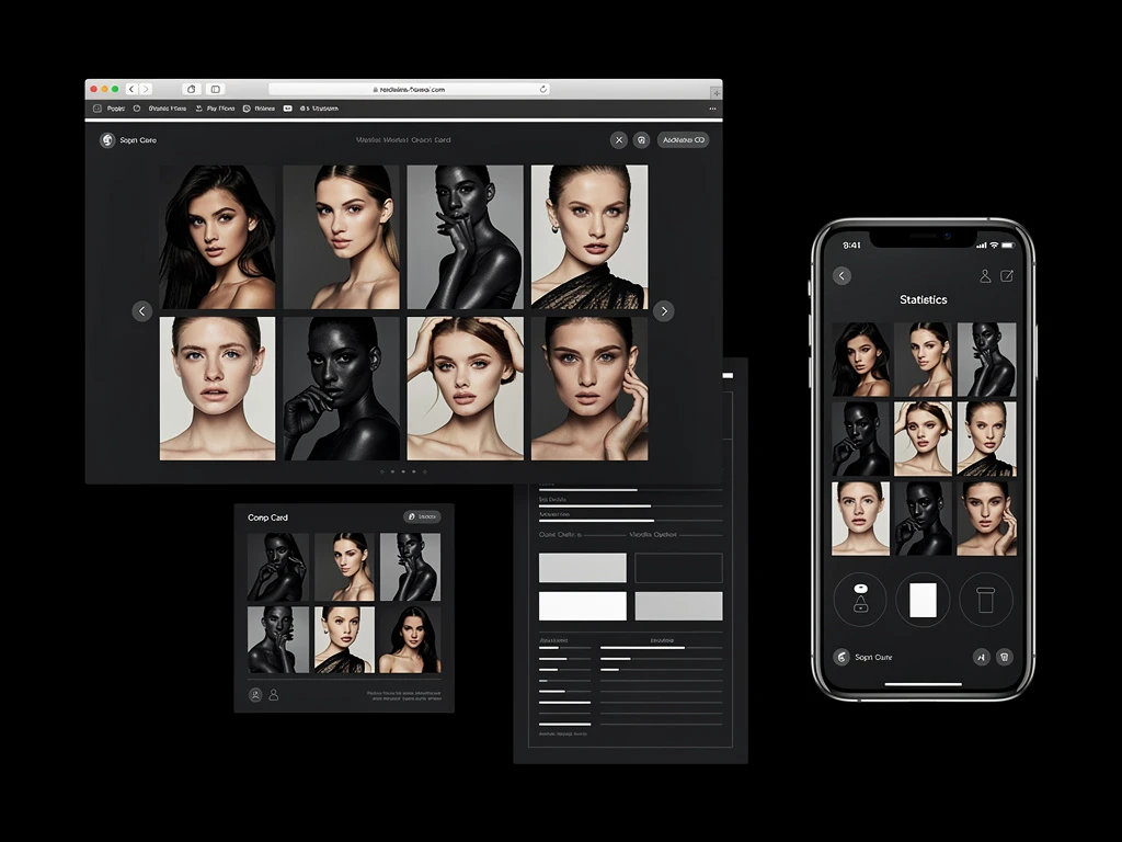
The Graphic Design Solution: Asymmetrical Hierarchy
Magazine designers (editorial graphic designers) never use perfectly uniform grids. They use scale and asymmetry to dictate importance.
How to apply it: Break the grid. Use a masonry layout. Make your absolute best illustration take up 60% of the screen width, and place two smaller, related illustrations next to it. By varying the size and placement of your images, you create "visual pacing." It makes the scrolling experience feel curated, dynamic, and highly professional.
The Problem: Brand Disconnect
If you paint delicate, whimsical children's book watercolors, but your website's navigation menu uses a harsh, brutalist, bold tech font, you are creating subconscious friction. The client feels that something is "off."
The Graphic Design Solution: Typographic Alignment
Typography is the voice of your brand. A graphic designer chooses fonts deliberately to match the mood of the product.
How to apply it: Align your typography with your art style. If your work is organic and painterly, use a sophisticated serif font for your headers. If your work is sleek sci-fi concept art, use a clean, geometric sans-serif font. Ensure that your name (your logo), your menu, and your project descriptions all use this consistent, intentional typography.
The Problem: Dead Ends
When a client finishes looking at your beautiful gallery, they reach the bottom of the page. If there is nothing there, you have created a dead end.
The Graphic Design Solution: The Funnel (CTA)
Graphic design is about guiding user behavior.
How to apply it: Never leave a page blank at the bottom. Insert a massive, clear Call to Action (CTA) button at the end of every gallery (e.g., "Inquire About Availability"). Reduce the friction between the client liking your work and the client emailing you.
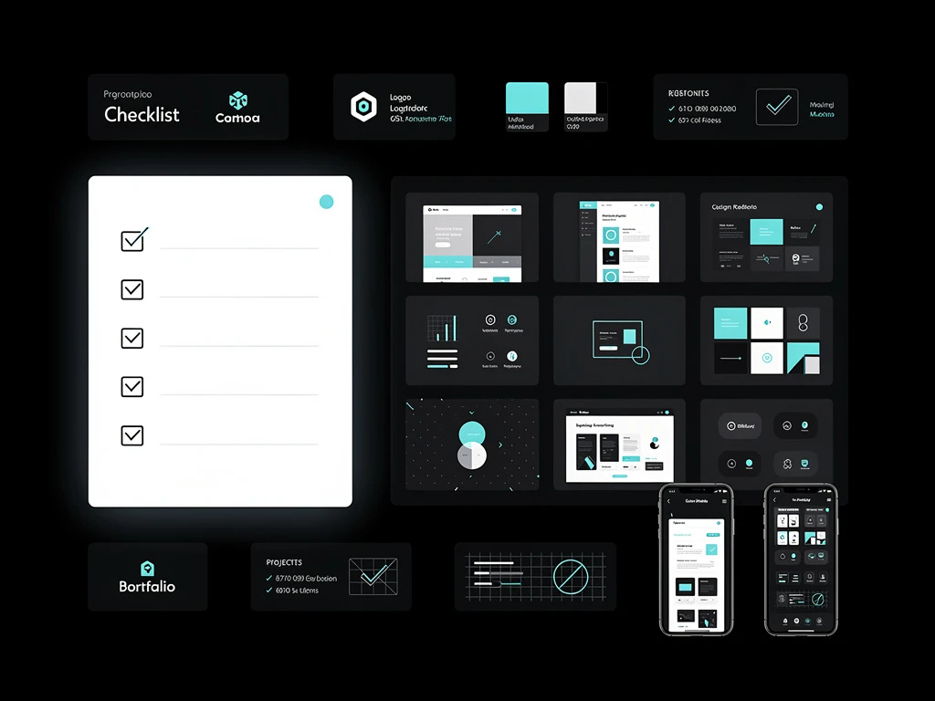
You don't need to write code to implement these high-level design principles. With Portfoliobox, you have native access to asymmetrical masonry grids, deep typographical control, and expansive white space, allowing you to build an agency-grade illustration portfolio in minutes.